1. Prerequisite
This tutorial assumes the completion of the following prerequisite. To progress on this tutorial, please at least finish one of the following guide and make sure the web application is running.
2. Basic Operations
iPLAss can construct web application easily by configuring the provided GUI. Please go through this tutorial to have a glance of the basics to utilize the GUI.
2.1. GEM Module and AdminConsole
The Tenant created by iPLAss has two applications ready to use, GEM Module and AdminConsole.
- GEM Module
-
A collection of views mainly for end users. It has login page, and GEM pages that can search/view/modify the Entity data. It is auto-constructed depending on the Entities defined at AdminConsole.
- AdminConsole
-
A collection of tools and views for system managers and developers. The developer can utilize the AdminConsole to define Entity, to manage the Metadata for Actions and Commands, and also to design the interfaces for operations. While creating the Tenant, the predefined Metadata for the following features are generated.
- Entity
-
Equivalent to the table of RDB. Defines the Entity that are necessary to support the important features such as Authentication, Authorization and Workflow.
- Action
-
Defining the behavior information such as which process to call and which view to redirect to. The actions for GEM pages were defined.
- Command
-
Defining the content to process. The Commands for GEM pages have already been defined.
- Template
-
Equivalent to the final output views. The Template for GEM pages were defined.
Start the AdminConsole
The AdminConsole for developers to configure about all kind of things can be started with the following steps.
-
Start the AP server
AP server(Tomcat etc.)should be running, please start it if it was not. -
Show the login pages
Please use the browser to access the login pages which are provided by default.- URL
- {Host}
-
AP server’s hostname
- {Port}
-
AP server’s port number
- {YourAppContextRoot}
-
The configured context root for the Web application
- {TenantName}
-
The target Tenant
-
Log in
Please use the Manager account(or other added user with manager privileges) created while making the Tenant to log in. If the log in was successful, the top page will shows up. This page is the top page of GEM that will be discussed later. -
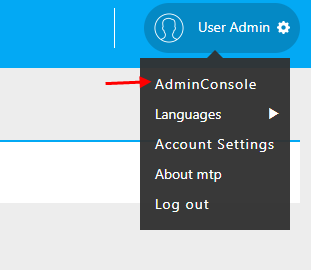
Starting AdminConsole
Clicking on theUser Adminin the header, theAdminConsolemenu will show up. By Clicking on theAdminConsolemenu, the AdminConsole interface will be shown in a new tab.
Basic Operations of AdminConsole
On the left of AdminConsole, there are two menu groups shown: MetaDataSettings and Tools .
MetaDataSettings is the collection of Entities and Metadata defined on each Tenant shown in the tree form based on their types.
This tree is used to add/edit the metadata.
Tools is the batches of management tools for developers. for details please refer to here.
MetaDataSettings
Upon the initiation, only the supplied fundamental Metadata types(such as Entity and Action) are shown on the tree. To refer to the registered Metadata, we need to double click on the corresponding nodes.
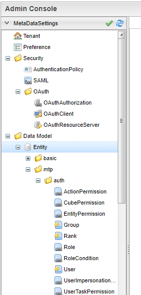
When Tenant was created, several Metadata have been defined already.
Such as mtp and gem are the collections of the Metadata which are used by the basic features provided by the iPLAss.
Check the Metadata
While creating the Metadata, there are cases that each Metadata is referring to each other.
If you only update or delete the Metadata at one side, the change will not be reflected on the Metadata referring to them.
There could be compile errors when using GroovyScript to configure the settings.
When such error happens, or you just want to make sure the Metadata was loaded correctly, please click the green check icon from MetaDataSettings .
The Metadata with error detected will be listed together, please click the corresponding objects to fix the issues.
Refreshing the Metadata
The Metadata will be cached on the AP server when loaded. It would be necessary to clear the cache when updating the Utility class that are referred by Command and GroovyScript. Please click on the blue refresh icon to clear the cache on the AP server.
Editing the Metadata
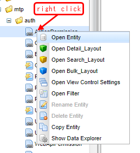
Select the Metadata on the tree, and right click to open the menu. The operations of the registered Metadata are all listed on this menu. In addition, the edit pane will show up when double clicking the Metadata.
Creating new Metadata
When creating new Metadata, please right click either on the root node or the existing branch node, on the hierarchy tree. Note, if performed on hierarchy node, the popup dialog will come with the hierarchy path pre-filled with respect to the path of that node.
2.2. Creating Entity and Manipulating Data
iPLAss basic features is like the Model part of MVC architecture, it is based on the definition of the Entity: one kind of Metadata, to provide the GEM module with features of search/edit/aggregation in advance.
Creating Entity
Here we will go through the steps to create the Entity, one of the important Metadata for the fundamental features of iPLAss.
Then we will go through the basic operations (searching, editing) on GEM pages which are available by the definement of Entity.
For the purpose of practice, we will create the Entities Product and ProductCategory in the way described below to manage products.
Creating New Entity
We will create Entity on AdminConsole.
Select Entity, then right click it for the menu and click on Create Entity.
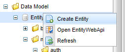
On the popup dialogs, please enter the information to create each Entity in the way suggested below.
For Entity’s Name, . (dot) is representing the hierarchy path.
| Name | DisplayName |
|---|---|
tutorial.product.ProductCategory |
ProductCategory |
tutorial.product.Product |
Product |
Creating New Property
Adding properties to the created Entities. This time, we edit ProductCategory first since it is referenced by the product Entity.
Defining ProductCategory Entity
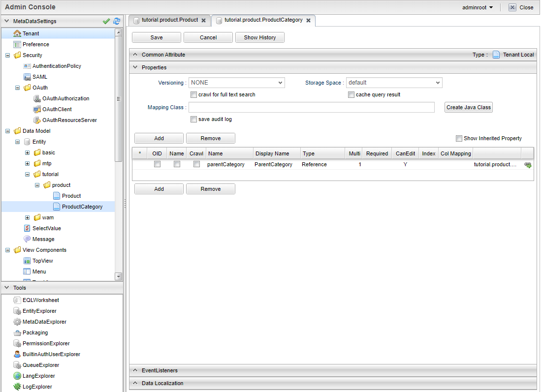
Double click the ProductCategory on the tree to show the page to edit the Entity.
The edit page of Entity has four categories: CommonAttribute 、 Properties 、 EventListener 、 Data Localization.( All others are collapsed except Properties in the beginning, you can click on them to expand and collapse the tabs.) In our case, the configuration happens on Properties.
Entity has Inherited property that is common properties for all entities.(the details will be explained later)
The common properties will be presented on the property list if you check the Show Inherited Property checkbox on top right of the list.
Here we want to look at oid and name.
oid is automatically generated and is stored by the core parts while registering Entity data.
It is like the Primary Key in RDB.
And name is for the purpose of records, it stores the name that will be used as the name of the data presented.
ProductCategory is the master data which frequently use code and name as its properties.
iPLAss can handle such kind of data easier with oid and name.
We will progress as if we will utilize oid and name as depicted.
(The common property will be hidden for the screenshots later on.)
The Entity property to be added to ProductCategory turns out to be only the 'ParentCategory'.
As usual in RDB, the concept like ParentCategory is implemented by referring to the KEY of the referred object as one column so the two tables(objects) are related together.
In iPLAss, table is equivalent to Entity, so as the implementation of the table relations, the Reference type Property is employed.
For our specific situation, the ParentCategory is the ProductCategory itself.
we will utilize Reference type Property to describe such a reference relation.
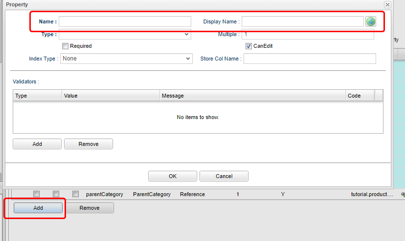
By click on the Add button, the dialog to define Property will show up.
For our case, we will define the property name of the ParentCategory to be parentCategory.
Note, please use only characters and numbers for Name.(recommended to use CamelCase.)
| Name | DisplayName |
|---|---|
parentCategory |
ParentCategory |
Then choose Reference at 'type' selection box.
Once you select the type, the tabs with corresponding setting options will be added to the scene.
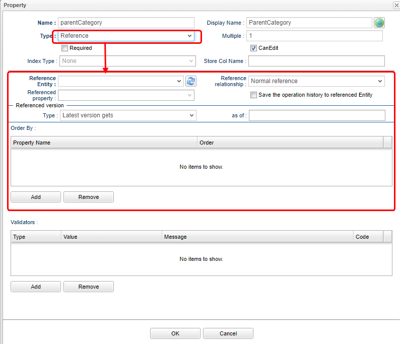
For Reference type, the setting options of Reference Entity, Reference Relationship, Referenced Property, Referenced Version, Order By will be displayed on the dialog.
This time we merely want to tie up things, so we will only put hands on Reference Entity.
(the rest stay untouched)
If you want to create more complicated relations with Reference Relationship and Referenced Property, such as the followings, then please refer to the section of Entity’s Property.
-
The reference with parent-children relation (if you delete the parent, the children Entity is affected as well)
-
Configure about whether you can update the referenced Entity at the side of the referencing Entity.
Now, choose "tutorial.product.ProductCategory" in Reference Entity, then click the OK button.
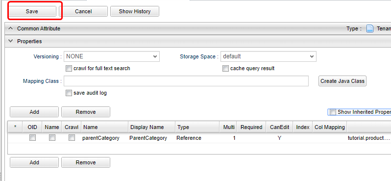
Make sure our changes have been added to the Property list.
Click the Save button on top of the page to save the changes.
The modification on ProductCategory is done at this point.
Defining Product Entity
About the Product Entity, just like what we did with ProductCategory, the common properties id and name can be used as our Product Code and Product Name.
Then the remaining properties are Price and Product Category.
Just like the ProductCategory Entity, click on the Add button to add property.
The first is Price.
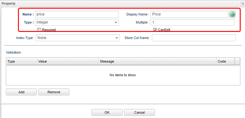
| Name | DisplayName | Type |
|---|---|---|
price |
Price |
Integer |
Continuing with Product Category.
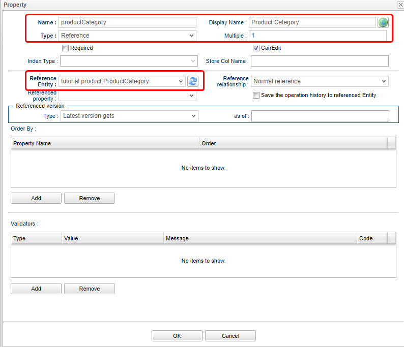
| Name | DisplayName | Type | Reference Entity |
|---|---|---|---|
productCategory |
Product Category |
Reference |
ProductCategory(tutorial.product.ProductCategory) |
The added property is displayed in the list.
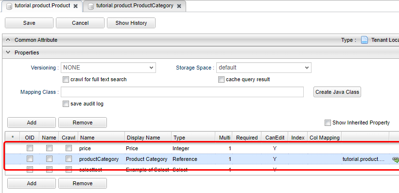
The modification about the Product Entity is finished at this point.
Don’t forget to click the Save button on top of the page to save the changes we just made.
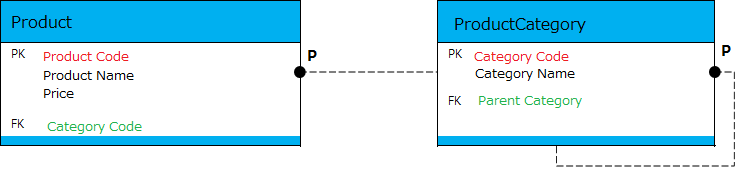
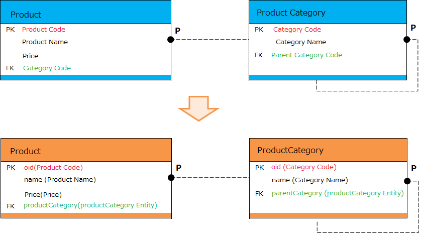
The Created Entity Definitions
So far, the ER-diagrams for the Entities created has changed to the following diagram.
GEM Pages, the Interface to Search and Edit Entity
The definition part is completed at this point. As one of the basic features of iPLAss, once the Entity was defined, it is possible to search and edit the entity instance on GEM pages. First of all, let’s have a look at the GEM pages.
Menu
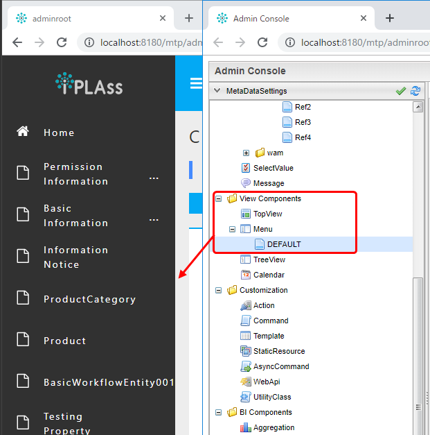
Go back to the GEM page which was used to get to AdminConsole, click on the home button on top left of the page. New tabs for the operations of ProductCategory and Product will be added to the menu.
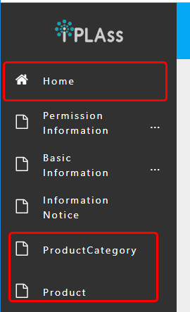
This is because when we created the Entity, the corresponding Menu objects was automatically generated and added to the Menu. Menu is the Metadata that manage the construction of the menu interfaces.
Expand the View Components Menu in the left pane (MetaDataSettings) in AdminConsole,
Double-click DEFAULT below it.
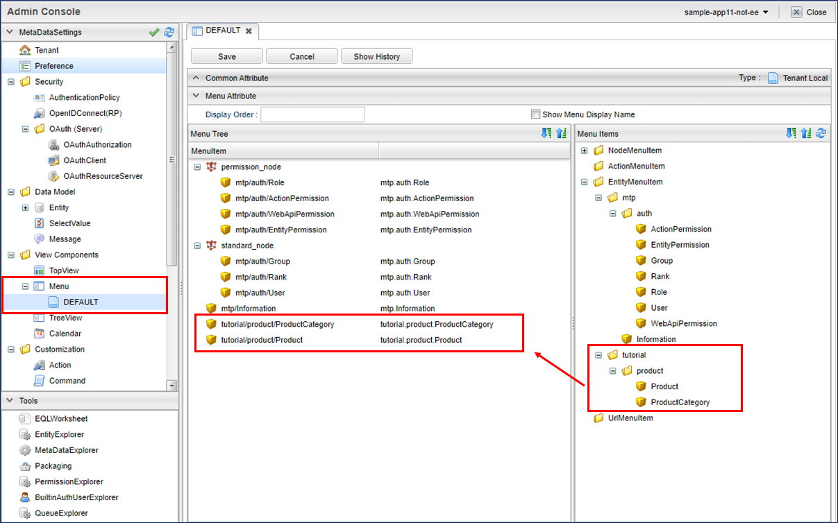
Menu Metadata has a menu definition called DEFAULT, which was generated while creating the Tenant.
Whenever a new Entity was created, the corresponding preset menu is automatically added to this DEFAULT menu.
(What happens in real is, the EntityMenuItem was created, and its reference was added.)
Although We will not talk about customizing the Menu definition here, please keep in mind that the MenuItem was created and added whenever a new Entity was created.
Searching Page
Now let’s click on the added Product Category menu, the interface to specify the search conditions are displayed in the main area.
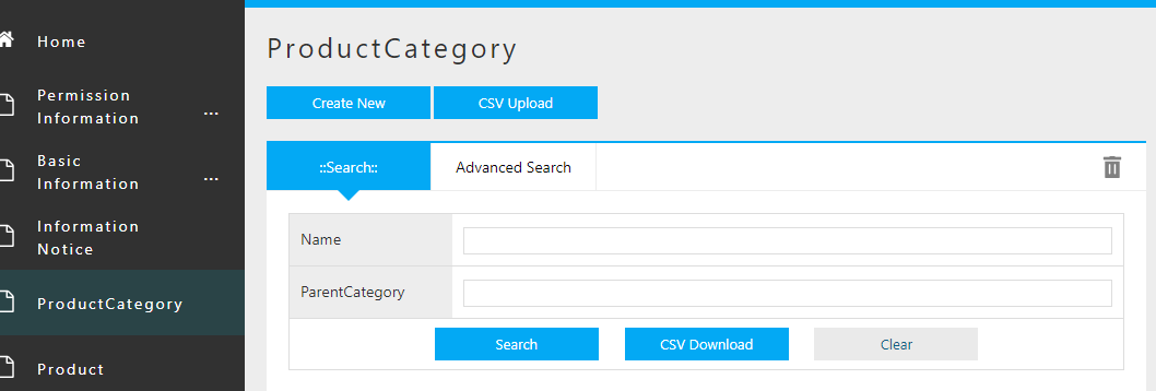
The utility features such as Create New, CSV Upload, search conditions, and CSV Download are provided and are displayed on the interface.
The items that are defined as Properties of the corresponding Entity are presented as optional search conditions.
(Beware not all Properties are available.)
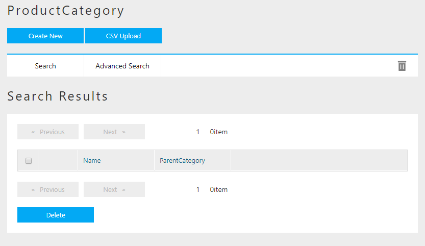
Once you click the Search button, the result will be displayed in below.
(We haven’t register any data yet, so there is no data to display if we click on Search now)
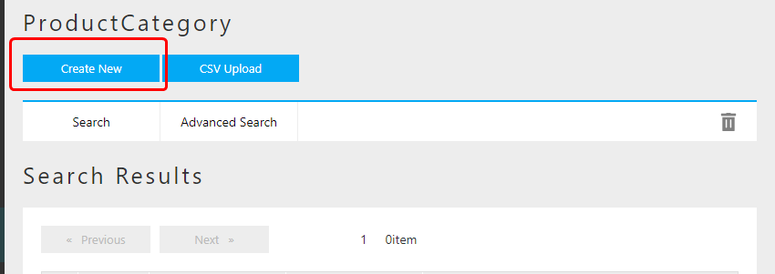
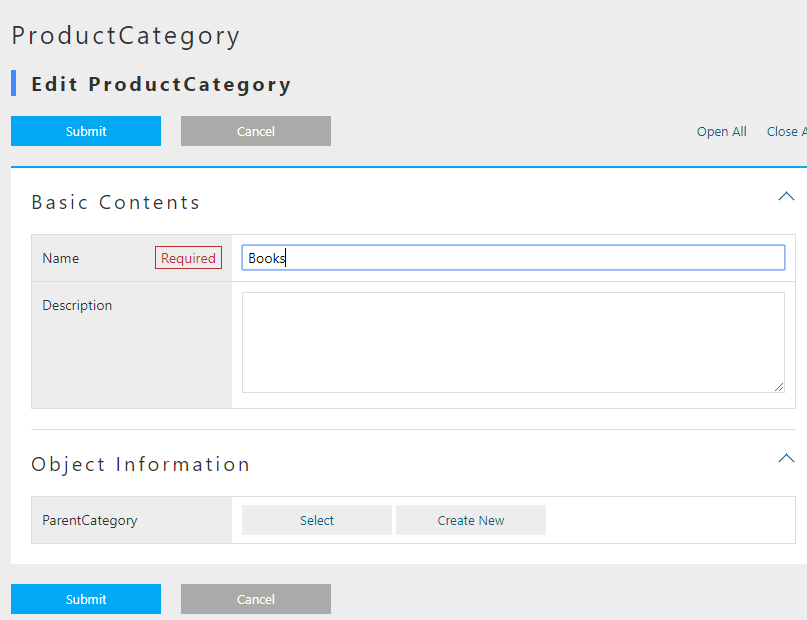
Let’s add some data for Product Category, click on the button of Create New on top of the page.
Registering Data to Product Category
By clicking Create New button, the dialog to edit data will show up.
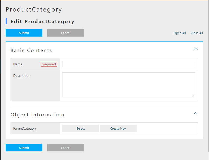
There are several points to mention about the composition of the page.
There are buttons and links displayed on top of the page.
The primary action, such as Submit, will be colored depending on the Theme of the Tenant.
Those buttons that are not affecting the data, such as Cancel, Return, will be colored in gray.
The links of Open All | Close All , is to expand/collapse the group(section) such as Basic Items and Object Information.
Basic Items is referring to the edit area of common Property of Entity such as name and description.
The mandatory item such as name is marked with "Required" mark.
Object Information is referring to the edit area of added Properties of the Entity.
(Some properties are not displayed)
The method of input (text box, text area, selection box and so on) is determined depending on the type of the property.
For instance, the parentCategory, which is Reference type, can be input/edited by the dialog from Select and Create New buttons.
Please input the following data.
| General Category | Specific Category | Miscellaneous Category |
|---|---|---|
Books |
Computer・IT |
Normal・Beginner |
Programming |
||
NewBooks・PaperBack・Novels |
|
Input the General Category.(Since there is no parent category for this one, we don’t need to worry about the parent category part.)
By clicking on Submit button, we will be redirected to the page listing details of this data.
The layout is almost same with edit page.
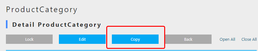
The buttons of Lock, Edit, Copy and Back are presented.
Lock is not a main action, thus its button is in gray.
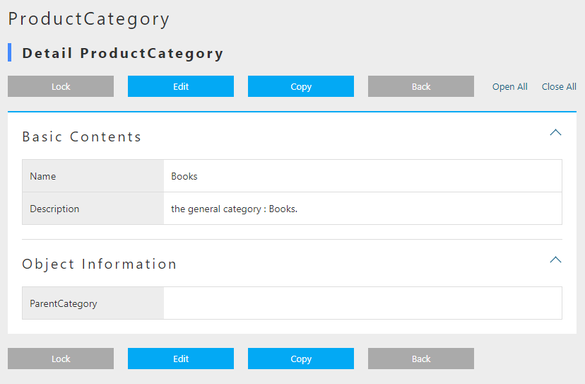
Let’s click on Back and go back to the searching page.
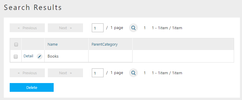
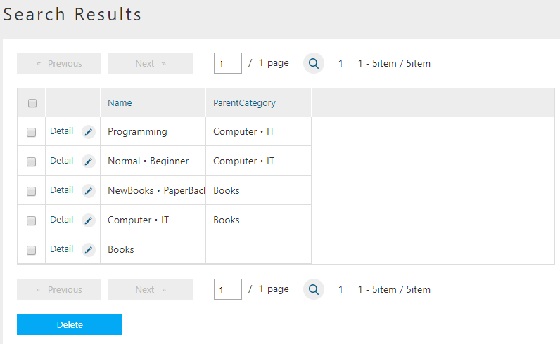
The data we just added will be shown in the search result.
The other categories will be added in the same way.
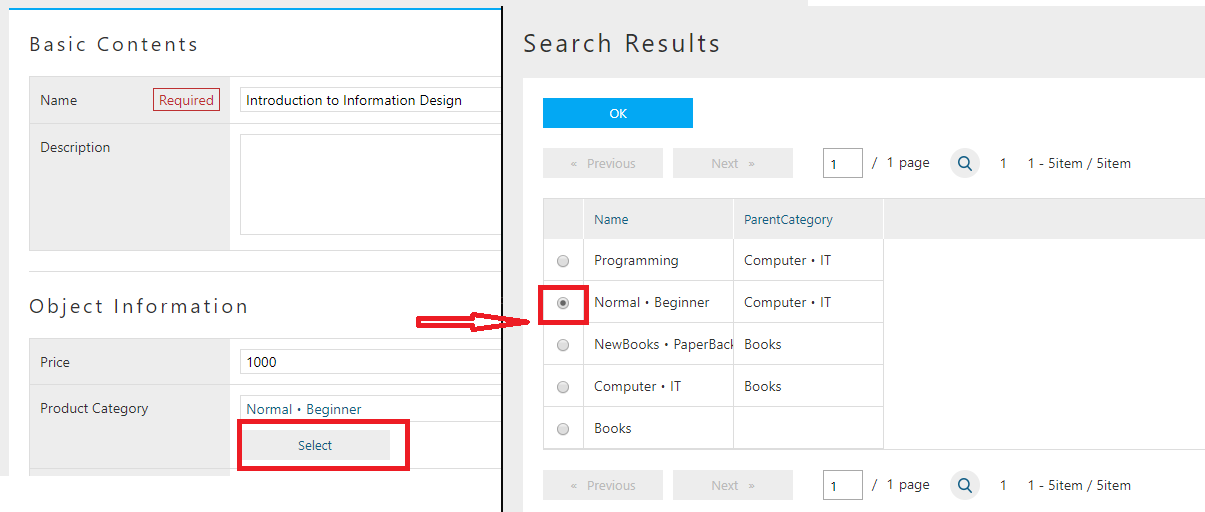
When we adding Specific Categories, we need to select the parent category.
(We can "select" when the parent category was inputted already. Otherwise we can Create New)
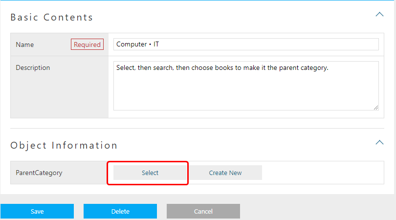
The dialog to choose product categories are shown, so the user can search and choose the parent category.
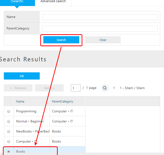
The selected category will be set as the parent category.
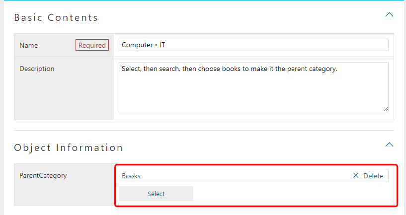
The selected data will be presented in the box as its name with a link.
The delete button can also be found beside the link.
Clicking that delete button will remove the reference.
(For this instance, Books data itself will noe be deleted)
Beware that when the Property’s multiplicity (as multiple in Entity edit page.) is 1, If data is already selected, the Create New button is hidden.
Press Submit button to register the data.
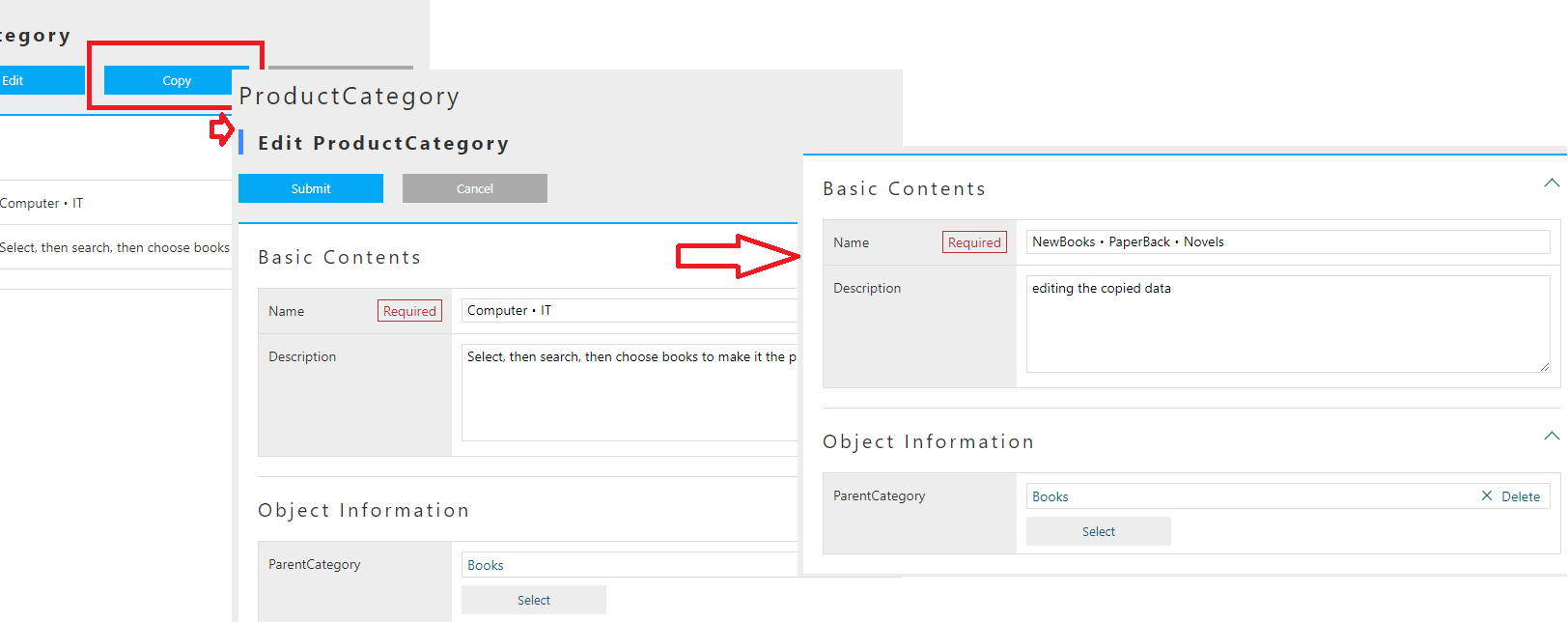
Let’s try to create data with the copy button on the details view.
On the edit page, the information of the copied data are pre-filled in the corresponding boxes. Please change the name and register the new data.
Now please input the rest of the data depicted in Registering data. The search result should be similar to the screen shot below.
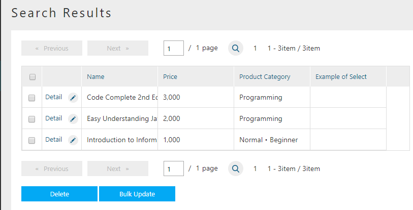
Registering Product Data
Similar to ProductCategory, let’s input all the data for product.
The data to be registered were listed below.
| General Category | Specific Category | Miscellaneous Category | Product | Price |
|---|---|---|---|---|
Books |
Computer・IT |
Normal・Starter |
Introduction to Information Design |
1000 |
Programming |
Easy Understanding Java Beginner’s Guide |
2000 |
||
Code Complete 2nd Ed. Vol.1 |
3000 |
|||
NewBooks・PaperBack・Novels |
|
|
|
Once all the product data were registered, the search result should look like this:
At this point, we have explained how to define Entity and how to operate on the GEM interface to manipulate the data of the defined Entities. On next section, the Property of the Entity will be discussed. The operation and behavior of different Properties on GEM interface will be tested.
2.3. Entity Property
Entity Property
As mentioned while defining Entity in previous part, Entity has common Properties. In addition, Property has multiple preset types. GEM interfaces will change its behavior based on the types selected.
Entity Common Property
On the edit page of Entity definition, if the Show Inherited Property box was checked, it will be possible to see the common Properties.
The shown common Properties are pre-defined for Entity.
The explanation for each Properties are listed below.
| Name | Display Name | Type | Multi(Multiplicity) | Required | canEdit | Description |
|---|---|---|---|---|---|---|
oid |
Object ID |
String |
1 |
The ID that was used by the infrastructure to retrieve specific data(≒Record). |
||
name |
Name |
String |
1 |
○ |
○ |
Name of the data, can be used freely |
description |
Description |
String |
1 |
○ |
The description of the data, can be used freely |
|
version |
Version |
Integer |
1 |
utility item, for version control, will be 0 if no version applied. |
||
state |
Status |
Select |
1 |
○ |
utility item, for version control |
|
startDate |
Starting Date |
DateTime |
1 |
○ |
utility item, for version control |
|
endDate |
Expiration Date |
DateTime |
1 |
○ |
utility item, for version control |
|
createDate |
Date Created |
DateTime |
1 |
utility item, the date when the data was created, auto-configured |
||
updateDate |
Date Updated |
DateTime |
1 |
utility item, the date when the data was updated, auto-configured |
||
createBy |
Creator |
String |
1 |
utility item, creator of the data, auto-configured depending on |
||
updateBy |
Updater |
String |
1 |
utility item, updater of the data, auto-configured depending on |
||
lockedBy |
Locked By |
String |
1 |
○ |
utility item, for data lock mechanism |
The name of theese Common Properties are reserved. Please avoid using the same name with the common Properties.
For each Entity data/records, there is one unique oid to server as the KEY(just like the primary key).
As the default behavior, oid will auto-increment upon Entity data creation.
Note, it cannot be changed by data update.
The Reference type Property that will be discussed later, is also referring to this oid.(more specifically, it is oid + version )
Required when inputting data.
Can be updated, and can also hold duplicated value.
Since KEY is oid, there is no strong restrictions on this Property.
Just beware that the size limit is 256byte, the excessive part will not be stored.
A prepared-in-anticipation data that can be used for any purpose such as the descriptions of the data. To use or not to use, and for what purpose, are all up to the user. Please feel free to use it. Just beware that the size limit is 1024byte.
The other common Properties are the utility Property for management.
It is not recommended to be manipulated by normal Tenants. (Better to be an job only for administrators)
Depending on the version updates later on, these properties may change in anyways.
Especially for startDate and endDate, though they are used by User Entity and Announcements. Since they are designed mainly to support version controls and in most cases are self-managed, please try to avoid using these two Properties.
The Common Settings for Property
If you open the Edit dialog from Entity edit pages, the settings for the Properties can be seen on top of the dialogs.(Not available to some types)
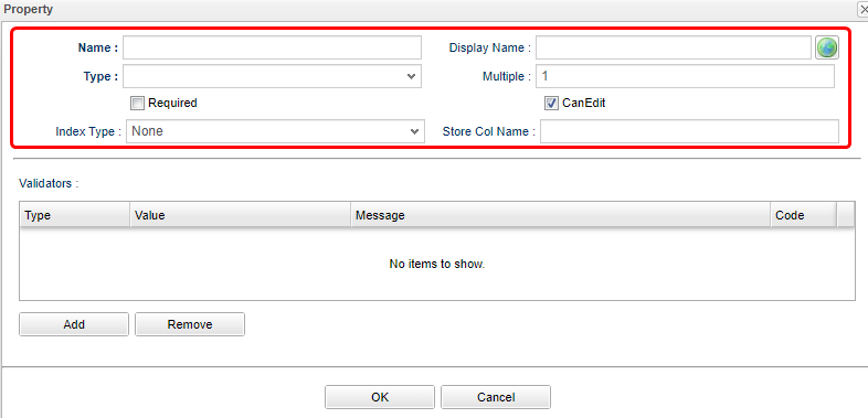
| Attribute | Value |
|---|---|
Name |
Physical name, only English characters and Numbers |
Display Name |
The name to be displayed to users.(Can be localized to different languages with configurations), if left undefined, it will use the Name as its input when saving the definition. |
Type |
Mold. for details, see Property Type. |
Multiple |
Multiplicity. for details, see Multiple(Multiplicity) |
Required |
If |
CanEdit |
Indicating whether this Property can be edited, such as whether to check the changes when a Entity update happens, and whether it can be edited on GEM pages. |
Index Type |
Index. for details, see Index Type |
Store Col Name |
Custom columns. iPLAss stores and manage the data on its own. By setting up this item, the user can define a specific column in DB to store this Property, thus can be accessed easily elsewhere. |
Entity can hold multiple values for one Property.(imagine a image of Array)
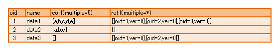
For Reference type specifically, it is allowed to use * to indicate infinite multiplicity.
For the types other than Reference, the limit was set to 32.(restricted by the back end DB definitions. )
If even more number of multiplicity is demanded, please define another Entity, and use Reference types to refer to that Entity.
For the Reference type with multiplicity other than 1, multiple records will be returned when performing EQL searches.
It is equivalent to the index of RDB, Index can be set corresponding to the Property. So that a better performance on searching can be achieved.
If the Index is defined, then a exclusive table is created to hold the value for each oid and the Property.
Thus when searching, the system will refer to this table so to speed up the process.
The Index can only be set according to each single Property. Composite Index (multiple Property one Index) is not supported.
Unique Index will check duplications for each Entity. When updating the Entity, it will raise an error if there is duplicated Index.
When performing version control on Entities, the Properties with Unique Index indicated are unchangeable.
It actually set CanEdit = false while saving the Entity.
(The version control will be explained other times)
Index feature is not available to the Property with multiplicity other than 1. (There is no effect even if you specify the Index)
If the Index type are changed while there are existing Entity data, the data will be recreated. Therefore, when there are huge amount of data in presence, more caution is suggested before executing. (In the case of unique Index, the definition cannot be saved if there is data with duplicated Indexes.)
Property Type
Property need its Type being specified depending on the data type you want it to keep. The following types are provided.
| Category | Type | Explanation |
|---|---|---|
Basic |
String |
Array of characters |
Boolean |
Type of True / False. |
|
Integer |
The type of integer number. |
|
Float |
The type of fractional number with decimal separator. |
|
Decimal |
The type of fractional number with specific decimal digit. |
|
Datetime |
The type of date and times. |
|
Date |
The type of date. |
|
Time |
The type of time. |
|
Special(Extended Types) |
Select |
The type to show selected items in form of |
AutoNumber |
The type of auto-incrementing values. |
|
Expression |
The type that can set formulas and expressions. |
|
Binary |
The type of Binary data.(BLOB) |
|
LongText |
The type to hold the character array that String type cannot afford of.(BLOB) |
|
Reference |
Reference |
The type to relate the Entities in reference relations. |
We will only list the special traits for Normal types.
-
Length restriction on String type
Because the String type is actually storing date in a varchar(4000) field at back end, there is no way to exceed that limit. Beware, that the character code used by back end DB isUTF-8, so the limit for full width characters is 2000. -
Decimal type’s round up mode
For Decimal types, it is possible to specifyDecimal PrecisionandRound Up Mode.Round Up Modeis as depicted below. (equivalent to java.math.RoundMode) The rounded result will be saved when saving the Entity data.Selected Value java.math.RoundMode Rounding away from 0
UP
Rounding towards 0
DOWN
Rounding up
CEILING
Rounding down
FLOOR
Round half up
HALF_UP
Round half down
HALF_DOWN
Round half to even
HALF_EVEN
Like the combo box that people can select the input value, this type can defines its data in a format of Value and Display name pairs.
To input the value and display name in pairs, there are two methods to take.
- Global Value
-
Used when there are pairs of values and DisplayNames that are used by multiple Entities. Choose and right click the
SelectValueon the menu bar at left, then click onCreate SelectValuefrom the right click menu.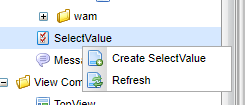
Attribute Value Name
tutorial/properties/PropertiesSelect
DiaplayName
'Select' for inspection
SelectValue is using
/(slash) in Name to indicate path levels.Once the
Savewas clicked, the contents will be added to the tree, double click the nodes to reveal it. UseAddbutton to add pairs, then double click on the existing records to edit. To remove the records, choose the targeting records (can utilize ctrl and shift to select multiple items) then clickRemovebutton. The user can also Drag&Drop the items to change their orders.(The GEM pages will change according to the settings.)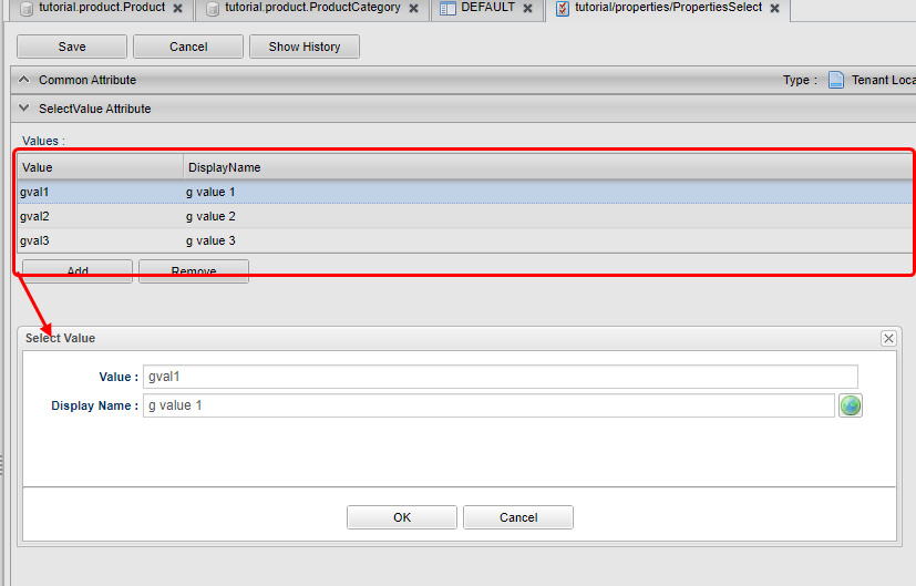
Input the pairs of value and display name, then
Save. Open the Property edit page for any Entity, when you select Global Value that is displayed when Type is set to Select, a list of registered SelectValue will be displayed, so select it.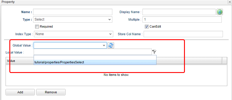
- Local Value
-
Please configure this item instead of choosing registered SelectValue, if you want to define specific pairs locally for that Property. (when both global and local values are set, the Globalvalue will switch to undefined when saving the data.)
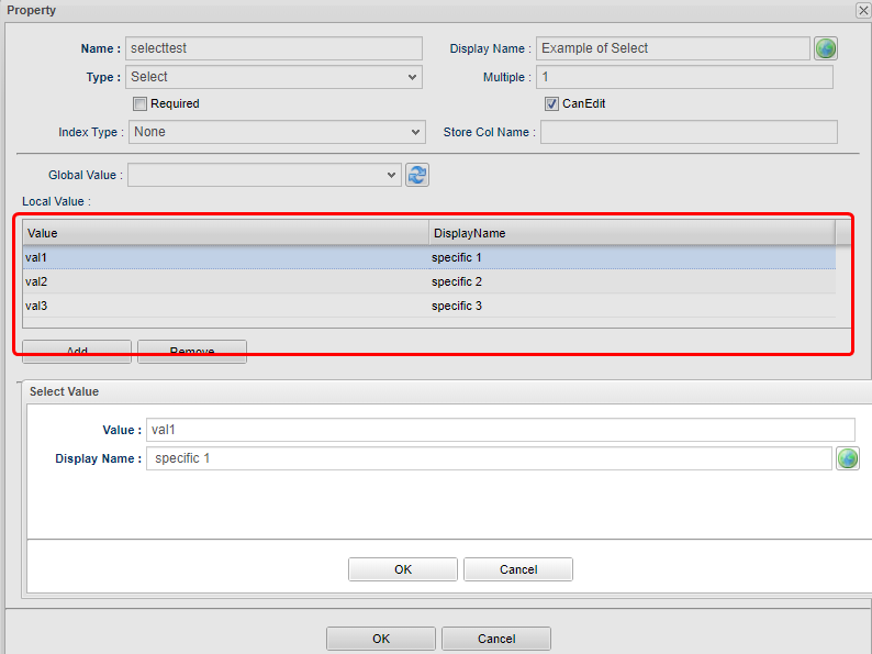
Use
Addbutton to add additional pairs, double click the existing records to edit them. To remove the records, choose the targeting records (can utilize ctrl and shift to select multiple items) then clickRemovebutton. The user can also Drag&Drop the items to change their orders.(The GEM pages will change according to the settings.)
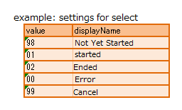
Select type will display the items only in order by how the items were defined.
Sort is available across iPLAss, such as clicking on the header, and using search functions provided by EntityManager.
In contrast, for Select type, if the pairs was defined in the following way, then the data will not sort by value, and will display in the order it was defined, that is not-yet-started~cancel.
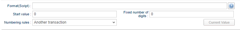
The Property type that will numbering itself automatically while registering the Entity data. For this sake, it is a read-only Property.
The following items can be configured.
| Attribute | Description | ||||||||||||||||||
|---|---|---|---|---|---|---|---|---|---|---|---|---|---|---|---|---|---|---|---|
Format |
It is possible to use the generated numbers in format by setting the binding format(${xxx}) The supported binding formats are listed below.
In the case of undefined binding, the normal generated value will be used.(equivalent to ${nextVal()})
|
||||||||||||||||||
Start Value |
Set the Starting point of the auto-numbering. The counter will not reset if this item was modified. If a reset on counter is wanted, please utilize the reset features. |
||||||||||||||||||
fixed number of digit |
Use this when it is need to format the length of the numbers. (i.e. fix to 0000 format) The number will be padded with 0s for the set length. If this item was set to 0, there will be no 0 padding at all. In the case when the taken value exceeds the length, the raw value will be used. |
||||||||||||||||||
Numbering Rule |
Configuring the rules about the how to increment each steps.
|
It is a type that can support any kind of query mechanisms as long as they are specified by Value Expression. For instance, the query with algebra, conditional calculations, and scalar subqueries (The query with only 1 result).
Therefore, it is a read-only Property.
The following items can be configured.
| Attribute | Explanation |
|---|---|
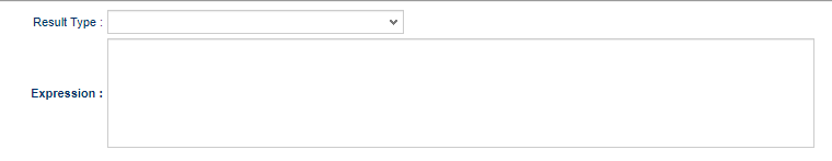
Result Type |
Specify the type of the results of the expressions. Only Basic types are available. |
Expression |
defining the expressions of the calculation
The queries that are working in Query(api.entity.query.Query)'s |
Other than the algorithms, the following expression can also be used.
case
  when integer1 = 50 then '△△△'
  when integer1 = 80 then '○○○'
  else '×××'
end
integer1 / (select sum(integer1) from sample.Sample)case
when 50 = (select integer1 + integer2 from sample.Sample on .this=this) then '△△△'
when 80 = (select integer1 + integer2 from sample.Sample on .this=this) then '△△△'
else '×××'
endthis keyword is almost similar to oid.
But beware the .oid=oid is not valid, in contrast to this.
Beware that when the algebra calculation is referring to a property with more than 1 multiplicity, the calculation will not execute correctly. Please only use the property with multiplicity of 1.
The type of Property for the data that are treated as binary data, such as image and documents.
The type of Property to hold the text data when String types cannot afford to. There is no specific Attributes need for LongText.
-
Search on LongText
LongText type is similar to Binary type, is managed in form of LOB or files. Therefore it is not possible to simply search on the LongText, because of that, the LongText type Property is not going to be shown in GEM either. In order to search through the LongText type Property, it is necessary to utilizeFullTextSearchMechanism.
The property to define and implement the relations between Entities. In RDB, the SQL command Join is used to link tables together. For iPLAss, the relations between Entities are defined in advance so to implement the relation equivalent features.
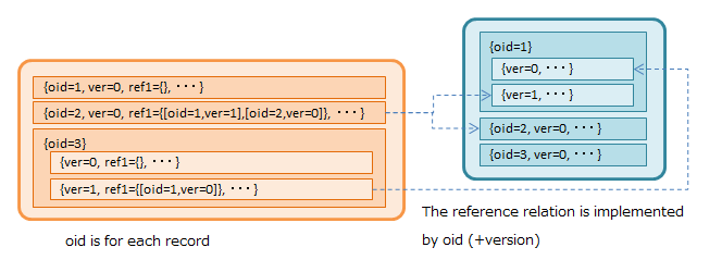
As mentioned in Common Property sessions, the reference type is actually holding the oid and version of the referenced Entity.
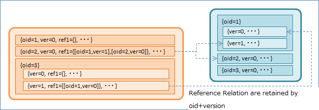
With this reference relation, it is possible to retrieve the information of the referenced Entity when searching on the referencing Entity. In RDB, the commands of From and Join are used to declare the specific searching options over the tables. In iPLAss, it is all implemented by creating this Reference Property.
The following Attributes can be configured.
| Attribute | Explanation |
|---|---|
Reference Entity |
Specify the referenced Entity, can be chosen from the registered Entities. |
Reference Relations |
It is indicating the relation between the configured Entity and the referenced Entity. The behavior of CRUD on Entities will change based on the selected relations.
|
Referenced Property |
Specify the Reference relations that was defined at the referenced Entity side.
It is available only when the specified |
Referenced Version |
Declare the policy about which version of the data to be acquired. There will be difference on the choices only when the the referenced Entity has Version Control enabled. If no Version Control performed, the version is by default set to 0.
|
Save the operation history to referenced Entity |
Declared the policy of the operation logs on the referenced Entity.
It is available only when |
Order By |
In the case when this Property has multiplicity larger than 1, the order of how to retrieve the referenced Entity can be declared. It is possible to specify to use the order of ascending/descending on the referenced Entity Properties. |
We will jump over the features of 'Version Control' and 'Operation Logs' this time, as they are not important at the current context.
For the 'Reference Entity' attribute of Reference type, it has the concepts of Referencing and Referenced to distinguish the relation details.
- Referencing
-
The Entity tracks on the data of the Referenced Entity. In the situation of
Referencing, the targeted data is treated as an updatable attribute for current Entity. - Referenced
-
It is used to reveal how the current Entity was referenced by the targeted Entity. It is meant for the Entity to grasp the existence of
Referencingfrom the targeted Entity. In the case ofReferenced, the targeted data is not treated as an updatable attribute, thus the changes on theReferencedProperties will have no effect on the reference relations.
The Behavior of GEM Pages Depending on Property
Above all, we have explained the Properties, now let’s look at the difference between the types in practice.
Create Entity
For the sake of practice, let’s create 5 Entities.
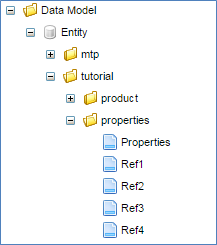
| name | Display Name |
|---|---|
tutorial.properties.Properties |
Testing Property |
tutorial.properties.Ref1 |
Reference 1 |
tutorial.properties.Ref2 |
Reference 2 |
tutorial.properties.Ref3 |
Reference 3 |
tutorial.properties.Ref4 |
Reference 4 |
Once the Entities were created, go to the edit page of Ref4 and add the reference to Properties Entity.
After adding, press the Save button of Ref4 Entity to save it.
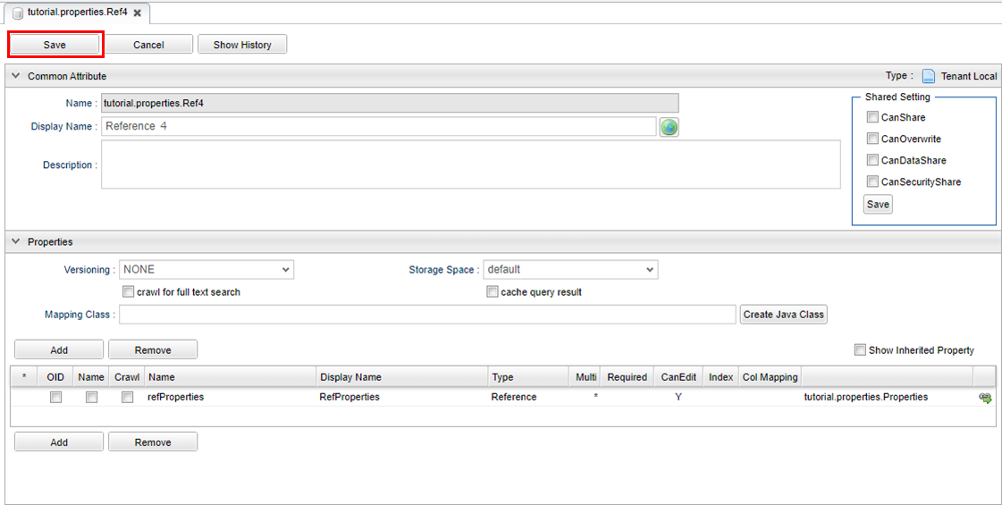
| Attribute | Value |
|---|---|
Name |
refProperties |
DisplayName |
RefProperties |
Type |
Reference |
Multiple |
* |
Reference Entity |
Properties |
Next, add the following Property to Properties Entity.
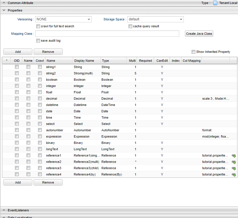
The corresponding settings are listed.
Please set the String type Property as depicted below.
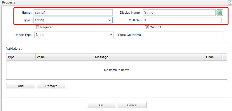
| Attribute | Value |
|---|---|
Name |
string1 |
Display Name |
String |
Type |
String |
| Attribute | Value |
|---|---|
Name |
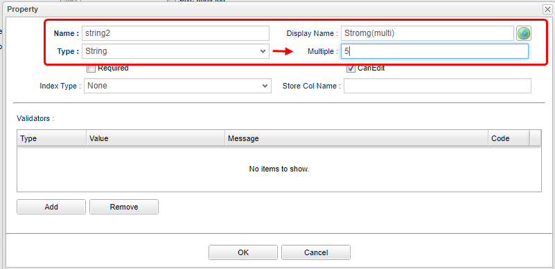
string2 |
Display Name |
String(multi) |
Type |
String |
Multiple |
5 |
Please set the Boolean type Property as depicted below.
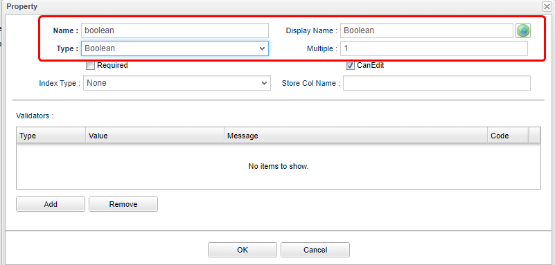
| Attribute | Value |
|---|---|
Name |
boolean |
Display Name |
Boolean |
Type |
Boolean |
Please set the Integer type Property as depicted below.
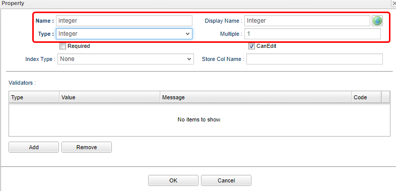
| Attribute | Value |
|---|---|
Name |
integer |
Display Name |
Integer |
Type |
Integer |
Please set the Float type Property as depicted below.
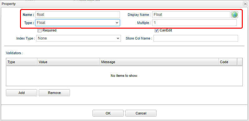
| Attribute | Value |
|---|---|
Name |
float |
Display Name |
Float |
Type |
Float |
Please set the Decimal type Property as depicted below.
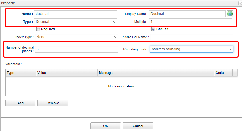
| Attribute | Value |
|---|---|
Name |
decimal |
Display Name |
Decimal |
Type |
Decimal |
Number of decimal digits |
3 |
Rounding mode |
Bank Type Rounding |
Please set the Datetime type Property as depicted below.
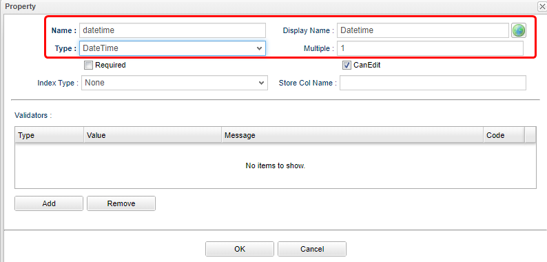
| Attribute | Value |
|---|---|
Name |
datetime |
Display Name |
Datetime |
Type |
DateTime |
Please set the Date type Property as depicted below.
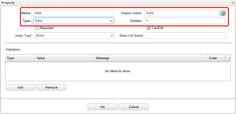
| Attribute | Value |
|---|---|
Name |
date |
Display Name |
Date |
Type |
Date |
Please set the Time type Property as depicted below.
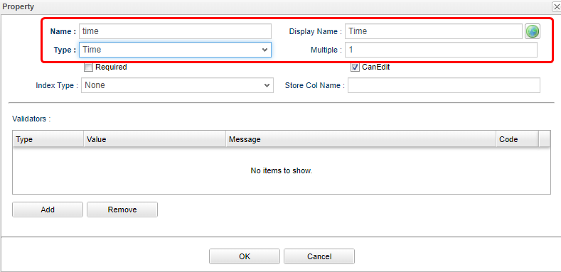
| Attribute | Value |
|---|---|
Name |
time |
Display Name |
Time |
Type |
Time |
Please set the Select type Property as depicted below.
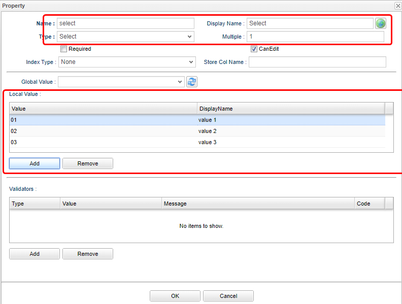
| Attribute | Value |
|---|---|
Name |
select |
Display Name |
Select |
Type |
Select |
Local Value |
refer as to the picture |
Please set the AutoNumber type Property as depicted below.
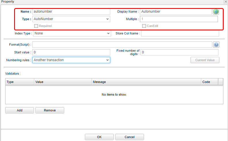
| Attribute | Value |
|---|---|
Name |
autoNumber |
Display Name |
AutoNumber |
Type |
AutoNumber |
Please set the Expression type Property as depicted below.
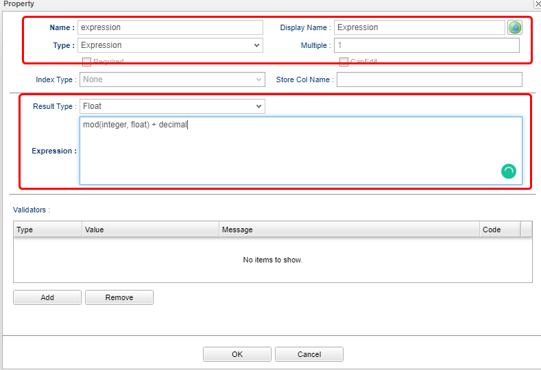
| Attribute | Value |
|---|---|
Name |
expression |
Display Name |
Expression |
Type |
Expression |
Result Type |
Float |
Expression |
mod(integer, float) + decimal |
Please set the Binary type Property as depicted below.
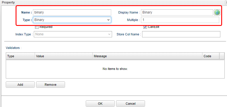
| Attribute | Value |
|---|---|
Name |
binary |
Display Name |
Binary |
Type |
Binary |
Please set the LongText type Property as depicted below.
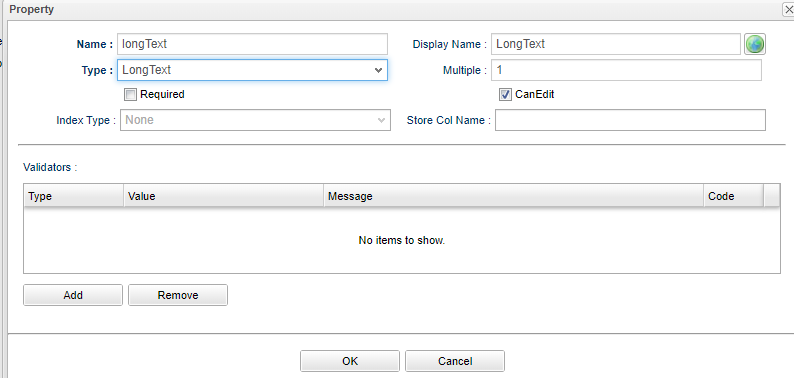
| Attribute | Value |
|---|---|
Name |
longText |
Display Name |
LongText |
Type |
LongText |
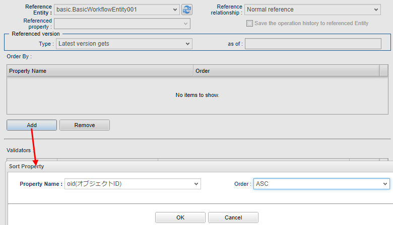
Please set the Reference type Property as depicted below.
| Attribute | Value |
|---|---|
Name |
reference1 |
Display Name |
Reference1(single) |
Type |
Reference |
Multiple |
1 |
Reference Entity |
Ref1 |
Reference Relation |
normal reference |
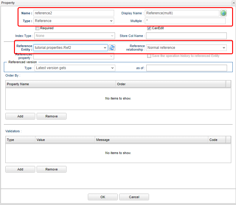
| Attribute | Value |
|---|---|
Name |
reference2 |
Display Name |
Reference2(multi) |
Type |
Reference |
Multiple |
* |
Reference Entity |
Ref2 |
Reference Relation |
normal reference |
| Attribute | Value |
|---|---|
Name |
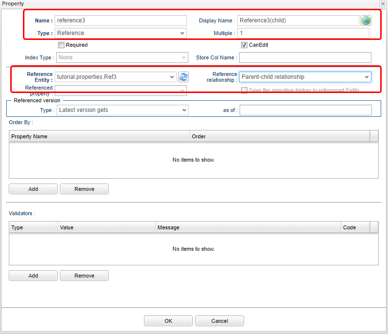
reference3 |
Display Name |
Reference3(child) |
Type |
Reference |
Multiple |
1 |
Reference Entity |
Ref3 |
Reference Relation |
parent children |
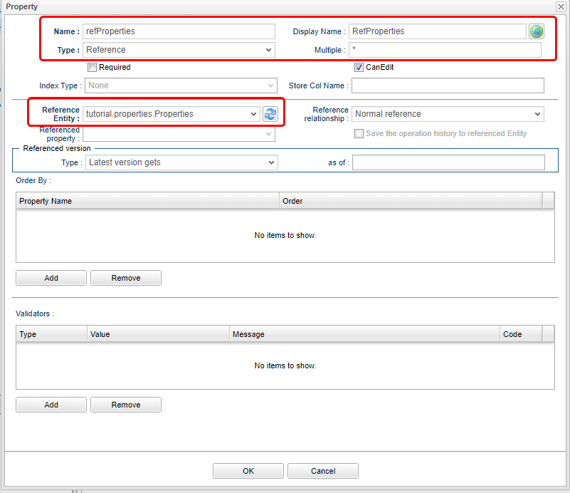
The referenced property refProperties is a property of the Ref4 Entity.
Ref4 Can not be selected unless it is added on the Entity side.
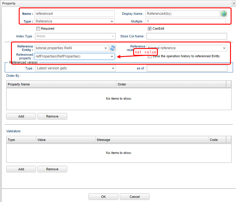
| Attribute | Value |
|---|---|
Name |
reference4 |
Display Name |
Reference4(by) |
Type |
Reference |
Multiple |
1 |
Reference Entity |
Ref4 |
Reference Relation |
normal reference |
Referenced property |
refProperties |
Once done creating the Properties, save the Entity.
Now the preparation to examine the Property types are finished. On to the next we will have a look at GEM pages.
Confirming in GEM pages
Switch to the GEM page which was used to start the AdminConsole, click on the he Home button on top left.
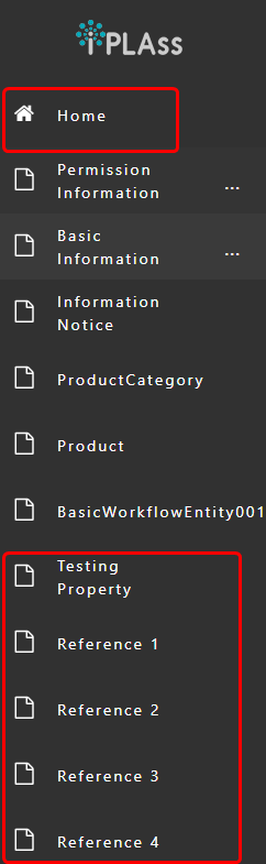
The menu of the added Entity: Properties, reference1, reference2, reference3, reference4 will be presented.
Click properties on the menu to open up the search interface.
The created Property will be displayed in the search option section. Properties will change the form of how it is presented, some of them are not even shown as search options.

The points to mention about the default search option section.
-
Boolean type are specified by an option button.(The wording is
valid/invalid. ) -
DateTime, Date, Time types property support the option of of "From…To…".
-
Select type Property is shown in the form of selection box.
-
Binary type Property is not displayed.
-
Reference type Property can only specify the Entity with multiplicity of 1. (Reference2 was not shown.) The types other than Reference type will be displayed even if they have higher multiplicity.(String(multi) is shown.)
Since the data has not been registered yet, please register the data.
Click the Create New button.
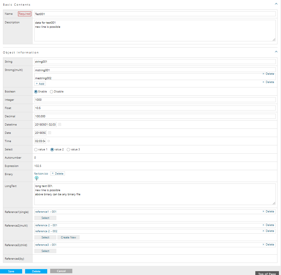
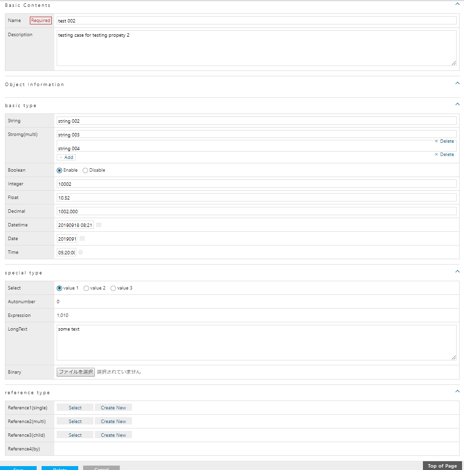
The input area for the added Property is also displayed on the edit screen. Depending on the type and attributes of the properties, some may be displayed differently or may not be editable.
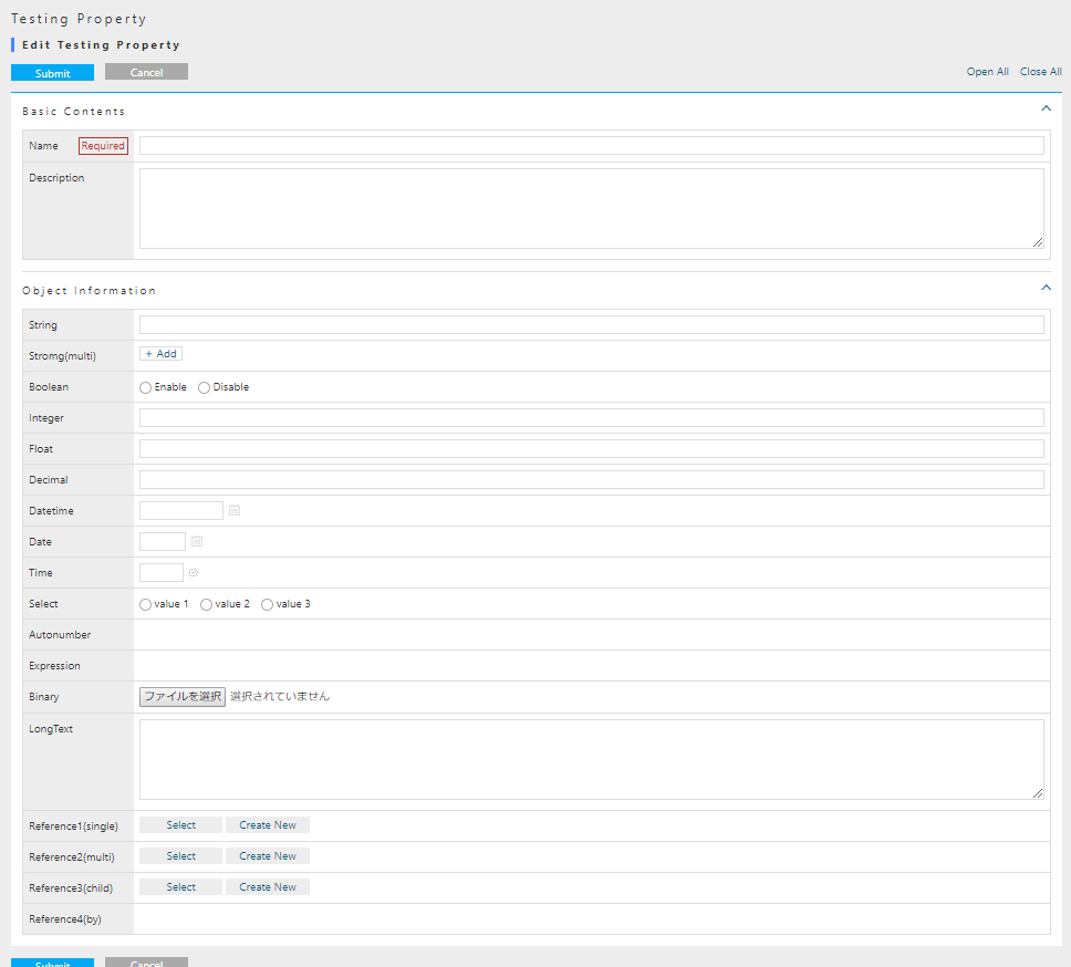
Tips of the edit screen displayed by default.
-
AutoNumber and Expression types cannot be entered because they are reference items
-
Reference type and referenced property (MappedBy specification) cannot be inputted because it is a reference item (Reference4 cannot be inputted). If a property other than the Reference type has a multiplicity more than 1, an
Addbutton is displayed.
Register the data for each Property with reference to the following example.
For Reference type Property, add the reference entity with New.
Click the Register button to display the detail screen.
Although there is no particular tips to cover for detail screen, just for your information, AutoNumber is automatically assigned at the time of new registration. The calculation result of Expression is also displayed.
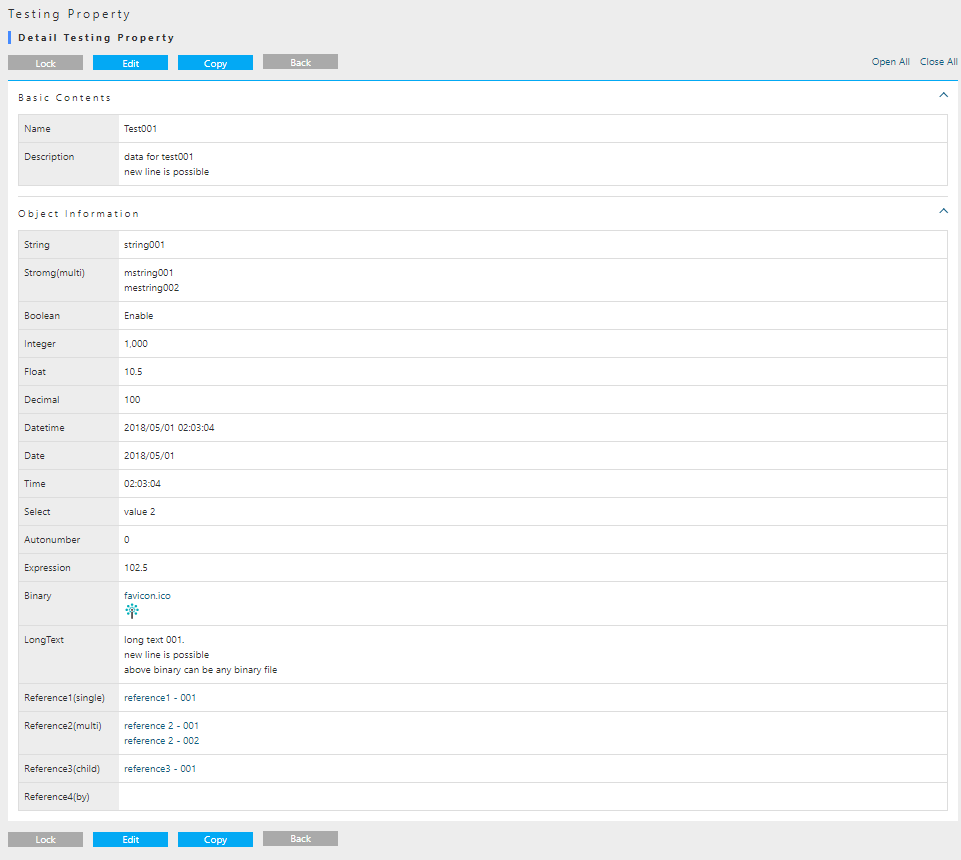
The timing for the value in Reference4 (by) to be displayed is after registering the above data linked to the Ref4 Entity.
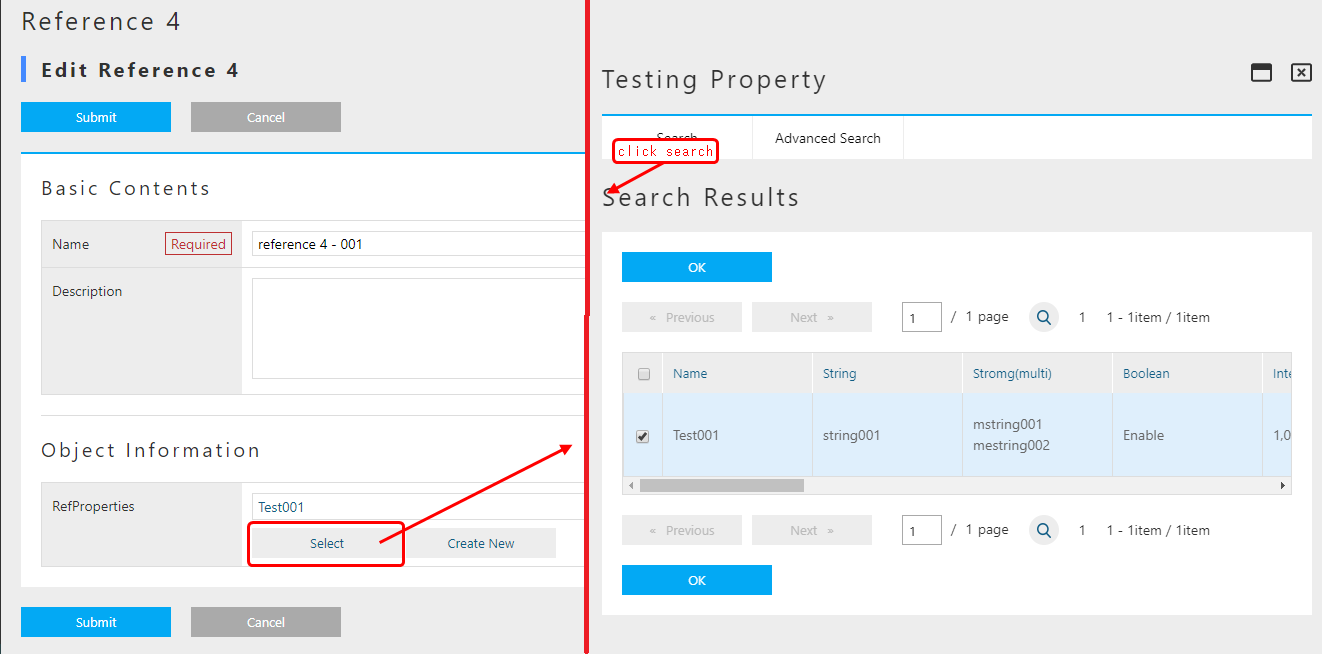
Click the Reference 4 menu to open the search screen, and click the New registration button.
After entering the information below, click the Register button.
The point is that you have selected the data for Testing property that you created earlier.
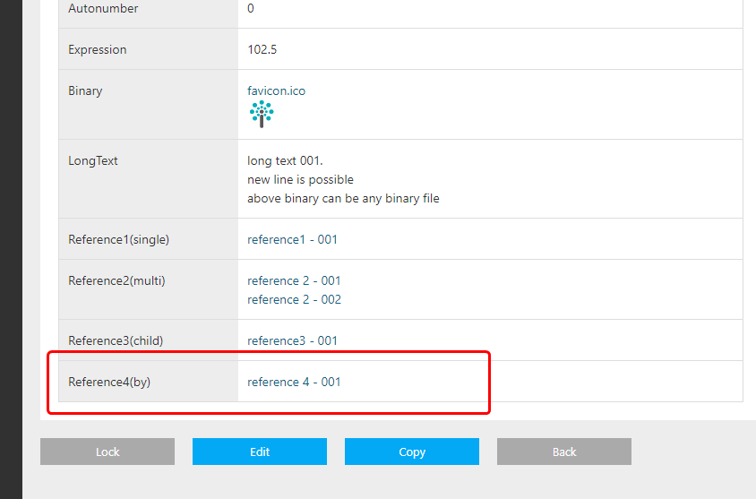
Please Try to confirm the property display in the detail screen again.
The Ref4 entity that refers to this entity should be displayed.
Next, check the search result list on result screen.
Click the Back link.
When there are many properties, horizontal scroll bar is displayed.
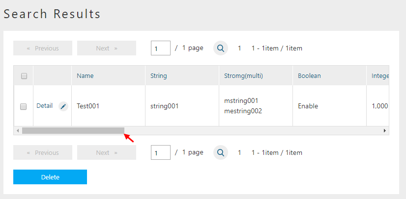
The following properties are displayed.
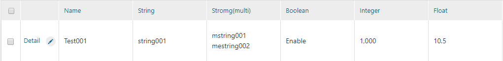
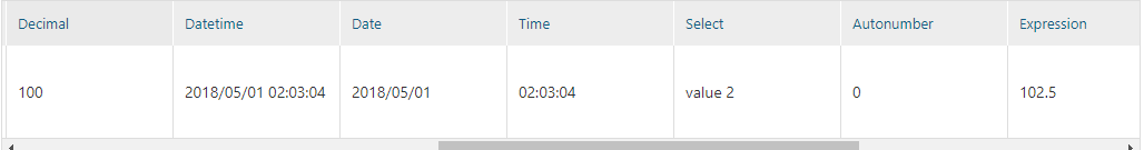
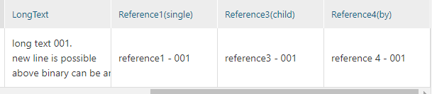
Points of the search result displayed by default.
-
Binary type Property is not displayed
-
Only reference type property with multiplicity 1 is displayed (Reference2 is not displayed)
-
Properties other than Reference type is displayed even if multiplicity is not 1. (String (multi) is displayed)
Up to this point, we have confirmed the default behavior of the GEM screen depending on the type of Property. The feature of iPLAss is that the operation screens for Entity data such as search and registration are dynamically created based on Entity settings.
2.4. Customizing the Entity Operation Screen
SearchLayout and DetailLayout
This section explains how to customize search / edit view for Entity. A simple example of customization are provided in order to help the reader to go through and understand the procedure.
So far, we have confirmed that a general-purpose entity search / edit screen can be used based on the entity definition. The GEM screens you have seen so far are based on Entity definitions, so you may need to customize them depending on your requirements. (It is more often to be the second case) The GEM screen has a mechanism that can be customized. Based on the development requirements up to now, many parts are available for customization. Customization is done from AdminConsole.
Launching the Layout Customization Screen
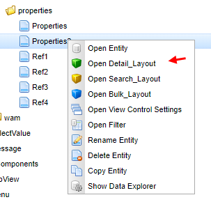
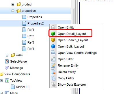
Open the AdminConsole, select the entity which you want to modify, and right-click to display the menu. (Customization can be done according to each entity)
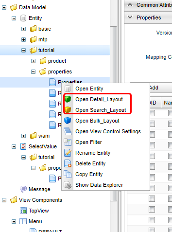
There are menus called Open DetailLayout and Open SearchLayout.
This is how to start the configuration screen to customize the GEM screen for each Entity.
- DetailLayout
-
Customize detail page and edit page.
- SearchLayout
-
Customize the search screen interface.
Customizing the Search Screen
Entity Copy
You can use the Properties Entity as it is, but this time, let’s copy the Properties Entity created earlier.
The Properties Entity will be used later to compare with the customized one.
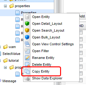
Copy can be done from the right-click menu.
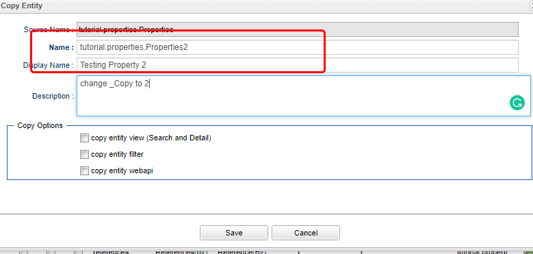
As the dialog shows up, change the name accordingly.
| Attribute | Value |
|---|---|
Name |
tutorial.properties.Properties2 |
Display Name |
Property For Confirmation |
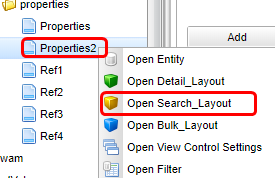
Click the Save button to save, right-click the Properties2 Entity on the tree, and click Open SearchLayout.
The search screen customization screen is displayed.
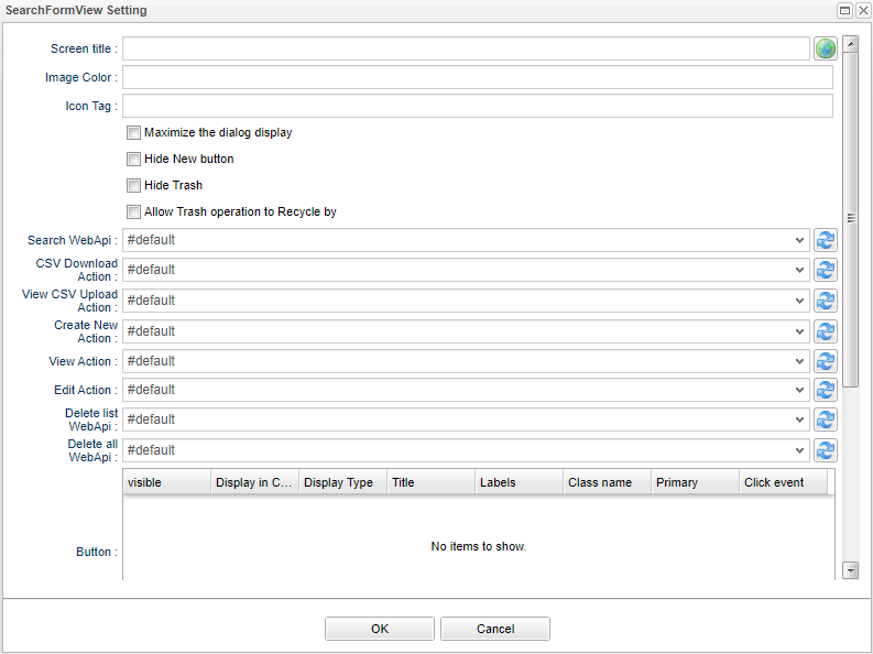
Page Format of the SearchLayout
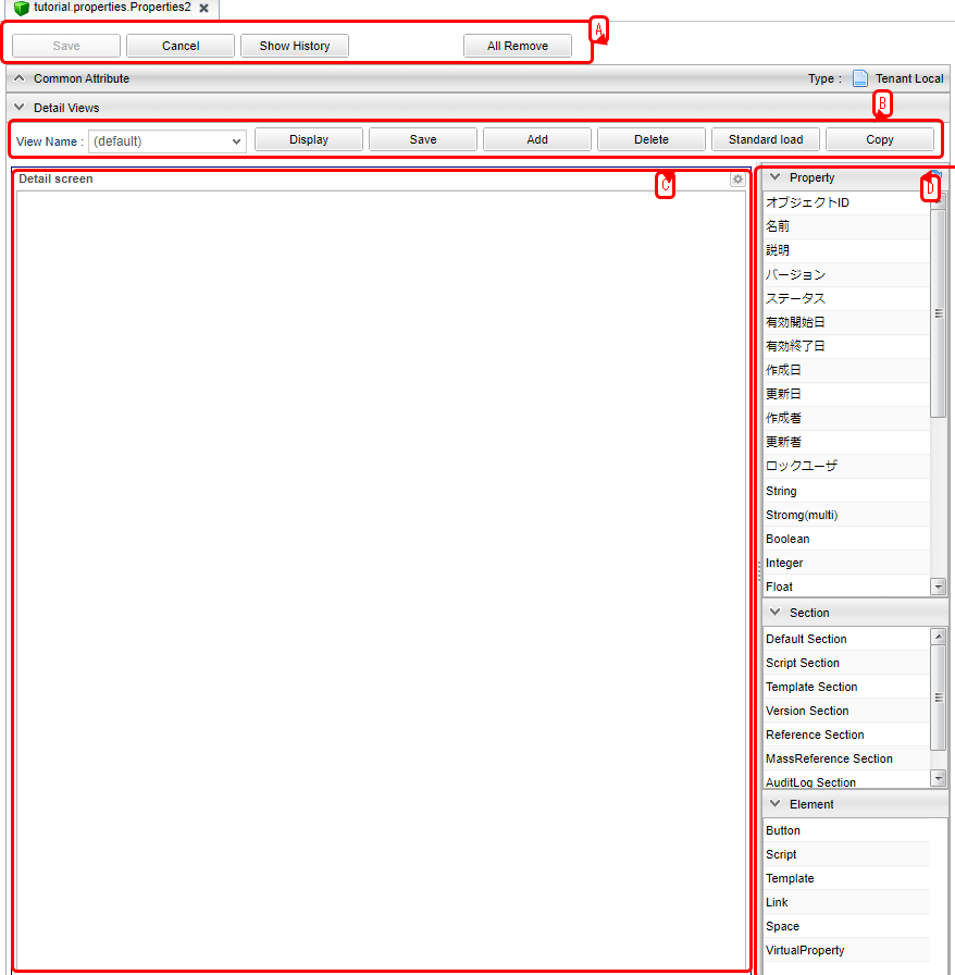
A screen like the one below appears.
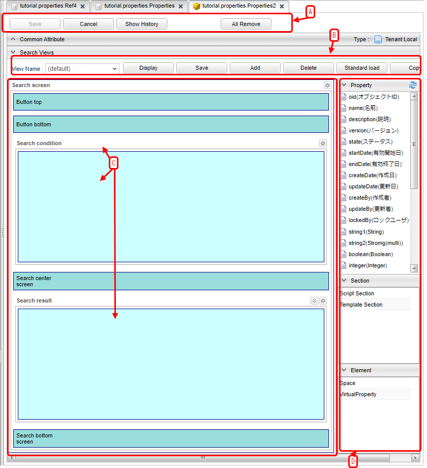
It can be divided into five main components.
Customization can save multiple layouts in units called views.
This area is mainly used for operations on the entire view.
The reason why the Save button is not available is that saving is done in View units.
This is for performing operations in View units.
For each section (row) in this area, the items displayed in the D area can be placed using Drag & Drop, It is possible to configure the setting according to each individual View unit.
Items called Property and Section defined in Entity are displayed. Drop the Property you want to display as search conditions and search results in C area.
Simple Customization
Make a simple customization to understand the procedure.
This time, we do not consider multiple view definitions etc., but modify a view called default.
Nothing is set when SearchLayout is opened for the first time. As you have seen so far, the search screen is displayed by default even if SearchLayout is not set. This is because the standard Layout definition is generated from the Entity definition inside the iPLAss base when needed.
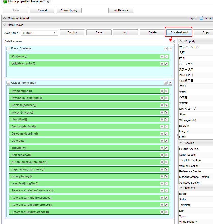
When customizing, it is efficient to customize based on this standard definition, so let’s display the standard definition.
Click Standard load on the View toolbar.
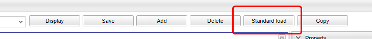
The default display settings of the Search screen are reflected here.
We will customize based on this setting.
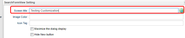
The settings for the entire search screen are done from the button in the right corner of the part that says Search Screen.
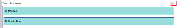
The edit dialog will be displayed.
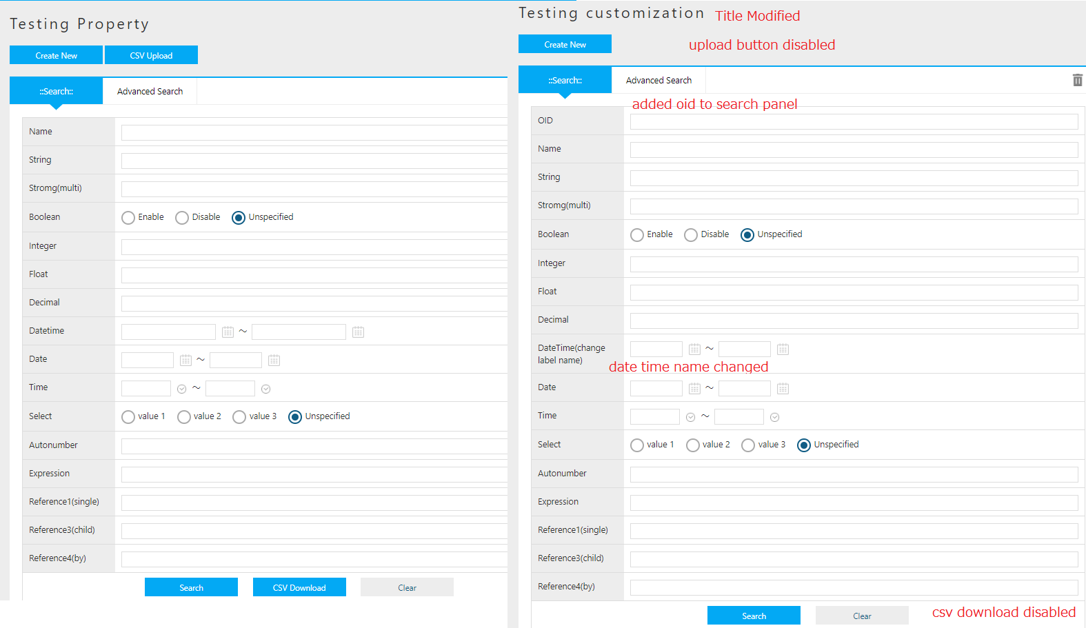
This time, enter Testing Customization(arbitrary) in the Screen title and click the OK button.
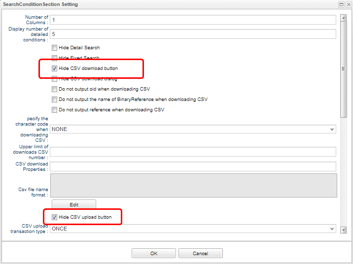
The setting for the search condition part is done from the button at the right corner of the part that says search condition.
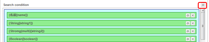
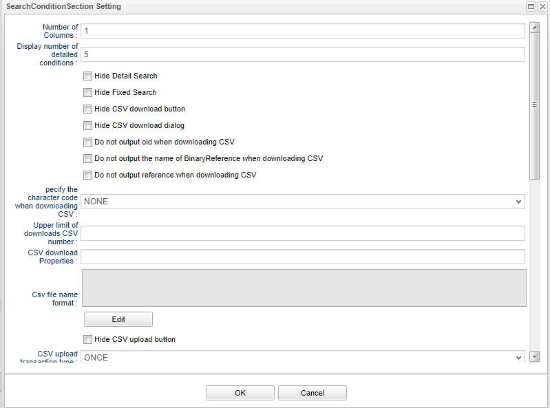
Check Hide CSV Download Button and Hide CSV Upload Button this time and click OK button.
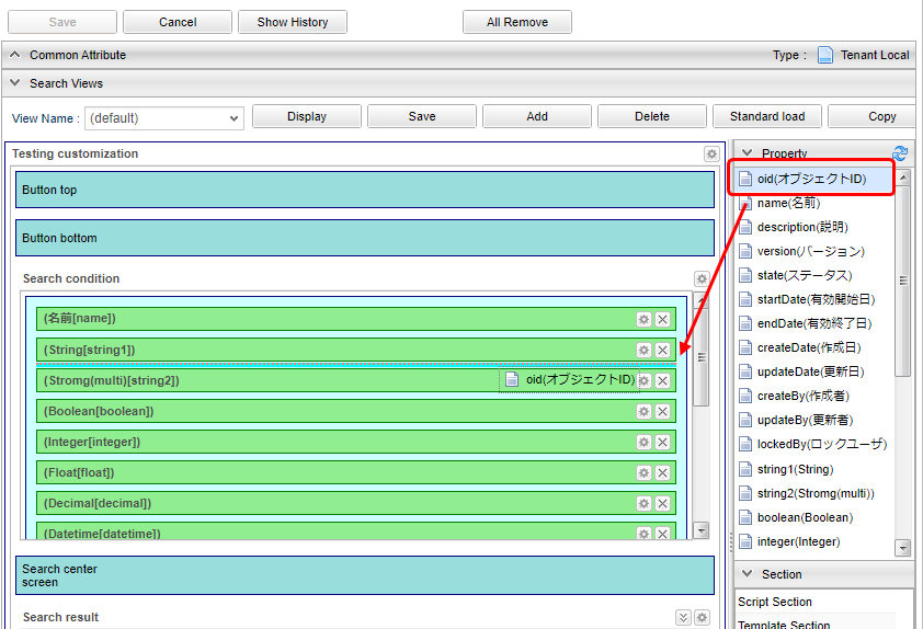
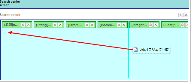
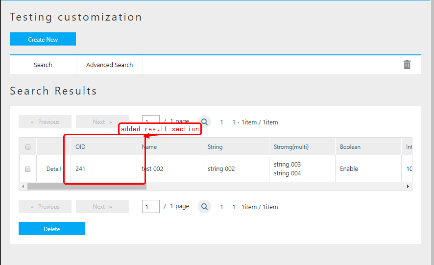
Let’s choose the object ID displayed at specific search condition section on the left as the search condition.
Drag to add it to the beginning.
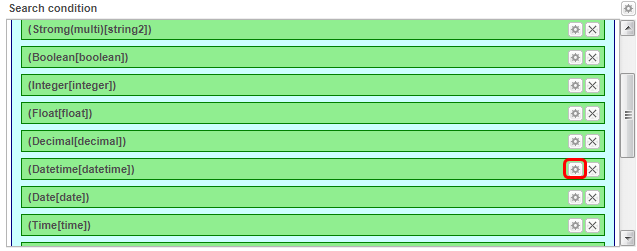
Settings for individual properties are made using the buttons next to the properties.
This time, edit the Datetime Property.
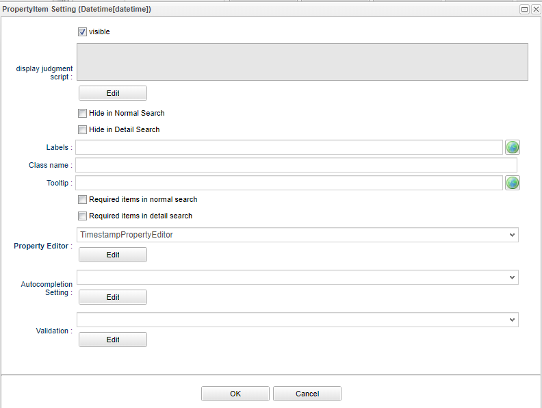
This time we will set the display label.
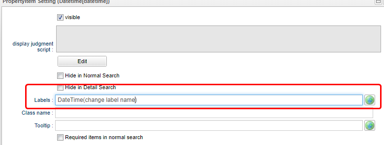
Also, TimestampPropertyEditor is in the item Property Editor.
For this, the Editor definition corresponding to the Entity Property type is automatically selected.
The list itself will not be changed this time as it may disappear from the screen if it is changed.
Click the Edit button next to this.
The Editor settings dialog appears.
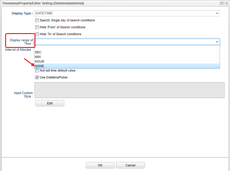
Items can be configured for each Property type (by each Editor).
Here let’s set Time display range to NONE.
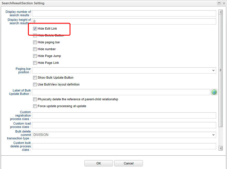
The setting for the search result part is done from the button at the right corner of the part that says search result.
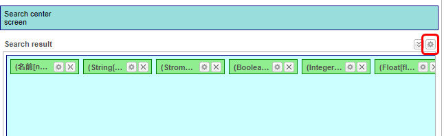
This time, check Hide edit link.
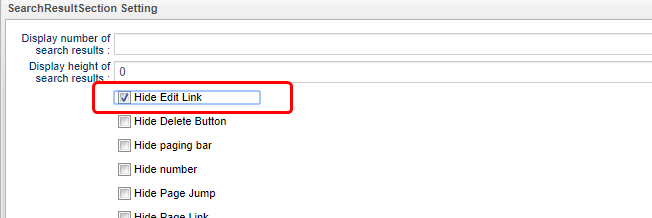
Let’s also specify object ID in the search result specification part.
Drag to add it to the beginning.
Same wise goes to search conditions, all items can be configured according to each Property. (omitted here)
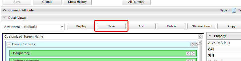
Now, save the View.
Click the Save button on the View toolbar.

Let’s switch to the GEM screen and check.
Click Home in the menu to refresh the menu.
Property confirmation 2 will be added, so click to display the search screen.
Check the changes of the search screen.
Since the data has not been registered yet, please try to register some data from the New registration button.
Then return to the list (press the menu items or return from the details screen) to display the search screen.
As depicted, you can customize the GEM search screen by setting SearchLayout.
Customizing the Detail Page
Next, we will customize the detail screen.
Launch DetailLayout Edit Screen
Open the AdminConsole screen again, right-click the target entity of AdminConsole and click Open DetailLayout as in the search screen.
Screen Layout of DetailLayout
The following screen is displayed.
The configuration is almost the same as SearchLayout.
Multiple design of Customized layout can be saved, they are in units called views.
This area is mainly used for operations on the entire view.
The reason why the Save button is not available is that saving is done in View units.
This is for performing operations in View units.
For this area, the items displayed in the D area can be placed using Drag & Drop or individual settings can be made.
Items such as Property and Section defined in Entity are displayed. An item called Element is also displayed.
Simple Customization
Let’s make a simple customization so to demonstrate the procedure.
This time, we do not consider multiple view definitions, etc., but define the view called default.
As the SearchLayout we discussed above, load the standard definition.
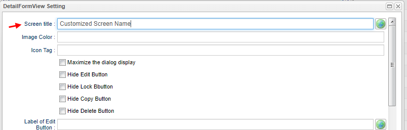
The settings for the entire edit screen are done from the button in the right corner of the part that says Detail screen.
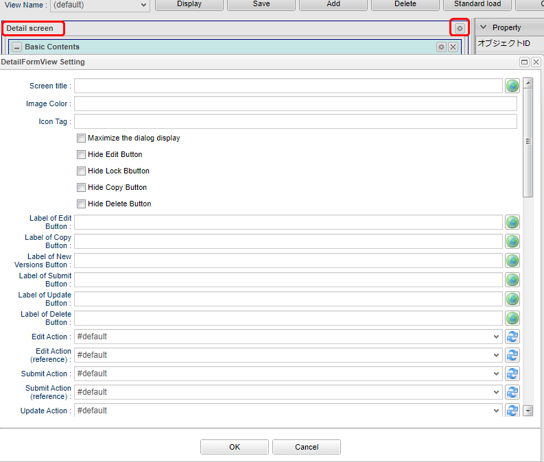
Let’s change the title like what we did to the search screen.
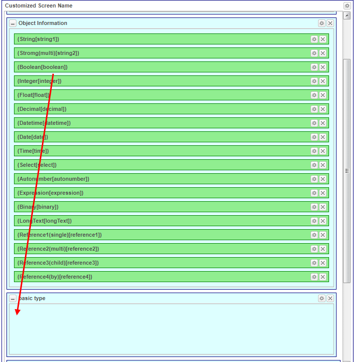
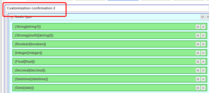
Looking at the definition loaded by default, they are divided into two groups: basic contents and object Information. (Background part is light blue)
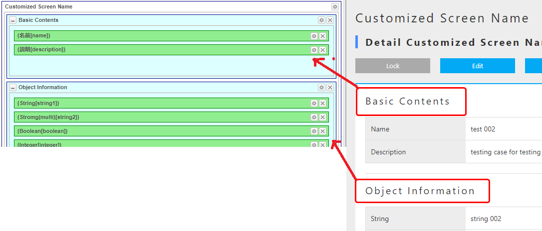
This is achieved by a section called Default Section in the Section item.
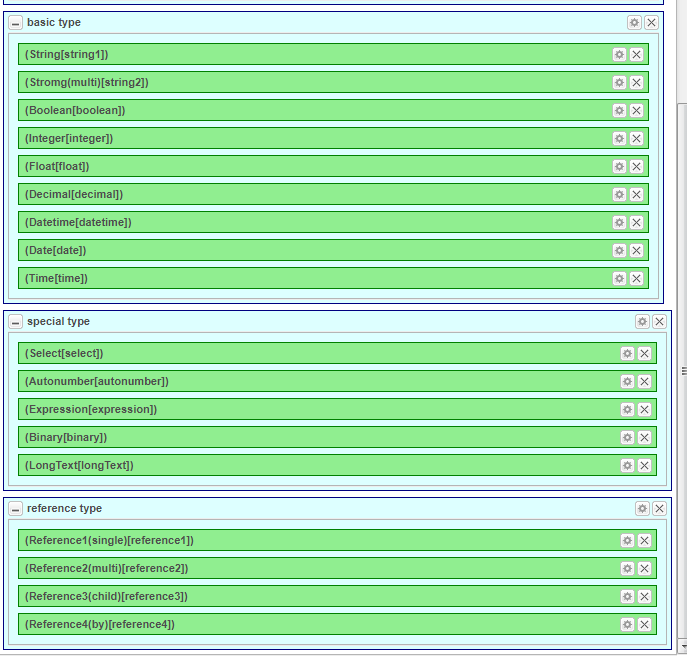
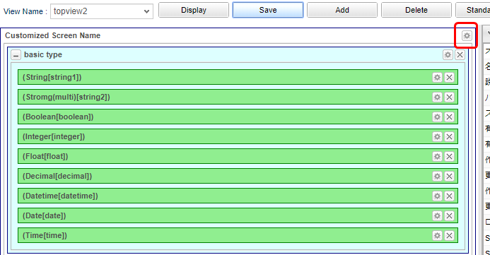
This time we will categorize this Section by the Entity Property type.
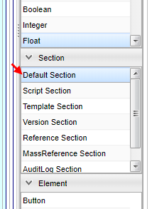
| Category | Type |
|---|---|
Basic Type |
String |
Boolean |
|
Integer |
|
Float |
|
Decimal |
|
DateTime |
|
Date |
|
Time |
|
Special(Expansion)Type |
Select |
AutoNumber |
|
Expression |
|
Binary |
|
LongText |
|
Reference Type |
Reference |
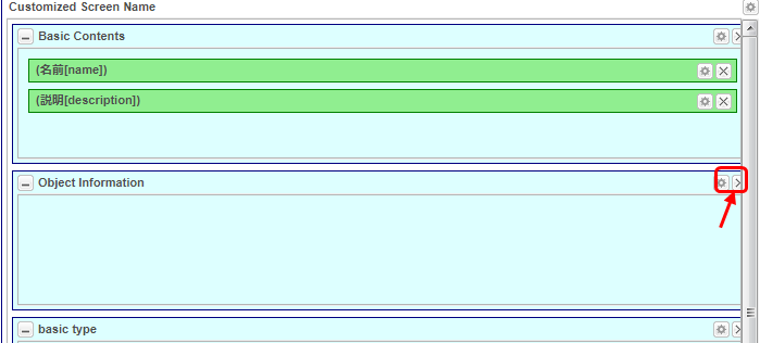
Drag & Drop the standard section on the right to the bottom.
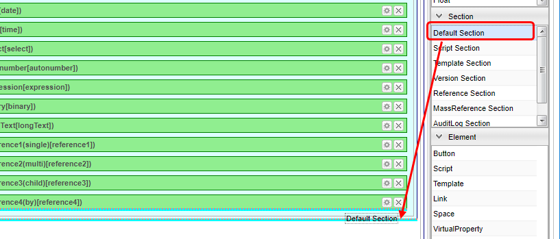
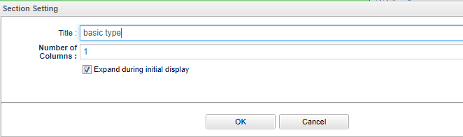
A dialog opens when you drop it. Enter Basic Type in the title and click the OK button.
Similar process goes with Special Type Reference Type.
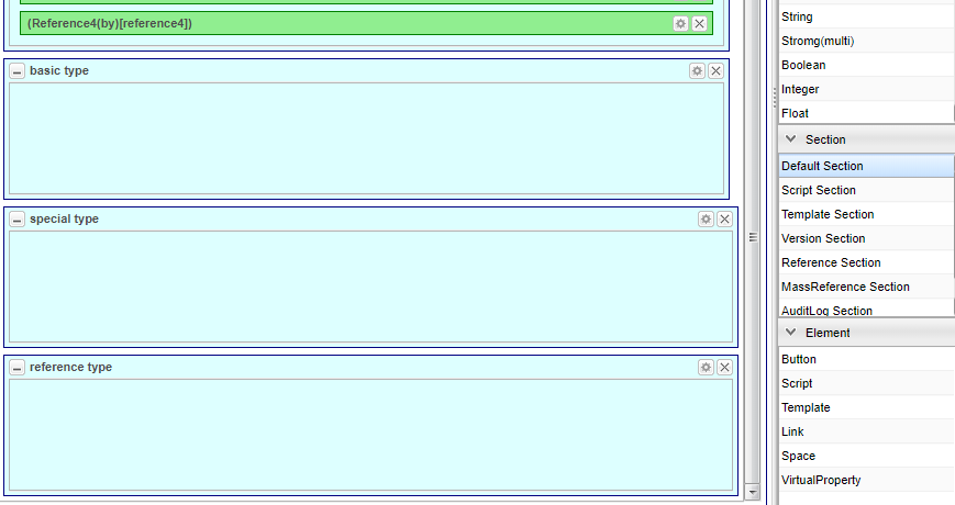
After that, move the Property defined in the standard definition in each Section from the top.
| Multiple Property items can be dropped in the View, control the display judgment script so that only one item is displayed. |
If you move everything as instructed, it will look like this:
Since the section of Object information is empty, let’s delete it. Click the × button next to Section to delete it.
Let’s save in this state.
If there is data registered at the time of confirming the search result, please choose the detail screen from the search result list.
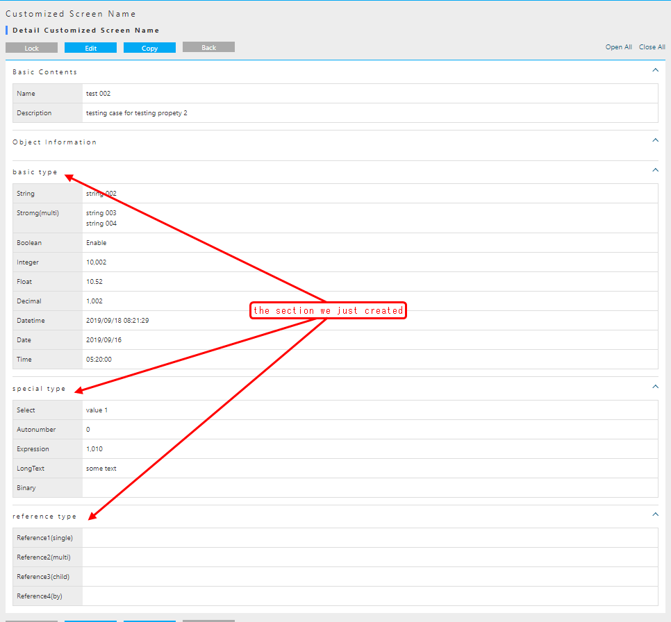
Continue to check the edit screen. It has been changed in the same way.
As depicted, you can customize the GEM screen by setting DetailLayout.
Registering a Standard Definition
So far, the following Entity has been created, but only the Property confirmation 2 has been customized.
| Name | DisplayName |
|---|---|
tutorial.product.ProductCategory |
Product Category |
tutorial.product.Product |
Product |
tutorial.properties.Properties |
For property confirmation |
tutorial.properties.Ref1 |
Ref 1 |
tutorial.properties.Ref2 |
See 2 |
tutorial.properties.Ref3 |
Ref 3 |
tutorial.properties.Ref4 |
Ref 4 |
tutorial.properties.Properties2 |
Property confirmation 2 |
For other entities, open Search_Layout and Detail_Layout respectively, and save the settings created in Standard load.
Although it was not described in detail this tutorial, it is required for operations by non-administrator users.
For details, please refer to Generic Entity Manager (EntityView) in the developer guide after completing this tutorial.
Up to this point, the procedure for customizing the GEM screen created by the entity definition has been confirmed. Next, we will explain how to customize the top screen of the GEM screen.
2.5. Customizing the Top screen
The Top screen displayed on the GEM screen is created based on Menu metadata and TopView metadata definition.
Here, you will understand the procedure for changing the Top screen through simple customization for each metadata definition.
In this procedure, we will explain multiple View definitions for Entity SearchLayout and DetailLayout.
Menu Customization
Menu Metadata
The menu part displayed on the Top screen of the GEM screen is defined by Menu metadata.
One menu called DEFAULT is defined at the time of tenant creation.
The menu can be linked with the setting of role which is the security function of iPLAss basics, but let’s leave it here and look at the configuration of the Menu edit screen.
Menu Edit Page Configuration
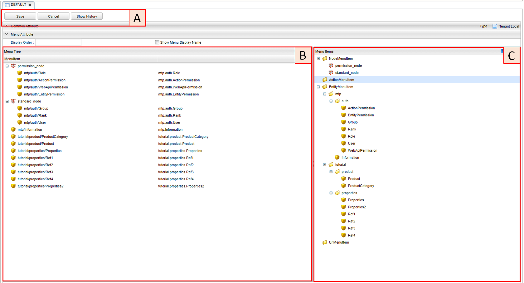
There are three main components.
There are buttons for saving and browsing history information. Click Cancel to cancel the edited content and reload it.
This is the part that defines the menu hierarchy. Add MenuItem displayed in C with Drag & Drop, or change the order by Drag & Drop in the tree.
Item displayed as menu items. Can be dropped on the tree.
The substance of each menu displayed on the Top screen is MenuItem. Four preset MenuItems groups are available depending on the application.
- NodeMenuItem
-
An item (like a folder) that can have multiple child items such as ActionMenuItem, EntityMenuItem, UrlMenuItem. This MenuItem will only toggle the child menu and the screen does not change.
- ActionMenuItem
-
Menu item that executes metadata registered as Action.
- EntityMenuItem
-
This is a menu item for displaying the entity search screen. When you create a new Entity definition, the iPLAss systems automatically creates an EntityMenuItem with the same name and will adds it to the DEFAULT menu.
- UrlMenuItem
-
Menu item to display the specified URL. This is used when calling an external site from the menu.
Simple Customization
Let’s make a simple customization to have a sense of the procedure.
If the tutorial has been followed according to the procedure, the menu displayed on the Top screen is as follows.
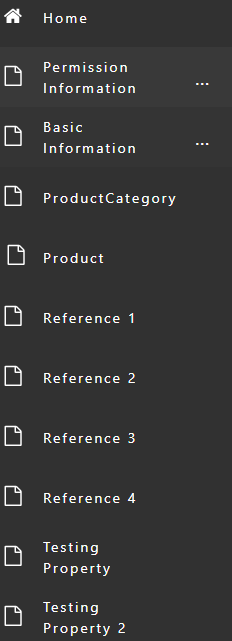
Authority information (NodeMenuItem), Basic information (NodeMenuItem), Notification information (EntityMenuItem) are menu definitions created by default when tenants are created.
The menu below is the EntityMenuItem that was created when the Entity was created during this tutorial.
Let’s organize it using the EntityMenuItem created in this tutorial. Try the following menu.
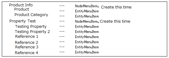
First, create a NodeMenuItem for Product information.
Open AdminConsole and double-click the DEFAULT menu definition to display its edit screen.
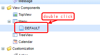
Right-click the NodeMenuItem displayed in MenuItems and select Create Menu Item. The Edit MenuItem dialog will be displayed.
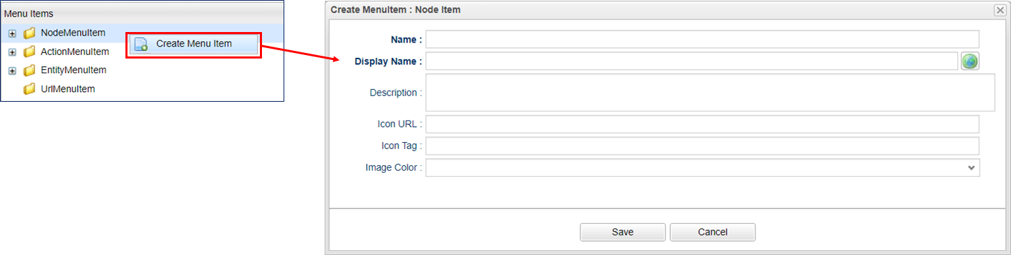
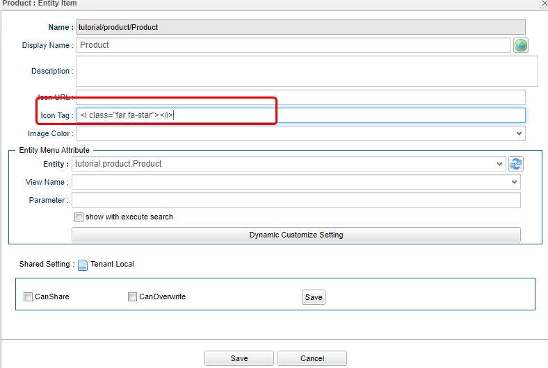
Please set the Name and DisplayName. The DisplayName will be displayed on the screen as the label of the menu. The description is for developers, so it can be left unset. The explanation of Icon URL and Icon Tag are omitted at this point.
Name is using / to represent its hierarchy.
It is .(a dot) for Entity, however it will be / most of the time else where of this system.
| Attribute | Value |
|---|---|
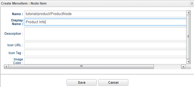
Name |
tutorial/product/ProductNode |
DisplayName |
Product Info |
NodeMenu can set the color of the frame part displayed in the menu.
This time, try to specify blue for Image Color.
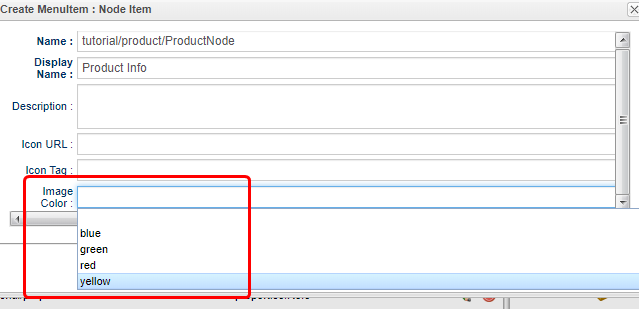
After finishing the settings, save with the Save button.
It will be added to the NodeMenuItem.
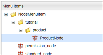
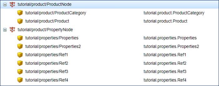
Let’s Drag & Drop the added Node to the left tree.
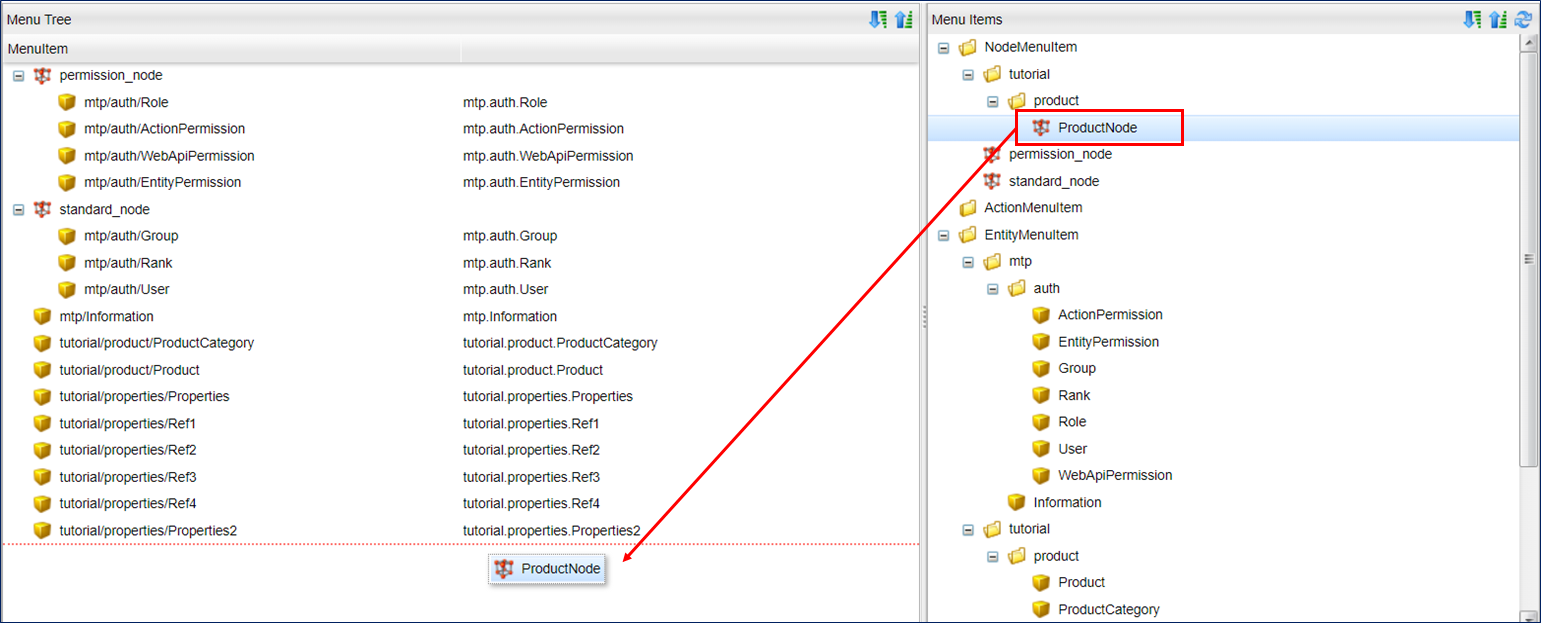
Drag the above Product Category Product item into the ProductNode NodeMenuItem you just added.
If you move the mouse pointer over the ProductNode item, it will display the child items of corresponding Node.
It may be a little difficult to control until you get used to deciding whether you want to move under ProductNode or under child item of ProductNode with the mouse position.
If it does not work, please try again.
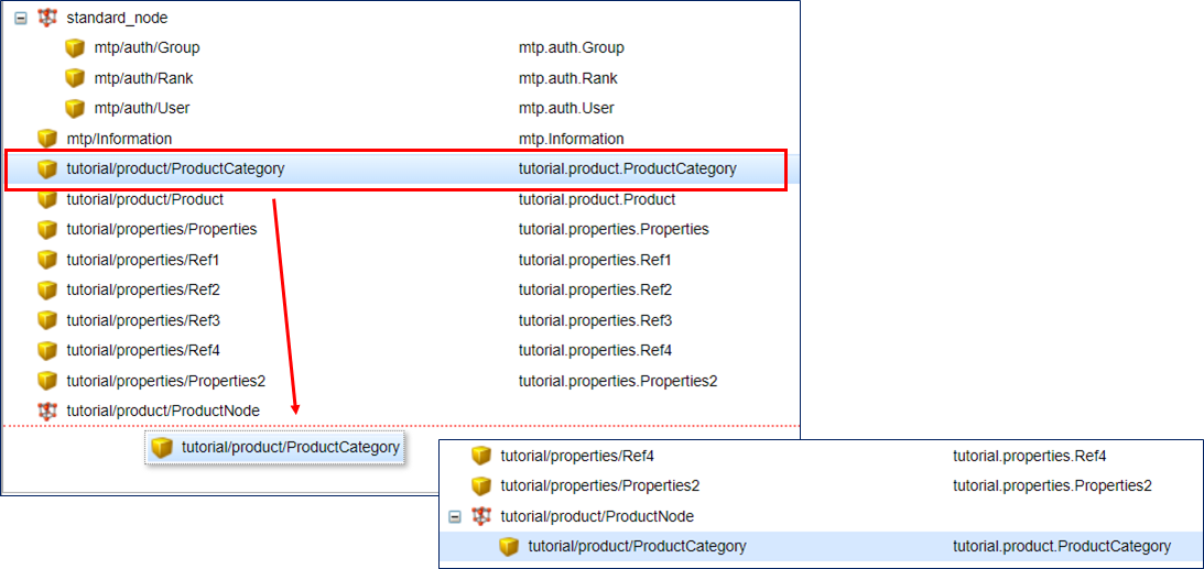
Similarly, create a Property Check NodeMenuItem and move the EntityMenuItem of the entity created for property check.
| Attribute | Value |
|---|---|
Name |
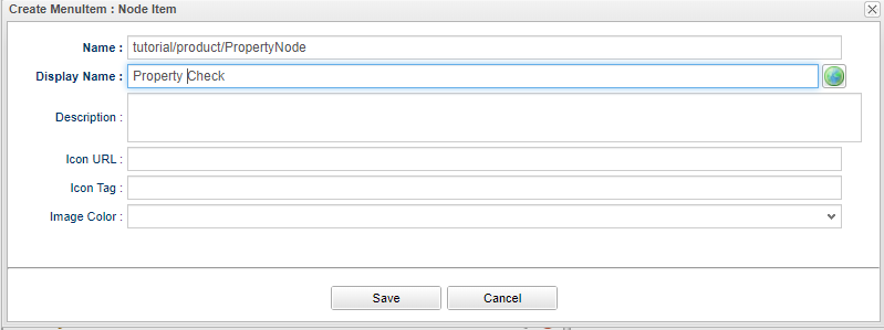
tutorial/product/PropertyNode |
DisplayName |
Property check |
Image Color |
green |
When completed, it will look like this:
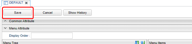
Make sure it is placed and press the Save button to save the menu.
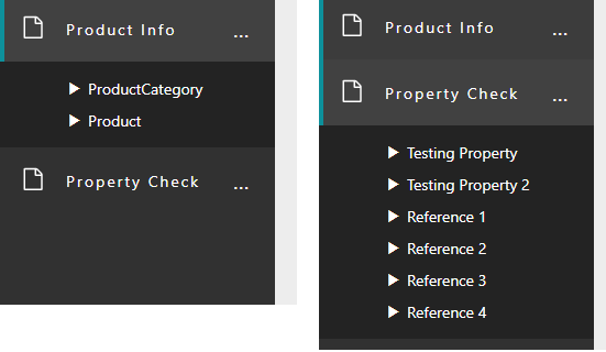
Click the Home menu on the GEM screen to refresh the screen.
Product information and Property check menu are added, and each Entity menu is displayed under it.
Next, let’s touch EntityMenuItem.
If you click the menu created from EntityMenuItem, Entity search screen is displayed.
In this search screen, if you specify es=t as the parameter when displaying the screen, you can display search results without conditions at the timing when the search screen is displayed.
It is assumed to be used when there are only small number of data registered, such as Product Category Entity.
Let’s actually display the search result for Product Category Entity.
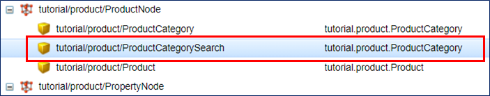
As a precaution, leave the Product Category EntityMenuItem without any parameters. Right-click on the ProductCategory EntityMenuItem and select Copy Menu Item.
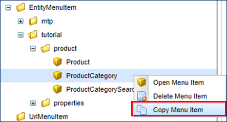
In the dialog that opens, edit the values.
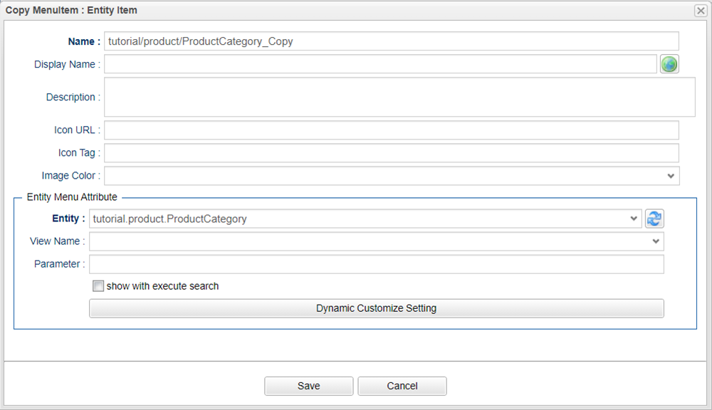
The value _Copy is set after Name when starting the dialog. For this time, Change as follows.
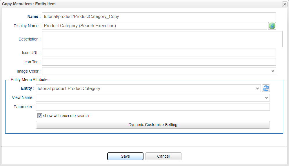
If you check show with execute search, the search process is executed when the screen is displayed by clicking the menu.
This setting has the same meaning as specifying es=t for Parameter.
Therefore, even if you specify Parameter without checking it, it will has the same behavior.
| Attribute | Value |
|---|---|
Name |
tutorial/product/ProductCategorySearch |
Display Name |
Product Category (Search Execution) |
show with execute search |
Check |
When you pressing the Save button, it will be added on the EntityMenuItme.
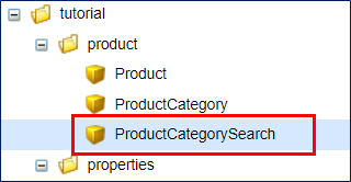
Drop it on the tree part.
This time, we will put it under the Product category beneath the Product Node .
Save the menu with the Save button.
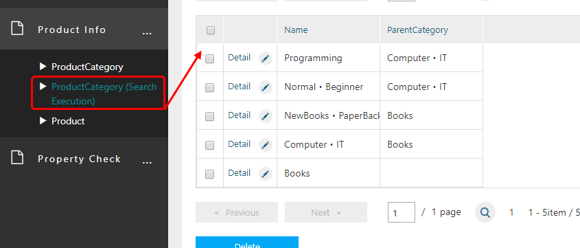
Click the Home menu on the GEM screen to refresh the screen.
In the Product Information Node, the Product Category (Search Execution) menu is added.
(The width of the menu part is fixed, so it will wrap when the title is long as shown on the right)
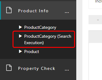
Click to display the search screen. When the screen is displayed, search processing is executed and displayed in the list.
Since Action has not appeared in previous tutorials, let’s create a menu that executes the Action already provided on the GEM screen in the sense of a procedure.
Now, create an ActionMenuItem that displays the new registration screen for the Product Entity.
When you click the New registration button displayed on the search screen, the new registration screen is displayed.
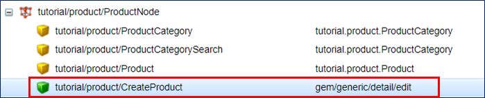
The action executed by this new registration button is the action definition gem/generic/detail/detail.
This time, we wil create an ActionMenuItem that executes the Action that displays the new entity registration screen.
Right-click ActionMenuItem in MenuItems displayed on the right side of the menu editing screen and select Create Menu Item .
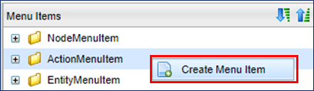
The Edit Item dialog will be displayed.
Set Name and Display Name.
In ActionMenu, you can specify Action to be executed and Parameter to be passed to the Action.
Here, specify the action of gem/generic/detail/detail we talked about earlier.
This action requires a new entity name to be added as a parameter.
Specify in the format of defName = Entity name.
Since this time we are targeting the product entity, defName = tutorial.product.Product.
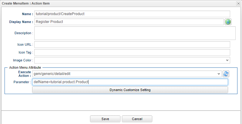
| Attribute | Value |
|---|---|
Name |
tutorial/product/CreateProduct |
Display Name |
Register Product |
Execute Action |
gem/generic/detail/edit |
Parameter |
defName=tutorial.product.Product |
After setting, save with the Save button.
And it will be Added to ActionMenuItem.
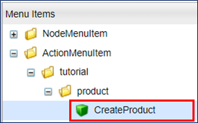
Drop the added item to the tree part.
This time, we will place it under Product of the Product Node .
Save the menu with the Save button.
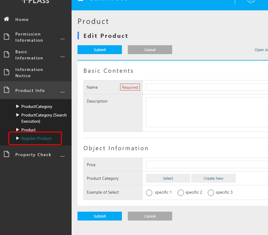
Click the Home menu on the GEM screen to refresh the screen.
The Product Registration menu is added to the Product Information Node.
Clicking on that menu will bring up a new registration screen for the product entity.
Customizing the top page
TopView Metadata
The parts other than the menu of the Top screen displayed after login are defined in TopView metadata.
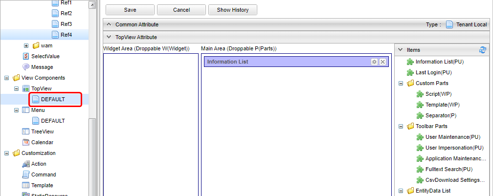
One TopView called DEFAULT is defined at the time of tenant creation.
Like the menu, the top screen can be linked to the role setting of iPLAss-based security function, but let’s leave it here and focus on the configuration of the edit screen.
TopView Editing Screen Configuration
There are three main components.
There are buttons for saving and browsing history information. Click cancel to cancel the edited content and reload it.
This is the area to drop items displayed on the Top screen.
It is divided into Widget Area and Main Area.
Items displayed on the Top screen. Drop to the area on the right according to the item type (Widget, Parts).
Multiple items are prepared according to the purpose. There is a notation W P U next to each item, which means the following.
- W
-
Available as Widget
- P
-
Available as Parts
- U
-
Drop only one across Widget and Parts
For Aggregation, Calendar, and TreeView, items for dropping can be created by creating corresponding metadata.
TopView items are classified as follows according to the drop area where they are placed. Even for the same item, settings and display contents may vary depending on the location.
- Widget
-
Items placed in the
Widget Areaof the Drop Area. A widget on the iPLAss Top screen is a part displayed in the menu area. When this widget is set,widgetwill be displayed in the menu part of the top screen.
- Parts
-
Items placed in the
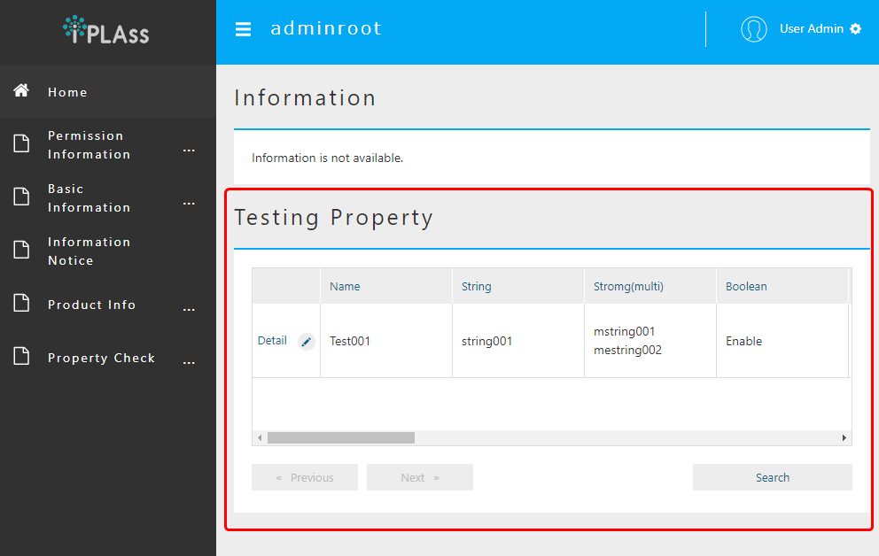
Main Areaof the Drop Area. Parts that display a list ofnotification informationat the time of tenant creation are set.ProductsIf you set Parts to display a list of Entity search results, it will be displayed as follows.
Simple Customization
Make a simple customization to understand the procedure.
Use of SearchResultList
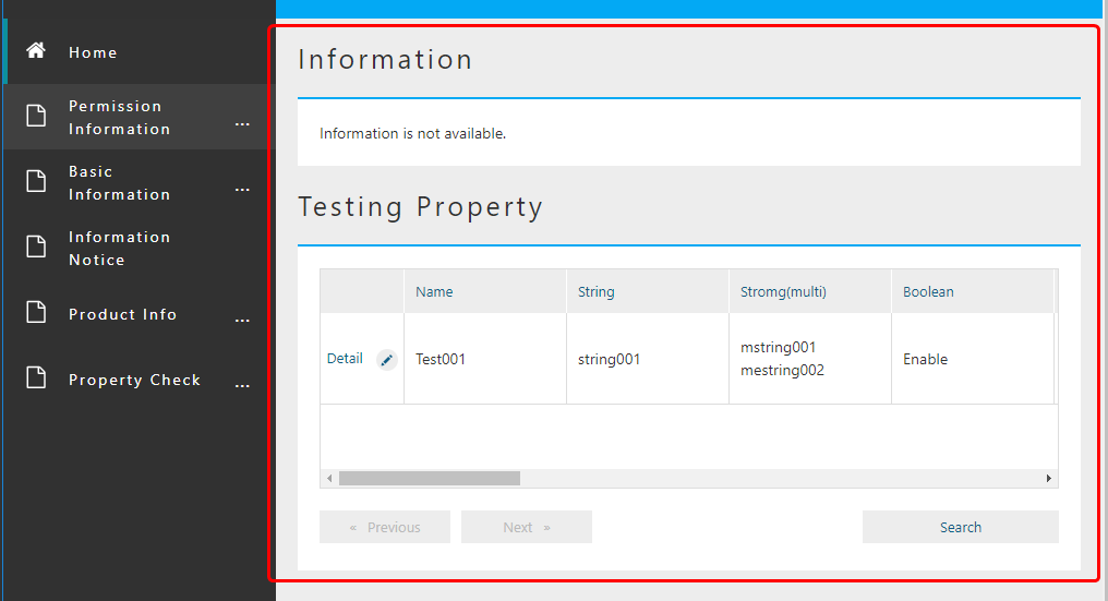
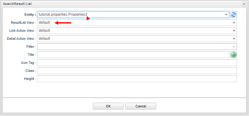
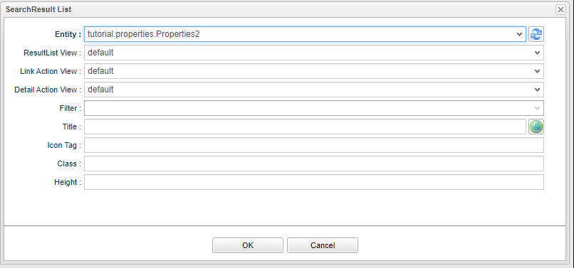
SearchResultList is an item that displays Entity search results on the top screen.
Drop SearchResult List in` EntityData List` to Main Area.
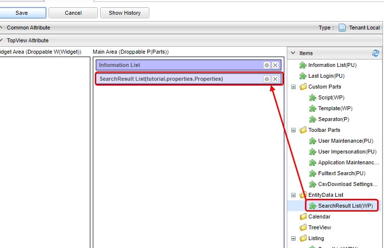
Once you droped the item, a dialog to set search target etc. will be displayed.
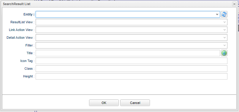
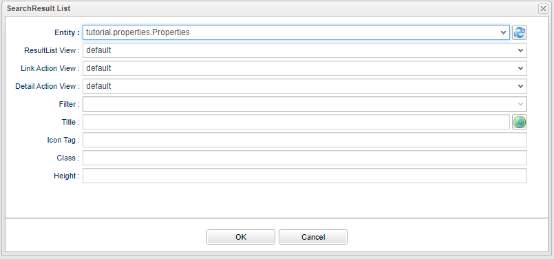
Select the Entity to be searched.
Select the Properties Entity that we created earlier.
(If it does not exist, it can be another Entity)
If selected, Result will be set to ResultListView and LinkActionView respectively.
Since this setting is explained separately, just click the OK button.
Click the Save button in TopView to save it.
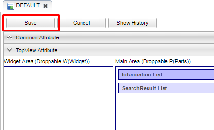
Click the Home menu on the GEM screen to refresh the screen.
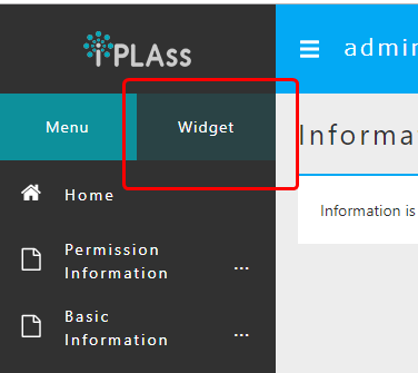
A list of search results is displayed.
To specify the search condition for this SearchResultList, use Entity Filter.
Since we haven’t explained Filter yet, we didn’t specify Filter here.
If Filter is not specified as in this case, search will be executed in descending order of updateDate, which is the common property of Entity.
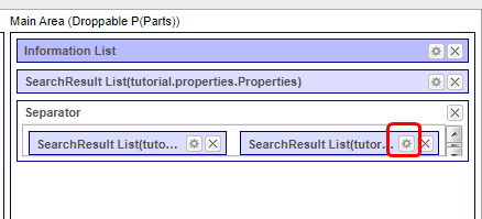
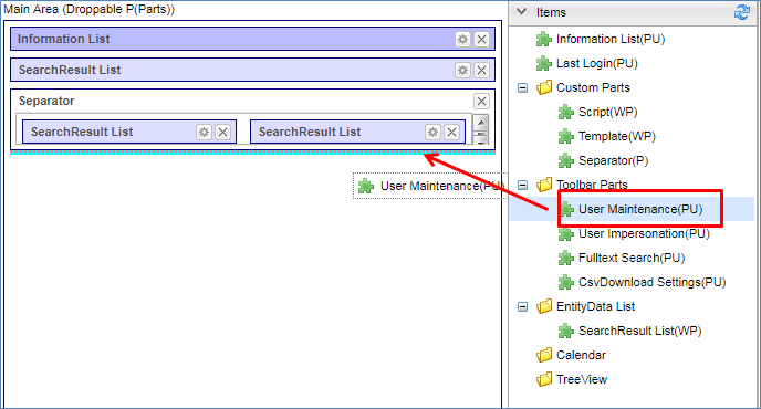
Separator is an item that divides the screen area into two horizontally.
Here, we will display SearchResult List side by side.
First, drop Separator in Custom Parts to Main Area.
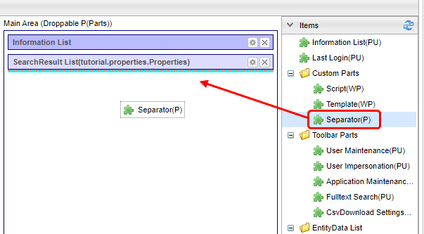
Separator has no setting items, so there is no edit button.
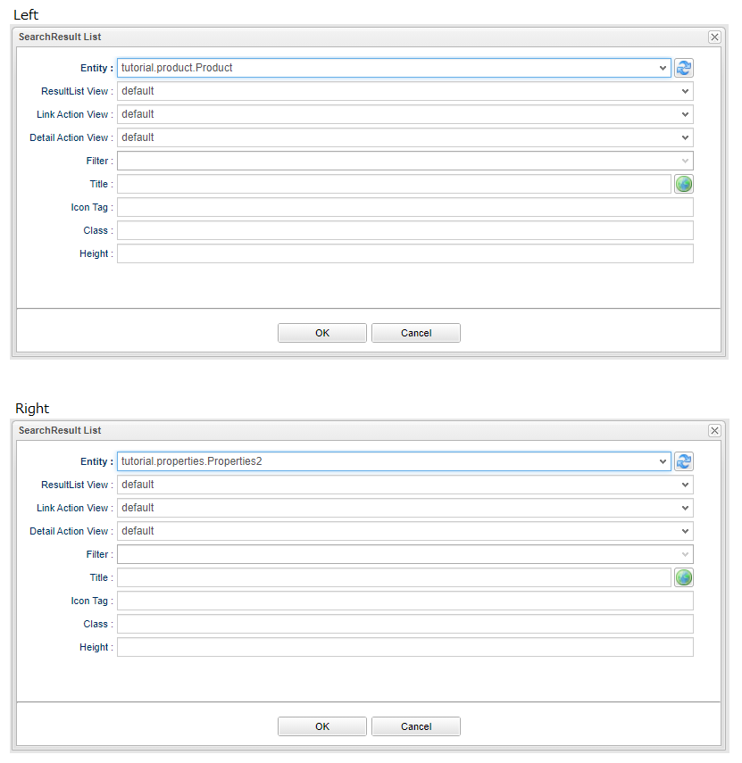
Drop two of the SearchResult List used earlier on this` Separator`.
On the left side, specify Product Entity, and on the right side, specify Properties2 Entity.
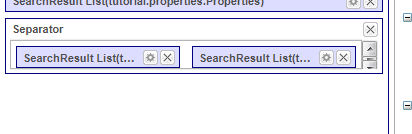
Save TopView here and check the screen.
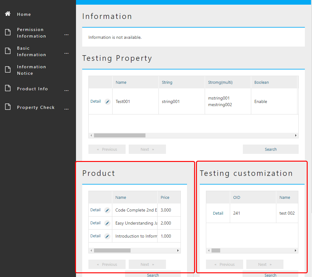
Two lists of search results for the specified Entity are displayed next to it.
If you look closely, only the list of Testing Customization does not show the Edit link.
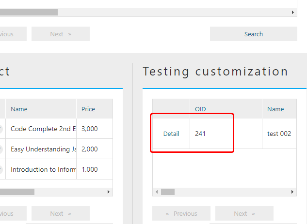
This is because the layout definition of the list displayed in SearchResultList is controlled by Entity’s SearchLayout setting (search result part).
Since ResultList View is registered as default on the settings earlier, default definition of SearchLayout setting of Properties2 Entity is used.
Let’s check SearchLayout of Properties2 Entity.
Click on the Edit Search Results button.
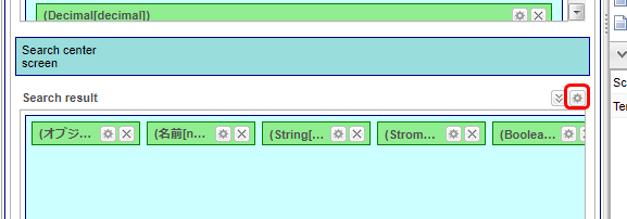
The edit link is hidden.
Other settings such as the delete button, number display, and page jump are ignored for the Top screen.
Next, let’s edit this view.
There are cases where you want to narrow down the display items for the Top screen, such as when there are many property items or the result display area separated by Separator is narrow, as in the currently displayed Top screen. This can be achieved by defining a View to be displayed on the Top screen in the Entity SearchLayout.
In the previous operation, the ResultList View setting was default.
Here, add View for Top screen to SearchLayout of Entity for Properties2 Entity and use it with ResultList View.
First, display the property search layout for the Properties2 Entity.
Since the view of default has already been defined, let’s organize the Property to copy and display this time.
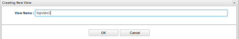
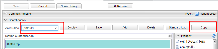
Click the Copy button.

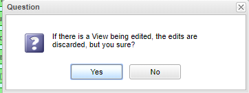
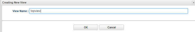
A confirmation message will be displayed.
A dialog box for specifying the name of the view is displayed. Enter the name.
This time it will be topview.
| Attribute | Value |
|---|---|
View name |
topview |
Then topview is added to View name and it is selected.
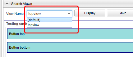
Let’s reduce the Property added to this search result list.
This time, everything except object ID and name will be deleted.
When you have finished deleting, click the Save button in View.
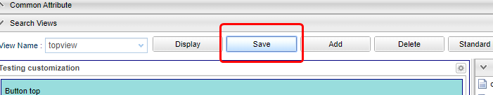
In the same way, add a view to the DetailLayout of the Properties2 Entity.
Let the view name to be added the same as SearchLayout, which is topview.
Let’s delete all sections excepet for the basic section at the top.
When you have finished deleting, click the Save button in View.
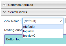
Next, go back to TopView of MetaDataSettings and click the edit button for the SearchResult List displayed at the bottom right.
The topview views (view definitions named topview) that were added earlier are now available in the ResultList View and Detail Action View, so please select them.
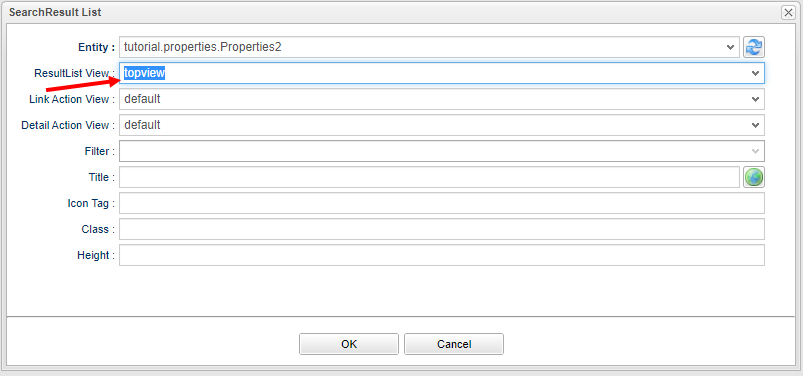
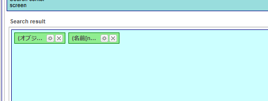
In this state, save TopView and display the Top screen.
Only the object ID and name are displayed.
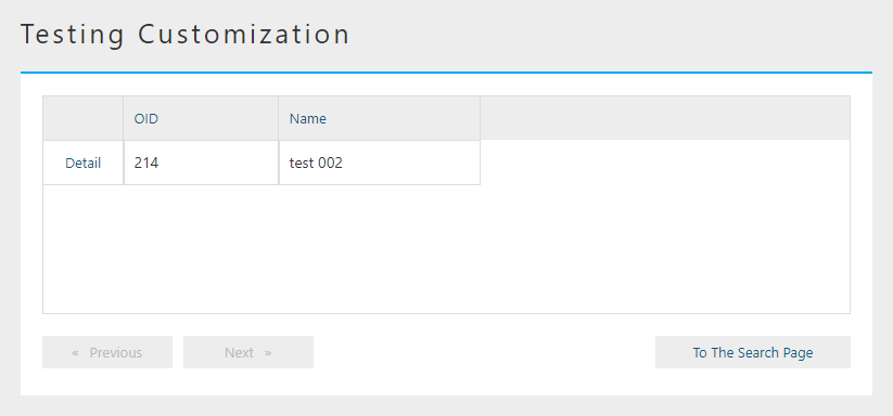
If you click the Detail link here, the View definition of topview defibed in Entity DetailLayout is displayed.
Next, use the settings of Detail Action View to change the View displayed in the Detail link (or Edit link) on the list.
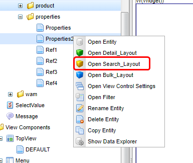
Properties2 Open Entity DetailLayout.
Like SearchLayout, the default view has already been defined.
We will copy this again.
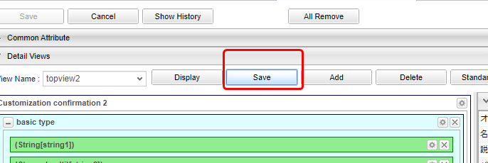
Click the Copy button to copy.
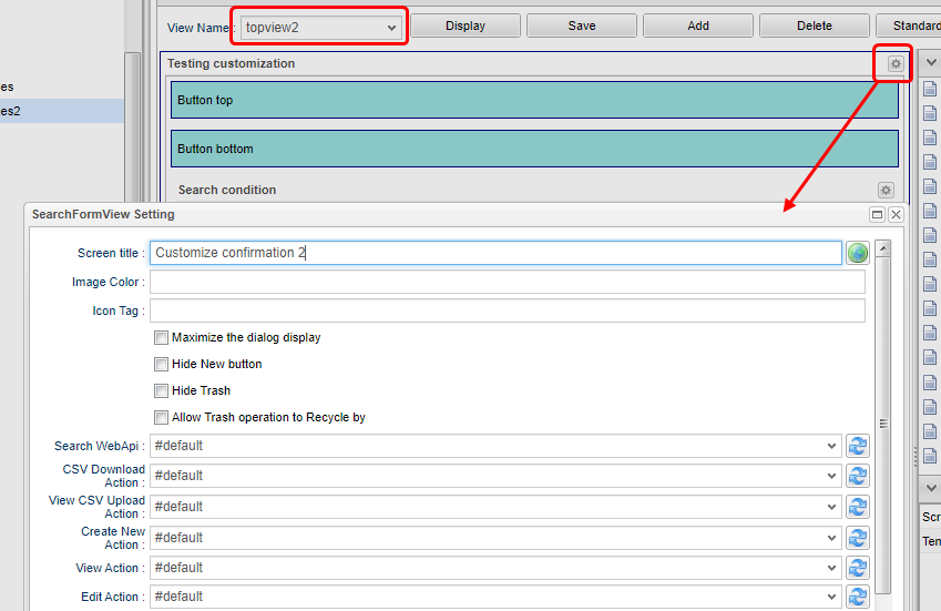
This time, change the view name to topview2.
| Attribute | Value |
|---|---|
View name |
topview2 |
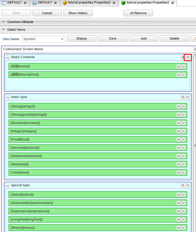
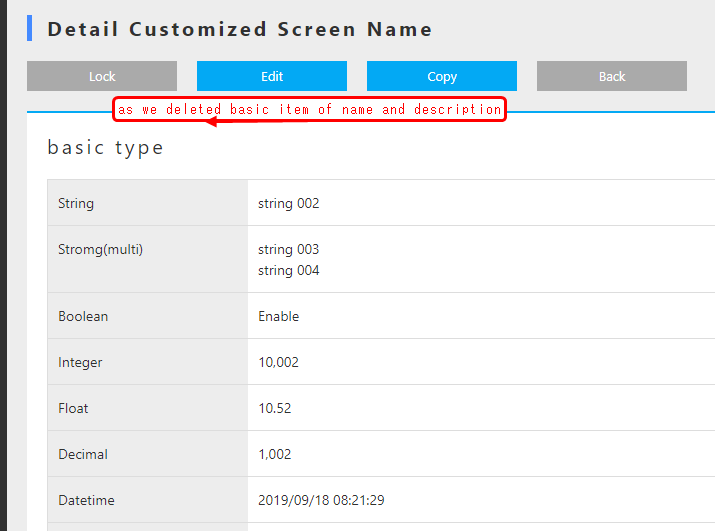
Since it is the definition of the detail screen, let’s put all Property items in.
So without changing the Property, just change the title to Customize confirmation 2 (arbitrary).
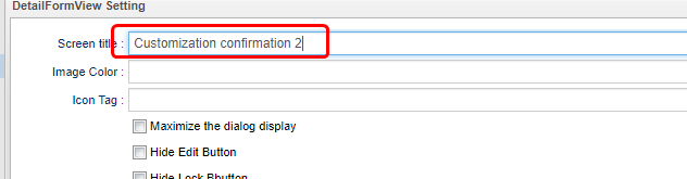
| Attribute | Value |
|---|---|
Screen title |
Customization confirmation 2 |
Save it now.
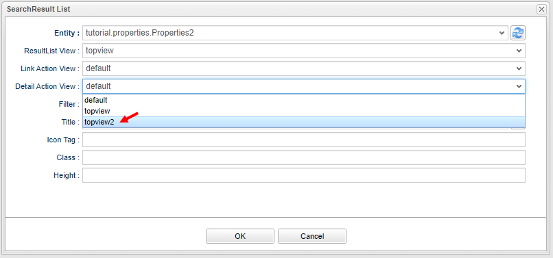
Next time, set topview2 to Detail Action View in the edit screen of SearchResult List on the TopView side.
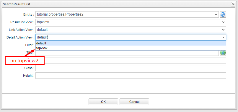
topview2 does not appear in the Detail Action View.
This is because the views that can be specified in Detail Action View are displayed on the SearchLayout side.
Currently, Topview2 is only registered in the DetailLayout side, so Detail Action View cannot be selected.
Create topview2 on the SearchLayout side.
This time, use the copy of View defined in default.
Also, change only the screen title to Customize confirmation 2.
Save SearchLayout, and check the pull-down of Detail Action View again on the edit screen of SearchLayout List on the TopView side.
Now you can select topview2.
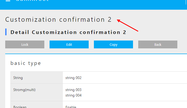
Save TopView and check the Top screen.
The top screen displays topview, which is the view definition specified in the ResultList View.
Click the details link to display the details screen.
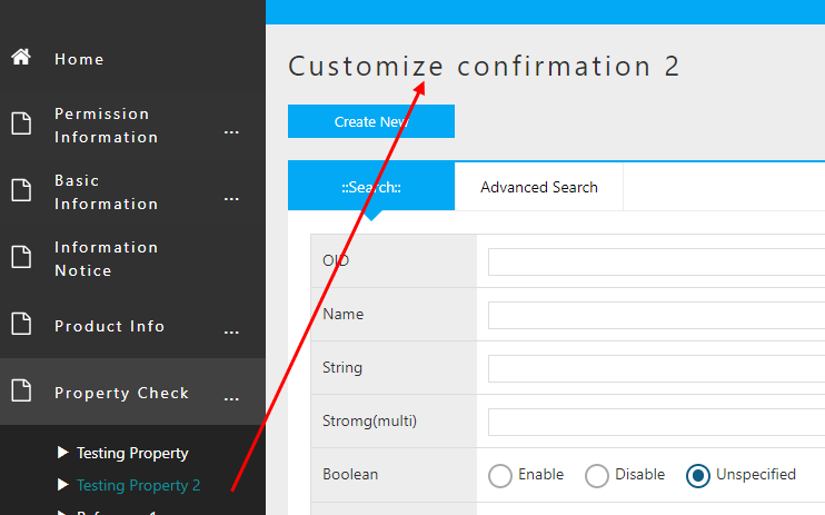
View definition (DetailLayout) of topview2 specified in Detail Action View is displayed so that the title is customization confirmation 2.
Next, use the settings of Link Action View to change the View displayed in the Search button on the list.
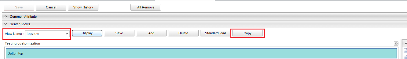
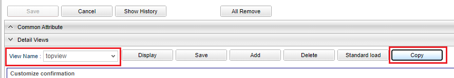
Properties2 Open Entity SearchLayout.
For this exercise, please copy and use the View definition named topview.
Please rename the View to topview3.
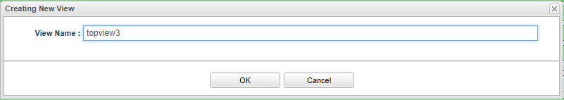
| Attribute | Value |
|---|---|
View name |
topview3 |
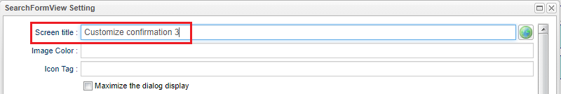
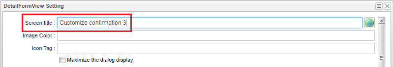
Since it is the definition of the search screen for topview, just change the title from the state where View is copied to Customization confirmation 3 (arbitrary).
| Attribute | Value |
|---|---|
Screen title |
Customization confirmation 3 |
Save it now.
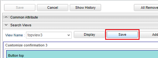
Next time, create topview3 on the DetailLayout side.
Like SearchLayout, the copy of View defined in topview is used as it is, so just change the screen title to Customization confirmation 3.
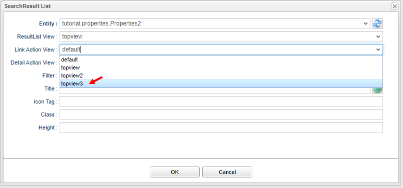
Save DetailLayout and select topview3 from the pull-down menu of Link Action View on the edit screen of SearchLayout List on the TopView side.
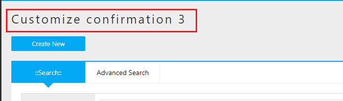
Save TopView and check the Top screen.
The top screen shows the topview specified in ResultList View.
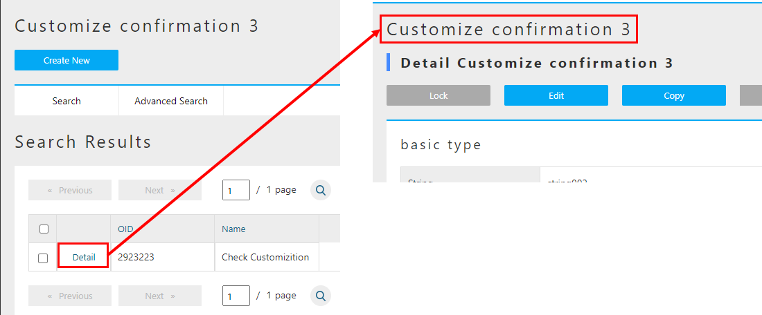
Click the To The Search Page button to display the details screen.
View definition (SearchLayout) of topview3 specified in Link Action View is displayed so that the title is customization confirmation 3.
Also, if you click the Detail link in the search result list, the View definition (DetailLayout) of topview3 will be displayed.
Once you have confirmed, return the property confirmation 2 setting.
.The Usage of UserMaintenance
UserMaintenance is an item that specifies the screen layout of the Account Settings menu displayed on the toolbar at the top of the Top screen.
By default, the password change screen is displayed.
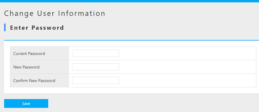
The UserMaintenance item can change this screen.
First, drop UserMaintenance from Toolbar Parts to Main Area.
Click the edit button on the right.

A dialog for specifying the View is displayed.
The View specified here is the DetailLayout view defined in the User Entity that holds iPLAss-based user information.
Display the User Entity DetailLayout and open the View name pull-down.
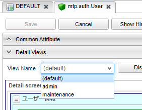
| View Name | Usage |
|---|---|
default |
For general user registration (no administrator setting) |
admin |
For registration of users including administrators (for system administrators) |
maintenance |
For your own maintenance (for TopView) |
Each view has a layout defined for the purpose of use.
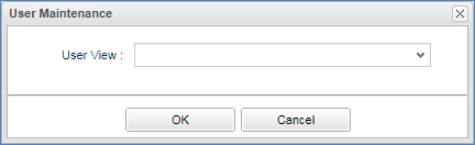
Let’s go back to the TopView UserMaintenance item edit screen and specify the View.
This time, specify maintenance View.
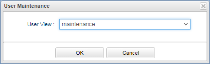
Save TopView and check the screen of the Change User Information menu on the Top screen.
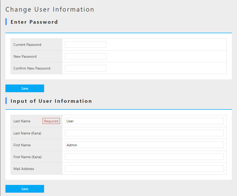
The user information input area is now displayed.
The password is displayed as a separate area.
This is because the user password information is managed separately from the User Entity in the iPLAss platform.
(User Entity has no Property related to password)
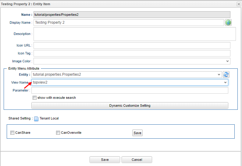
Specify View in EntityMenuItem
In the explanation of the Top screen, the View definition of SearchLayout and DetailLayout was used. Here we will explain how to specify View of this Entity in EntityMenuItem described as an item for Menu.
In the Change EntityMenuItem of the tutorial, the settings were made to execute the search when the search screen was displayed.
Similarly, the View is specified on the EntityMenuItem setting screen.
The menu settings for Property confirmation 2 remain the default settings.
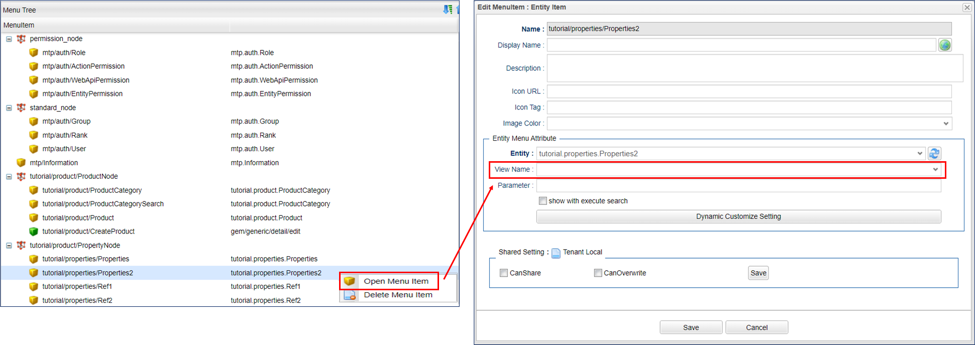
Therefore, when you click Property check 2 in the menu, SearchLayout defined as default is displayed.
In the TopView tutorial, we created a view definition called topview and topview2.
Since topview is a view for the layout of the SearchResult List for the Top screen, DetailLayout is not defined and cannot be used for the search screen that is started from the menu.
This is because the same view name is used when transitioning from the search screen to the detail screen, and from the detail screen to the search screen. If either is not defined, an error will occur if the user tried to display the screen.
(So, if you create a view definition of topview in DetailLayout, you can use it)
Here we specify topview2.
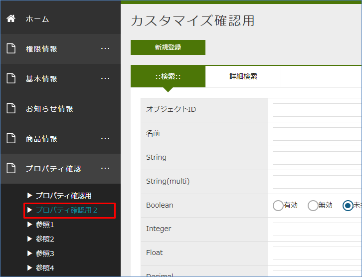
After saving the item, return to the GEM screen and click the Home menu to refresh the screen.
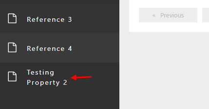
If you click on Testing Property 2, the title Customization confirmation 2 is displayed, and you can see that the topview2 screen is displayed.
Here, we confirmed the steps to customize some of the components displayed in the menu part and main part of the Top screen. We also confirmed the use of the ViewLayout and DetailLayout view definitions at the same time. The following describes the icons that can be set on the GEM screen.
2.6. Icon settings
You can set icons on the Entity search screen, detail screen, menu, and Top screen parts that you have seen so far.
There are items such as Icon Tag and Icon Tag in each setting screen, and by setting the icon tag of Font Awesome here, you can display icons freely.
This time, try setting star icon. Since the html tag for display is described in the page of each icon, we will utilize it.
<i class="far fa-star"></i>Let’s set an icon for each screen.
Menu
Open the DEFAULT setting of Menu and open the setting screen of the Product Entity.
Since there is an Icon Tag item, set the html tag here.
Save the settings and click Home on the GEM screen to redisplay the screen.
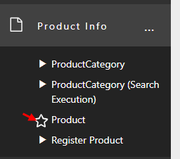
An icon is displayed in the menu of the product entity.
Top Screen
Open the DEFAULT setting of TopView and open the Information List setting screen.
Since there is an Icon Tag item, we will set the html tag here.
Save the settings and click Home on the GEM screen to redisplay the screen.
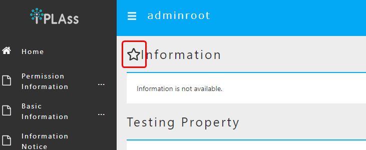
An icon will be displayed in the notification information on the Top screen.
Search Screen
Open SearchLayout of Product Entity and open the search screen setting screen.
Since there is an item of icon tag, set the html tag here.
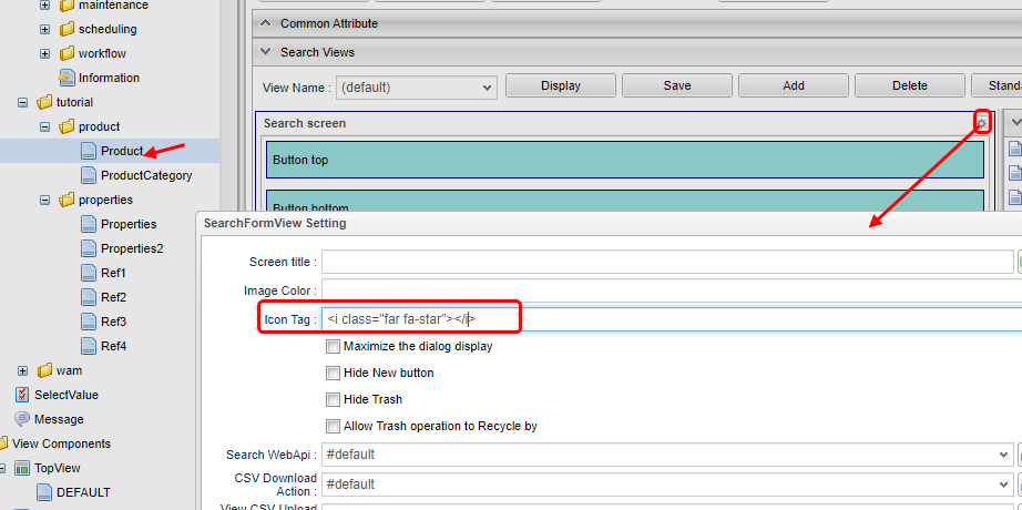
Save the settings and click the Products menu on the GEM screen.
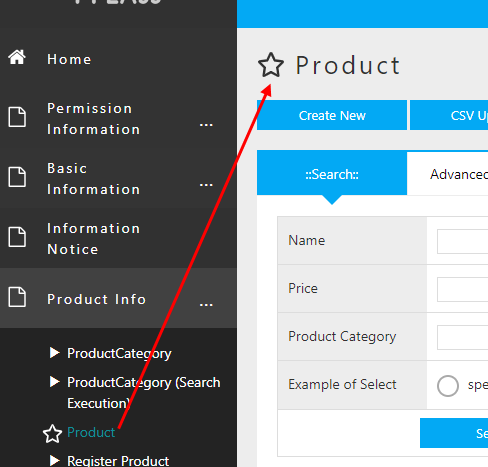
An icon was displayed on the search screen for Products Entity.
Details Screen
Open DetailLayout of Product Entity and open the setting screen of detail screen.
We can also find an item of icon tag,let’s set the html tag here to see what will happen.
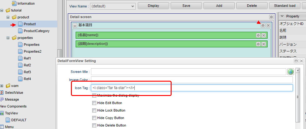
Save the settings and display the details screen of the Product Entity on the GEM screen.
An icon will be displayed on the details screen of the Product Entity.
Here, we have confirmed the basic methods of displaying icons on each screen. As we have referred to the GEM screen many times so far, let’s have a close look into the GEM on the next section.
2.7. Skin theme settings
The GEM module can switch the menu display method (skin) and screen base color (theme) as the screen layout definition. This specification can be specified on a tenant basis, so set it on the Tenant metadata.
| Selected values | Description | Default | |
|---|---|---|---|
Skin |
Flat |
Flat design based layout. The menu is displayed vertically (left side of the screen). |
○ |
Vertical Menu |
The menu is displayed vertically (left side of the screen). |
||
Horizontal menu |
The menu is displayed horizontally (upper side of the screen). (The widget component specified in TopView is displayed on the left side of the screen.) |
||
Horizontal menu (drop list menu) |
The menu is displayed horizontally (upper side of the screen). (The widget component specified in TopView is displayed on the left side of the screen.) However, the submenu (menu under NodeMenuItem) is displayed vertically. |
||
Theme |
Black |
The line at the top of the screen is displayed in black, and buttons are displayed in blue. |
○ |
Red |
The lines at the top of the screen are displayed in red, and the buttons are displayed in red. |
||
Green |
The line at the top of the screen is displayed in green, and the buttons are displayed in green. |
||
Blue |
The lines at the top of the screen are displayed in blue, and the buttons are displayed in blue. |
||
Bright red |
The line at the top of the screen is displayed in bright red, and buttons are displayed in a bright red base. |
||
Bright green |
The line at the top of the screen is displayed in bright green, and buttons are displayed in a bright green base. |
||
Bright blue |
The line at the top of the screen is displayed in light blue, and buttons are displayed in a light blue base. |
||
Orange |
The line at the top of the screen is displayed in bright orange, and buttons are displayed in bright orange base. |
||
If not specified, Default is applied.
The style sheet of the GEM module is switched according to the setting, and the appearance can be easily changed.
Flat/blue
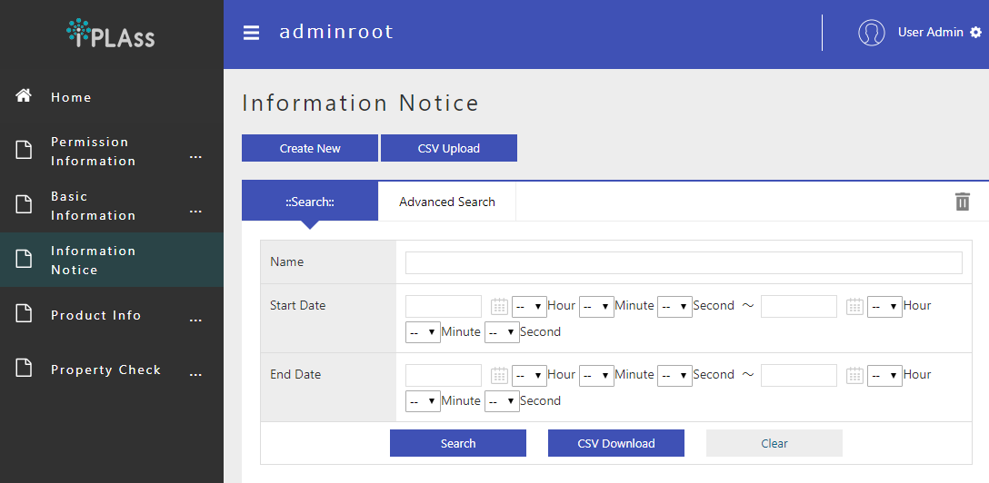
Vertical Menu/black
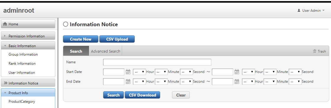
Horizontal Menu/green
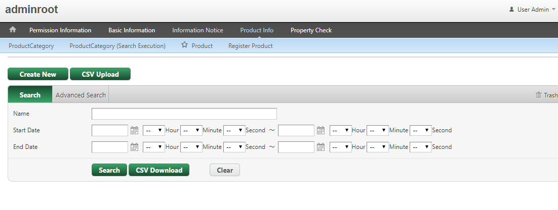
Horizontal Menu(drop list menu)/red
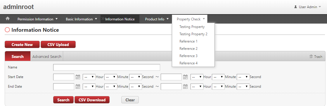
It is possible to switch after the release or during the development, but if your implementation is more concerned on custom view (modifying Template, inserting Template, etc.), it is highly recommended to decide the styles as early as possible at the development stage.
3. User Management
3.1. User Registration
User Entity
In iPLAss platform, User Entity (mtp.auth.User) is used as Entity for managing user information.
Here, we will explain the properties of User Entity defined by default.
Property
Display the edit screen of User Entity from AdminConsole.
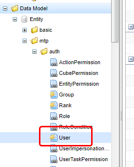
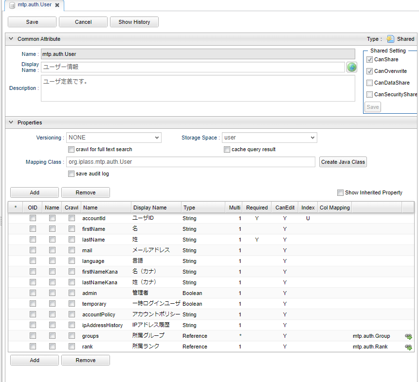
We will focus on the following items.
Apart from oid which is a common property of Entity, Property has an alternate property called user ID.
Usually, user IDs will has its own rule of regularity, and are not decided automatically, differing from oid, which are automatically assigned.
(The primary KEY for Entity is oid. However, oid can be set as the value of accountId.)
For user names, only lastName is required.
(For Reference) About name Property
The value is automatically set to name (required Property), which is a common property of Entity, using the function called EventListener of Entity when registering or changing the data of User Entity.
(The EntityEventListener is not explained, so you can ignore it.)
At this case, if the Tenant metadata locale is en, the value is set as firstName lastName, otherwise it is set as lastName firstName.
The e-mail address is an optional input item, but it is necessary to notify the password when a password was generated automatically when a user is registered with the the account policy settings of Automatic-Password-Generation.
This is not necessary if you want the user to set password at the time of user registration, but it is still required for the purpose of notification when the administrator resets the password, so change the setting according to the application.
Please note that when performing the tutorial, please set your email address as much as possible.
This property must be true for system administrator users.
Only system administrators can use AdminConsole. This value is true for system admin users who are notified when tenants are created.
Property for managing users by group and rank.
Group Entity and Rank Entity are also provided as default.
Used as Role 's conditions to filter the users to apply privilege to.
The authentication policy that the user uses during authentication. Only an administrator user or a user with the user administrator role can change it.
User Registration
User Registration Flow
User registration is performed from the User Entity registration screen. The user’s password is automatically generated by iPLAss when the user is registered, and is notified to the user via email. When the user logs in for the first time, the screen for changing the password is displayed, so the user’s will set password there.
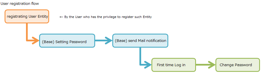
Settings to Check Pending Emails During Development
Since the set password is notified to the user by e-mail, a mail server is required. However, there are many cases where there is no mail server at the development stage or implementation stage of tutorials. If you don’t have a mail server, you can check your password using the debug app for checking pending mail provided by iPLAss.
To use this debug app, edit mtp-service-config.xml stored in src/main/resources.
The related information can be found in a property called listener commented in the MailService configuration of mtp-service-config.xml.
<!-- Mail Service Settings -->
<service>
    <interface>org.iplass.mtp.impl.mail.MailService</interface>

    ・・・・・

    <!-- ■ for develop only (additional="true) ■ -->
    <!-- If you want to output the mail in debug mode, please enable the following configuration. -->
    <!--
    <property name="listener" class="org.iplass.mtp.mail.listeners.LoggingSendMailListener" additional="true"/>
    -->
</service>

・・・・・
As a method to check outgoing mail, we provide a class that outputs the contents of the mail to a log. This time, we will enable this debugging function assuming that you are using Tomcat from Eclipse on your local PC. (Please uncomment)
    <!-- ■ for develop only (additional="true) ■ -->
    <!-- If you want to output the mail in debug mode, please enable the following configuration. -->

    <property name="listener" class="org.iplass.mtp.mail.listeners.LoggingSendMailListener" additional="true"/>
After restarting the server, you will be able to see the sent mail.
You can also incorporate your own process by implementing the SendMailListener interface.
| Be careful not to disable log output, such as production environment and verification environment, for security reasons. (Please only use this as a tool for development) |
User Registration Operation
Let’s actually register a user.
User registration is done from the Basic Information - User Information menu.
When the search screen is displayed, click the Create New button.
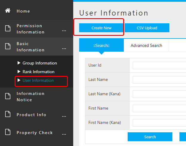
The input screen for the Property set in User Entity is displayed, so enter the user information.
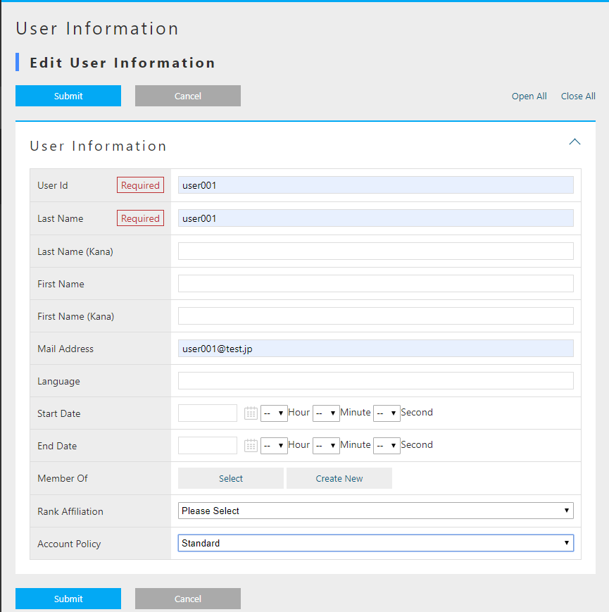
| Item | Setting |
|---|---|
User ID |
user001 |
Last Name |
User 001 |
E-mail address |
|
Groups |
GemUser |
Account Policy |
Standard |
After entering, click the Register button.
Once registered, the details screen will be ready to be displayed.
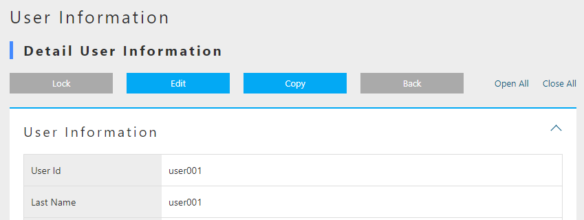
In addition, by enabling the listener for log output, the mail contents are output to the Eclipse console.
11: 13: 33.151 [http-nio-8080-exec-4] DEBUG 16 542 gem / generic / detail / InsertCommand oimmlLoggingSendMailListener-From: test@contract.dentsusoken.com ReplyTo: test@contract.dentsusoken.com To: (1) user001@test.jp; Cc: (0) Bcc: (0) Subject: [SampleTenant] User registration notice FileName: PlainMessage: User 001 User registration of “User 001” is performed on SampleTenant I was broken. A user ID and temporary password have been issued. Access SampleTenant from the URL below and register the password. URL: XXXXXXXX User ID: user001 User name: User 001 Temporary password: k, 3s6 # HV ============================== ======================================= □ For those who are not familiar with this email Emails are sent to customers who have registered with SampleTenant. If you do not understand this email, please contact the following address (source address). SampleTenant Secretariat test@contract.dentsusoken.com ====================================== ======================== Sender: DENTSU SOKEN Co., Ltd. COPYRIGHT 2011 DENTSU SOKEN INC. ALL RIGHTS RESERVED. HtmlMessage:
The title is prefixed with the tenant name (different for each tenant). The title and email content can be changed with metadata called MailTemplate.
Although it is a little difficult to see because it is output in a form that ignores line breaks, a temporary password is written in the mail body.
It is necessary to log in for the created user.
First Time Login
Now let’s log in as a new user. First, log out the currently logged-in user.
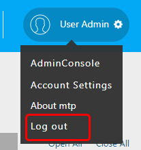
Try logging in as the new user user001.
When the password change screen shows up, set the password.
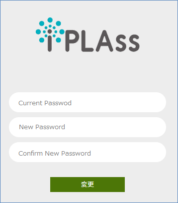
After the change, login process is performed and the top screen is displayed.
If an error dialog appears at this point, please create screen definitions for DetailLayout and SearchLayout for each entity you have created so far.
Please log in again after creating and confirm that the error is resolved.
*This error occurs when you attempt to view the Topview view definition using a user account other than the Admin account, because the view definition is set to be accessible only to the Admin user.
Since the user created here is not an administrator user, the AdminConsole menu tab will not be displayed in the menu list.
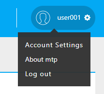
Registering Administrative Users
Administrators cannot be registered in the default state.
As mentioned in the description of the UserMaintenance item in Customizing the Top screen, User Entity is defined in 3 views.
| View | Name Usage | DetailLayout | SearchLayout |
|---|---|---|---|
default |
For general user registration (no administrator setting) |
○ |
○ |
admin |
For registration of users including administrators (for system administrators) |
○ |
○ |
maintenance |
For user’s own maintenance (for TopView) |
○ |
× |
Among these, maintenance View is provided as a View for the TopView UserMaintenance item, so SearchLayout is not provided.
View used for transition of general-purpose search screen and detail screen is not available here because DetailLayout and SearchLayout need a set of views with the same name.
For a detailed explanation of UserMaintenance, see User Maintenance.
If you want to create an administrator user, you can set the administrator flag by using the admin View.
Here, specify admin View for User Information EntityMenuItem existing in DEFAULT registered as Menu metadata so that the administrator can be registered.
Setting
Log in as an administrator user again and display the editing screen of the DEFAULT Menu.
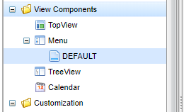
Right-click mtp/auth/User in standard_node and select Open Menu Item .
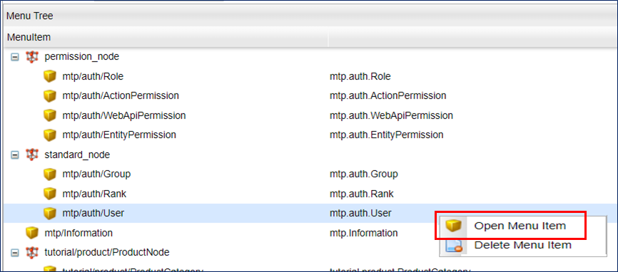
Set ViewName.
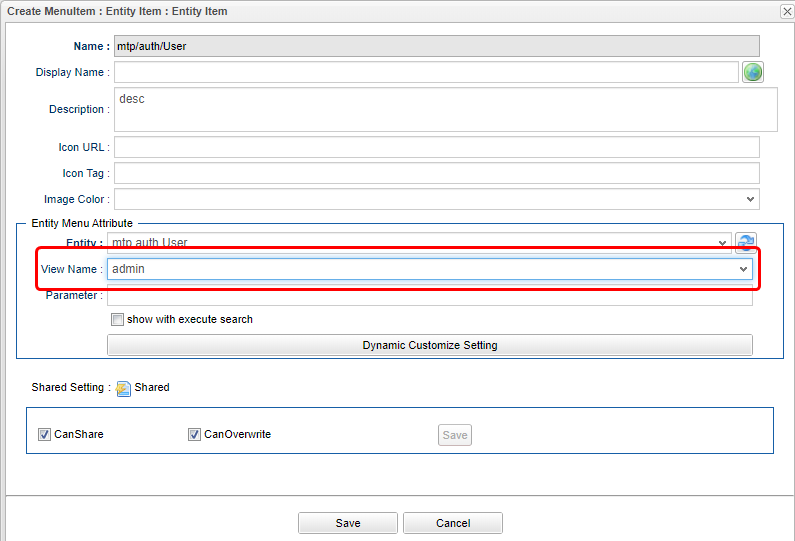
| Item | Setting |
|---|---|
ViewName |
admin |
Let’s save and register a user from the User Information menu on the top screen of the general-purpose screen.
Confirm
Click Home on the top screen of the general-purpose screen to redraw, and then proceed to the new user registration screen.
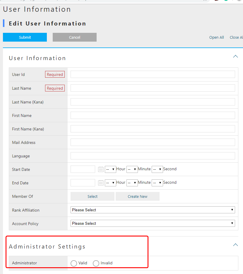
The input section for Administrator Settings will be displayed on the screen.
Let’s register an administrator user.
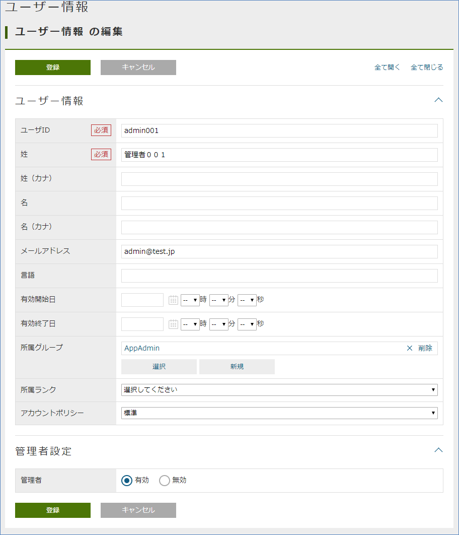
| User ID | admin001 |
|---|---|
Last name |
admin001 |
E-mail address |
|
Affiliation Group |
AppAdmin |
Account Policy |
Standard |
Admin |
enabled |
When you register, you will receive an email as before. Try logging in as a new user.
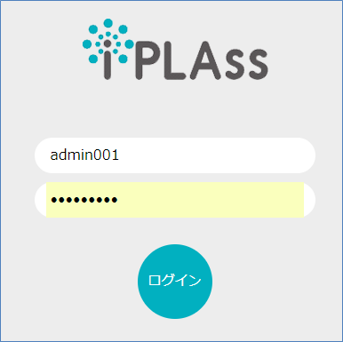
When you check the user menu, the AdminConsole menu is displayed.
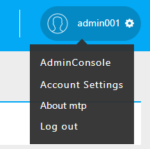
Here, the registration procedure of the user was explained. The following describes the role definition for controlling user privileges.
3.2. Authority Control by Role
Role-Based Privilege Control
The iPLAss platform has a built-in function to control user privileges on a role basis.
Role is expressed by Role Entity (mtp.auth.Role), and the target user is specified as a condition.
It is also possible to specify a property (such as administrator flag, group or rank) defined in User Entity as a condition to narrow down the target user.
For the created role, set permissions such as reference/update for each Entity, execute permission for action, execute permission for WebApi, execute permission for workflow, etc. (These are also expressed in Entity)
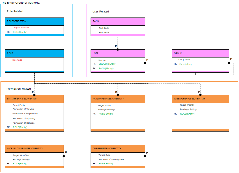
Here, the role is actually created.
Then, actually set the Entity authority in the authority setting and check the operation of the general screen.
It also explains how to associate Menu and TopView metadata with roles.
Initial Roles and Grant Privileges
When the tenant is created, the AppAdmin role (application administrator role) and the GemUser role (Gem user role) are created.
Each group belongs to a condition, and the two users created earlier are assigned their respective roles.
The AppAdmin role has more privileges than the GemUser role.
There is also an administrator (developer) who has stronger authority than AppAdmin.
Administrator (developer) is not a role, but the user with the administrator flag enabled corresponds to administrator (developer) (such as the initial user when creating a tenant), and authority for all operations Have
Please refer to GEM permission control for details of the permissions set for these two roles.
Creating a Role
Let’s actually create a role.
Role creation is done from the Role Entity registration screen from the general screen.
The default menu definition is done from the Permission Information- Role menu.
When the search screen is displayed, click the Create New button.
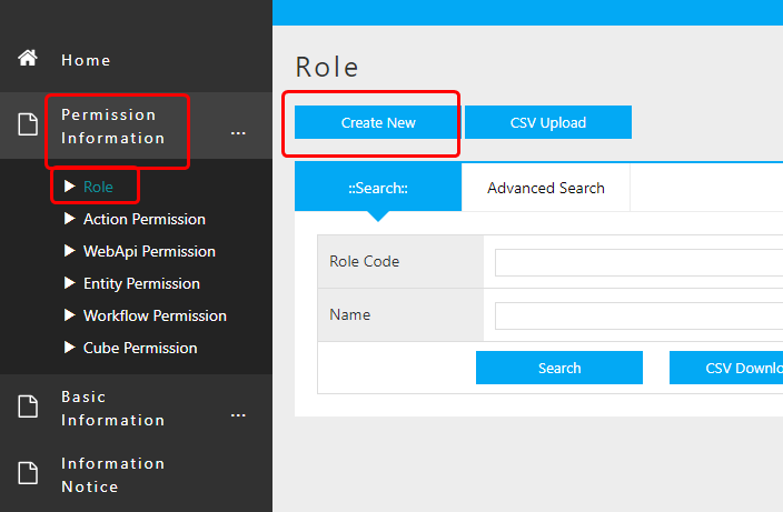
For this example, create the Administrator role and the General user role.
Use the admin Property of the User Entity as the criteria parameter.
Creating an Administrator Role
First, create an Administrator role.
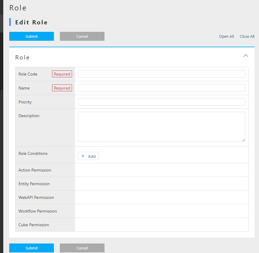
When the role registration screen is referenced, the role code and name (role name) are required. There are points need to be considered about the naming of these two property.
Roles can work together with Menu metadata and TopView metadata. Coordination is determined by whether the Menu metadata and TopView metadata with the same name as the role code are registered for the role to which the user belongs. If Menu metadata and TopView metadata with the same name as the role code exist, the top screen defined in the metadata is displayed. (we will confirm about it later)
Considering that it will be the name of Menu metadata and TopView metadata, it is easy to organize by defining role codes using / for layering metadata.
Role conditions allow a user to fall into multiple roles. In the iPLAss platform, when the logged-in user belongs to multiple roles and respectively multiple Menu metadata and TopView metadata are registered, a selectable menu item to select witch top screen to be displayed will be provided in the top screen toolbar.
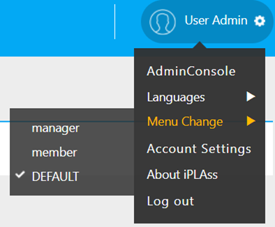
The role name is displayed here.
Create the following roles as administrator roles.
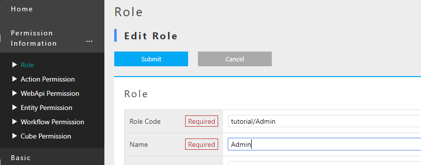
| Item | Setting |
|---|---|
Role Code |
tutorial/Admin |
Name |
Admin |
Skip the priorities and add roll conditions.
Click the Add button.
An area for entering name and condition is displayed.
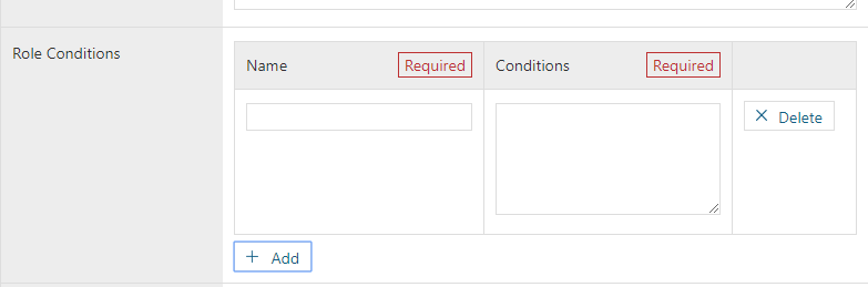
The name is for development maintenance, so give it a descriptive name. We will explain the conditions.
Conditional Statement for Role Conditions (GroovyScript)
Roll conditional statements can be set using the script language grammar called GroovyScript.
In this conditional statement (Script), it is necessary to return true / false whether the target user corresponds to this role.
The script for this conditional statement is passed the target user information in the bind variable user.
Use this user information to define a script that determines whether it corresponds to a role.
The following methods are provided for variables bound as user.
| Method | Content |
|---|---|
boolean isAdmin() |
Returns whether the user is an administrator. |
boolean memberOf (String groupCode) |
Judges whether the user is included in the group corresponding to the specified group code. In addition, this method performs judgment including the group code of the parent hierarchy. (Because groups can be hierarchical) |
Object getAttribute (String name) |
Returns the property value of user Entity. The return type depends on each property. |
String [] getGroupCodeWithChildren () |
Returns the group code when Group is set for the user. This method also returns the group code of the child hierarchy of the set group. (Because it can be a hierarchical structure) |
String [] getGroupCodeWithParents () |
Returns the group code when Group is set for the user. This method also returns the group code of the set parent hierarchy. (Because it can be a hierarchical structure) |
It feels a bit complicated, but it’s not overall difficult. The following examples are provided to help understanding the context.
Determine Administrator
Whether or not a user is an administrator is determined by the admin Property of the User Entity.
By using the user variable bound to the conditional statement, it can be determined as follows.
return user.isAdmin();

//user.isAdmin(); // return can be omitted. This is because GroovyScript interprets the last logic as a return value.
Determine if it is included in group code Group001
return user.memberOf("Group001");Determine if the rank is 3 or higher
return user.rank.level >= 3; // See `level` Property of` rank` Property (RankEntity) of `User` EntityIn this way, simple conditional logic based on User Entity can be built. For example, another entity can be prepared therefore create more complicated decisive logics using a class called EntityManager. (The script set as this conditional statement only needs to return true or false)
In this case, you want to determine whether you are an administrator, so there is no problem with the same contents as the first example.
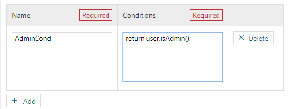
| Item | Setting |
|---|---|
Name |
AdminCond |
Condition |
return user.isAdmin(); |
Register the role in this state. Similarly, create a role other than administrator.
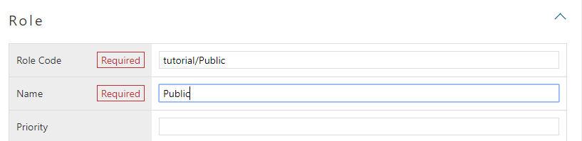
| Item | Setting |
|---|---|
Role Code |
tutorial/Public |
Name |
Public |
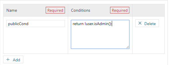
| Item | Setting |
|---|---|
Name |
PublicCond |
Condition |
return !User.isAdmin(); |
Creating Entity Privilege
Here, let’s set the reference and update permissions for each role for Entity.
Entity authority creation is done from the Entity authority Entity registration screen.
In the default menu definition, it is done from the Permission information - Entity Permission menu.
When the search screen is displayed, click the Create New button.
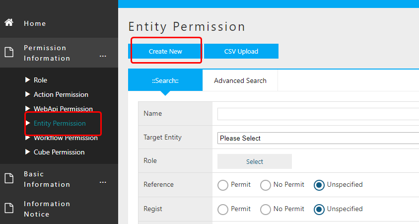
In this case, for the Product Category Entity, only administrators have the privilege to register while general users could only search and view.
Settings for General Users
The registration screen for Entity authority is divided into a part for setting authority target and a part for setting authority such as reference and update.
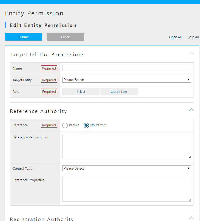
First of all, let’s set the target.
| Item | Setting |
|---|---|
Name |
ProductCategoryPermissionPublic |
TargetEntity |
ProductCategory |
Role |
Public |
Next, set the reference authority.
Select Permit because you want to allow general users to see it.
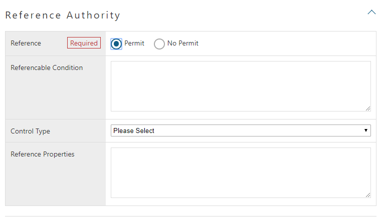
Privileges also have items such as referenceable condition to narrow down records by records and control type of reference properties reference property list to narrow down properties.
This time, it is only set in units of product category Entity, so you can leave it unset.
Set the registration privilege, update privilege, and deletion privilege to No Permit.
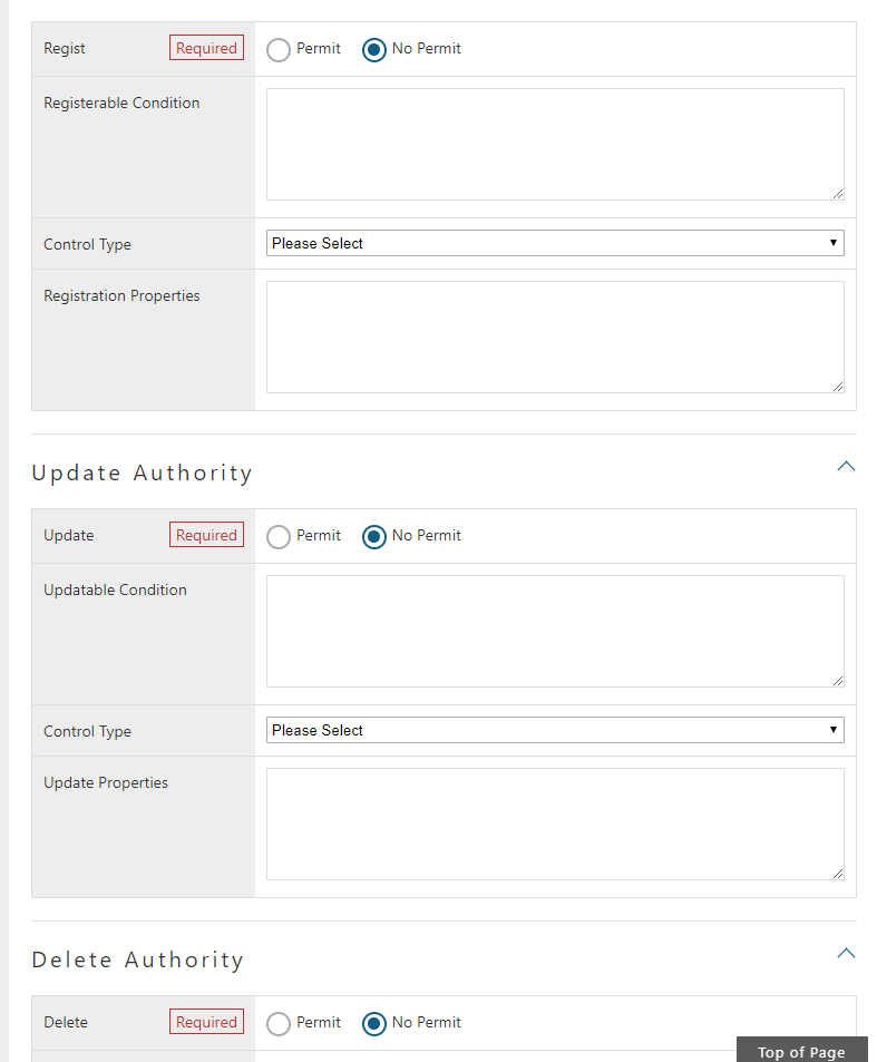
Please register in this state.
Confirm General Screen with Entity Permission
Depending on the settings of Product category Entity privilege, the general-purpose screen will have different item display.
Please have a look at it.
As the preparations in advance, create DetailLayout and SearchLayout of Product Entity, Product Category Entity, and Property Confirmation Entity.
Display each edit screen, execute standard load and then save.
Please log in as a non-administrator user.
(If you are following strictly to the User registration tutorial, then it should be user001.)
Top Screen
THere does not suppose to be any changes at this point.
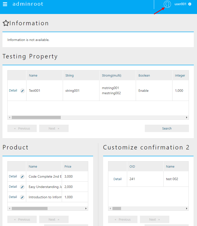
Search Screen
Click on the Product Info - Product Category menu to display the search screen.
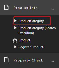
Try searching on the list view.
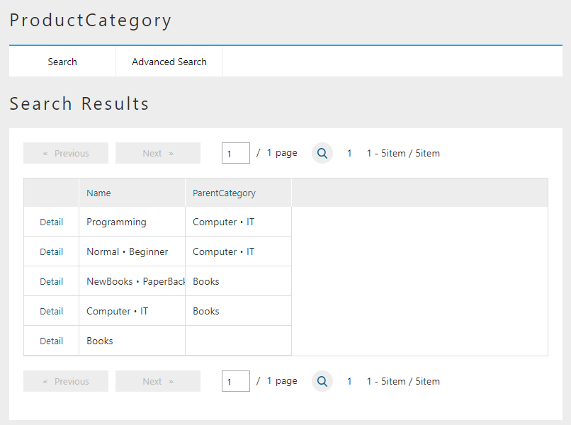
If you are not an administrator user, you are authorized to view data, but you are not authorized to register or change data. As a result, the following changes will occur:
-
New registration,CSV Upload,Show trashbutton will disappear. -
The
editlink(pencil icon) in the list is no longer displayed. -
The check box for selecting the target to delete in the list and the
Deletebutton are no longer displayed.-
(For Reference) Administrator search result screen
-
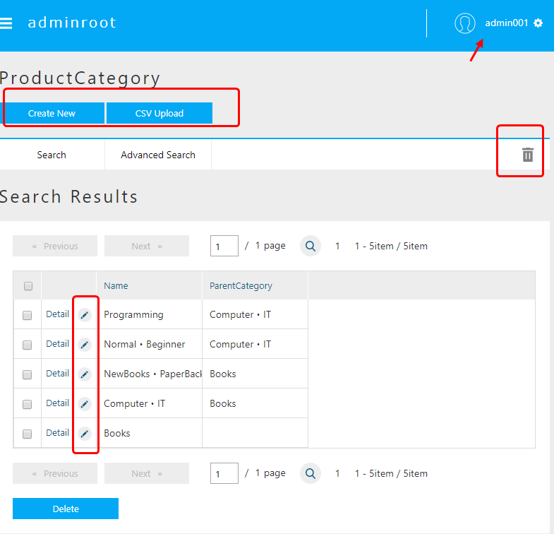
In this way, the functions that can be used vary depending on the setting status of the Entity permission.
Details Screen
Next, click the Detail link to display the details screen.
There is also a change on the details screen.
The lock, edit, and copy buttons are no longer displayed.
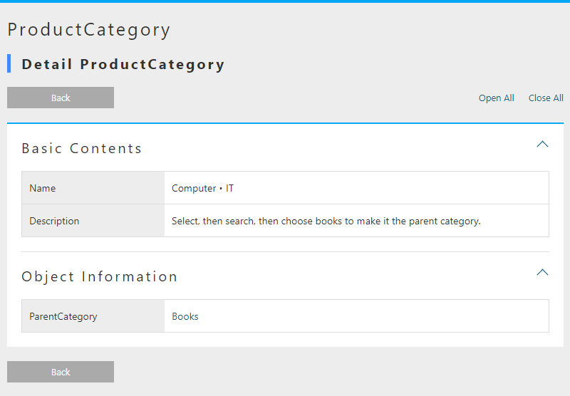
(For Reference) Administrator details screen
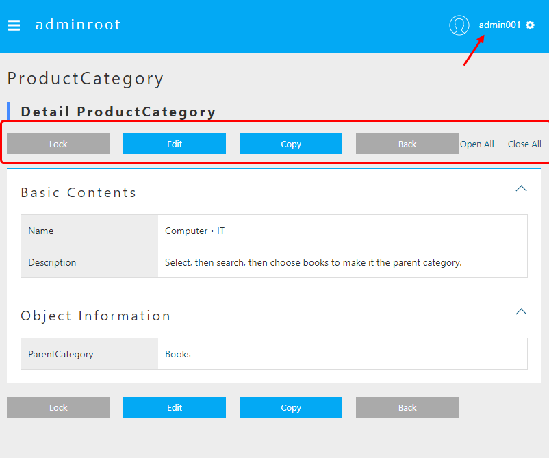
Reference Screen
Now let’s continue, click on the Register product menu.
Previously, Product Entity could select and add Product Category Entity.
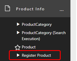
Entity privilege limitation is not set for Product Entity, so registration etc. can be executed.
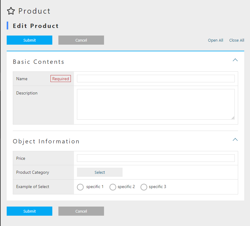
On the Product Entity registration screen, changes have been made in the product category selection part.
(For Reference) Product category selection part of the administrator
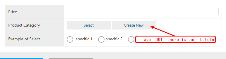
Just by setting the Entity permission in this way, the function of the general-purpose screen is controlled according to the privilege authority.
Behavior When There is No Reference Authority
Until now, only reference permission was allowed for the product category entity.
This time we want to check the behavior for Entity without reference authority, so let’s disallow this reference authority.
Once again, the administrator user will display the edit screen of Entity authority for the Product Category Entity.
Open the edit screen by following the steps: Permission Information menu> Search screen> Search execution> Edit link of ProductCategoryPermissionPublic> Edit screen.
(For now, it can be executed by an administrator user or general user)
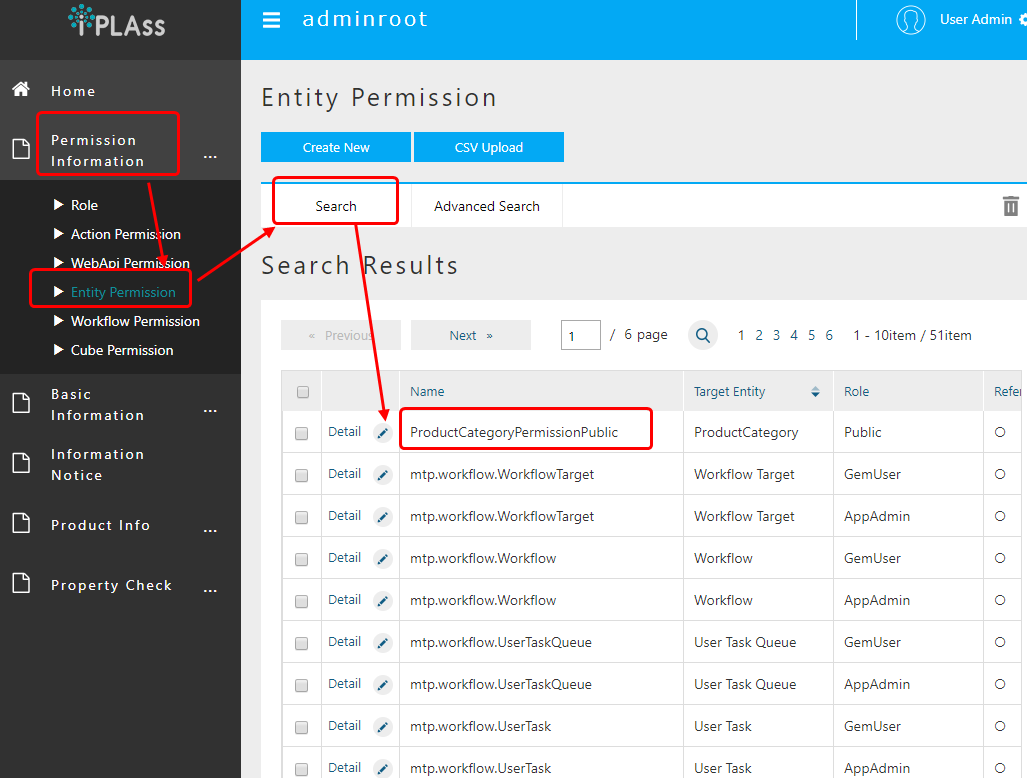
When the edit screen opens, change the reference authority to No Permit and save.
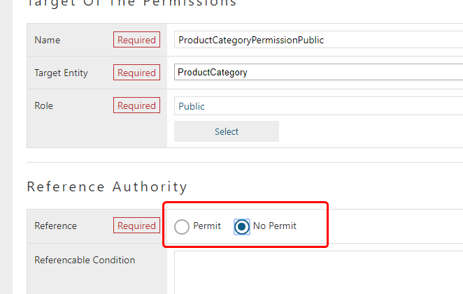
After saving, log in again as a user other than the administrator and look at the top screen. (If you are working as a user other than the administrator, you do not need to log in again.)
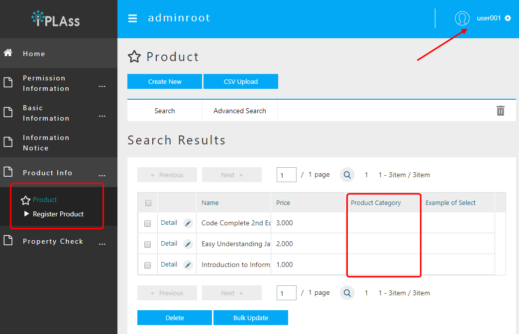
The menu for Product Category disappears from the menu on the left.
(For Reference) Administrator’s product category menu
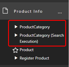
Also have a look at the SearchResultList of product categories placed in TopView.
Product category is not displayed.
(For Reference) List of product search results by administrator
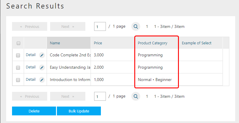
The result list of the normal search screen will not be displayed in the same way as it is displayed with the Display search screen link on the left (or displayed in the Products menu).
In this way, menus registered using EntityMenuItem, search result screens, and edit screens that have not been confirmed are automatically set to be displayed/hidden with reference to the Entity reference authority.
Since we are done with confirming the behavior, please return the reference authority to the product category Entity to permission.
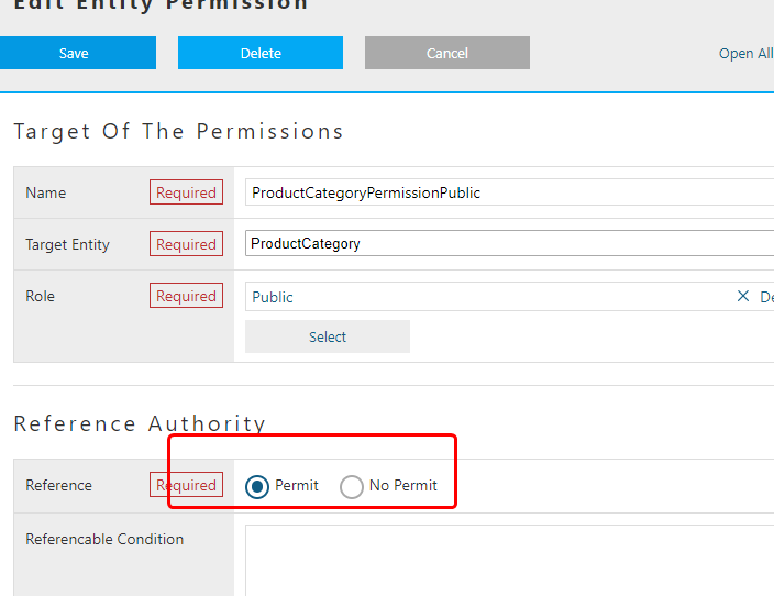
Integration of Role, Menu, TopView
Until now, when Entity permission etc. was set for the role, it was confirmed that the authority of display/hide of buttons and links was determined for each displayed component.
Aside from privilege control, there is a function that links TopView and Menu to roles for if you want to switch menus and parts displayed on the top screen for each user.
(The function currently provided is not per user, but per role .)
This section explains the linkage between roles, Menu and TopView.
Integration method
The integrating method is simple.
You only need to create Menu metadata and TopView metadata with the same name, as the role code registered previously when creating the role.
By doing so, the top screen corresponding to the role to which the target user belongs will be displayed.
Let’s actually create and check.
Creating The Menu
So far, we have created two roles, tutorial/Public and tutorial/Admin.
First, let’s create a Menu for tutorial/Public.
Open the AdminConsole screen, expand the menu metadata and display DEFAULT.
Let’s create a copy of this DEFAULT menu.
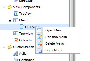
Change the name to tutorial/Public same as the role code and save.
(Description aswell)
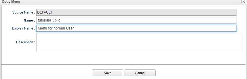
| Item | Setting |
|---|---|
Name |
tutorial/Public |
Description |
Menu for Normal User |
Let’s display the edit screen by double-clicking the created Menu.
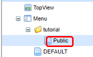
Since it is a general user this time, let’s delete permission_node and standard_node.
Also, delete the product category menu from ProductNode.
Save it as shown below.
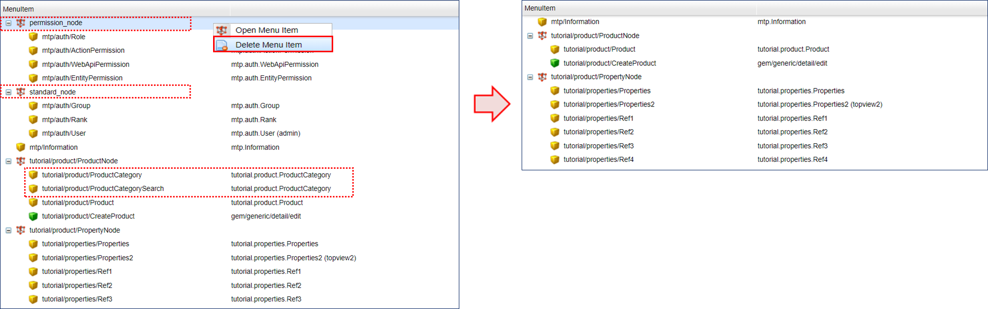
At this point, log in again as a non-administrator user and look at the top screen.
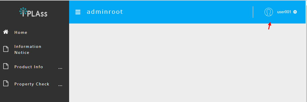
The menu has changed.
At the same time, TopView parts are no longer displayed.
This is because when there is Menu metadata that matches the target role, it is controlled to display TopView metadata with the same name.
Create the same tutorial/Public in TopView.
Creating TopView
Also copy the already registered DEFAULT.
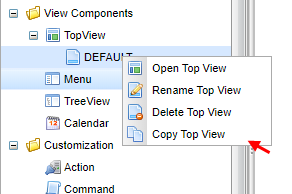
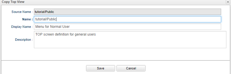
| Item | Setting |
|---|---|
Name |
tutorial/Public |
Description |
Top screen definition for general users |
Open the edit screen.
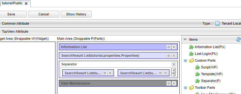
In Customizing the Top screen, User Maintenance is added and maintenance is specified in View.
As a result, the name and email address can be changed on the Account Settings screen on the top screen.
Let’s delete User Maintenance and separator this time so that each user can only change the password.
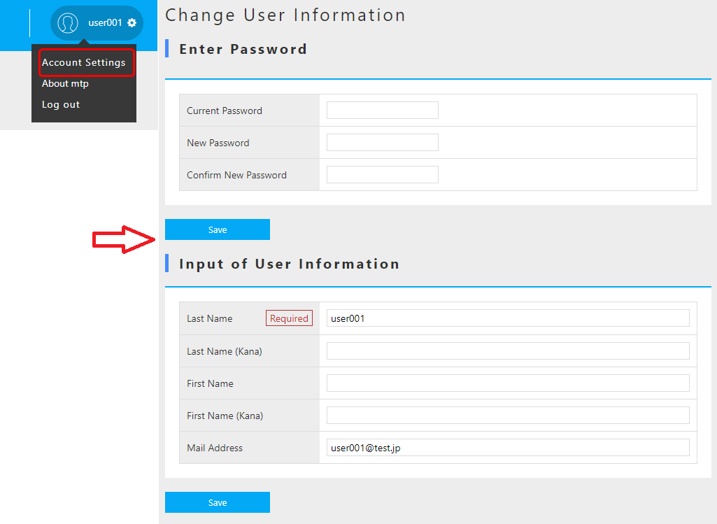
By deleting this User Maintenance part from TopView, only the upper password can be changed.
Save it as shown.
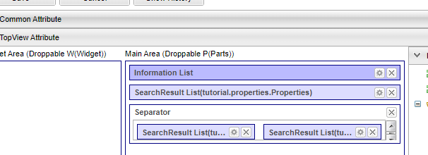
At this point, log in again as a non-administrator user and look at the top screen. The parts will be displayed.
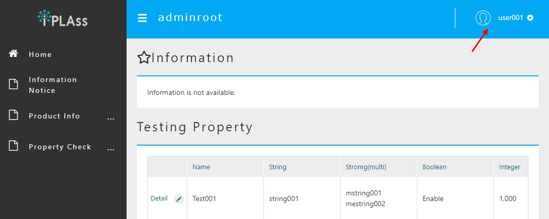
Next, click on Account Setting.
Only the password can be changed.
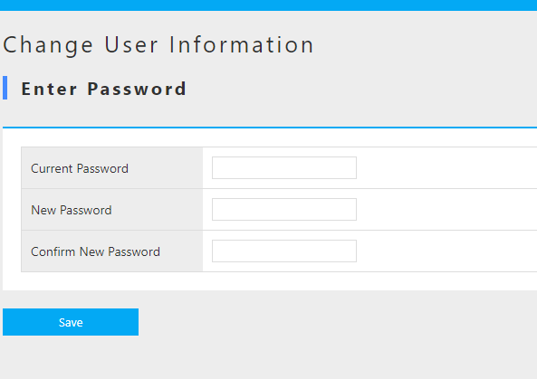
By defining Menu and TopView for a role in this way, you can create views for each role.
By specifying viewName = View name as the parameter of EntityMenuItem, it was possible to specify the layout of the search screen and detail screen.
Now, by creating a Menu for each role, you can specify the View definition that you want to display in that role.
If you define the layout of the screen to be displayed for each role as a view, you can switch with the parameter of EntityMenuItem.
About Administrator
So far, Menu and TopView have been created for the role tutorial/Public for general users.
We haven’t created anything for the admin role tutorial/Admin yet.
If you log in as an administrator in the current state, the top screen will be the Public top screen.
(Permission information and basic information are not displayed)
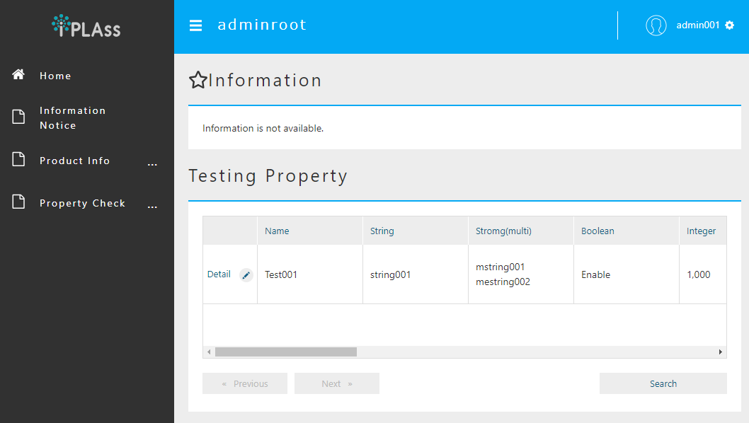
This is because the administrator (User Entity admin = true) has the privilege to have access to all roles' pages.
Also, since the Menu/TopView definition defined as DEFAULT has the lowest priority, the screen registered as Public is displayed in the initial state.
If there are multiple screen definitions like this administrator, the Change menu menu will be displayed on the toolbar at the top of the screen.
Now let’s switch the screen definition.
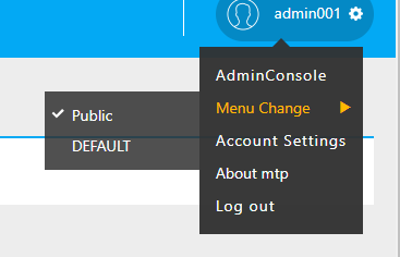
If it is troublesome for the administrator to start from the Public screen every time, it can be avoided by creating Menu and TopView for tutorial/Admin.
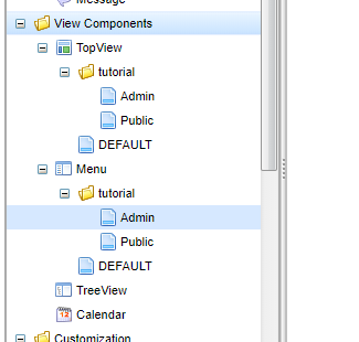
In this state, the initial screen is determined with the following priority.
-
Ascending order of menu definition display order
-
RoleEntity priority in descending order (0 if not specified) -
For the same priority, the ascending order of the names of
RoleEntity
Sorted in this order, the screen corresponding to the first Role is initially selected.
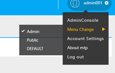
In this case, even if the priority is not specified for the display order of the Menu definition or the Role Entity, the name is Admin and Public, so Admin takes priority, but by specifying the priority, You can set it so that it does not depend on the name.
Let’s set the priority for each menu definition.
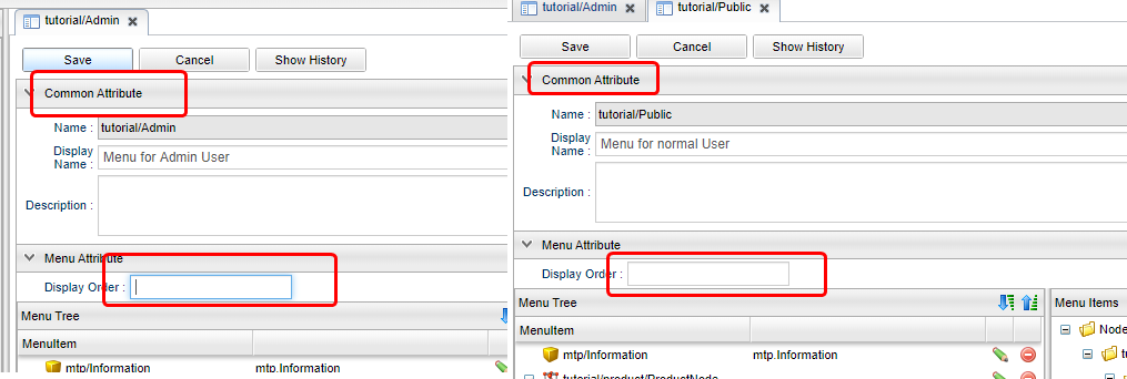
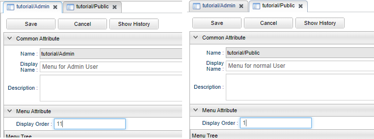
If the priority of Public is higher than Admin, Public is selected as the initial selection.
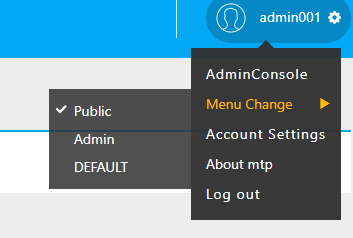
Above all, we have created a role, set Entity permissions for the role, and checked the screen behavior for that setting. We also confirmed that different layouts can be defined for each role using Menu and TopView.
4. Next Step
To have a deeper understanding on the features of iPLAss, please try the Tutorial(advanced) .